现如今网页越来越趋近于动画,相信大家平时浏览网页或多或少都能看到一些动画效果,今天我们来做一些文字上面的动画效果,下面一起看看吧。
实现效果

其实主要就是通过 animation 添加动画属性,利用 keyframes 来描述动画的开始、过程和结束的状态,核心就是 animation + transform:rotate,话不多说,下面直接看代码。
<template>
  <div class="parentBox">
    <div class="contantBox">文字抖动</div>
  </div>
</template>
<style lang="less" scoped>
.parentBox {
  height: 100%;
  background: rgb(31, 31, 31);
  padding: 100px;
  @keyframes cartoon {
    2% {
      transform: translate(6px, -2px) rotate(3.5deg);
    }

    4% {
      transform: translate(5px, 8px) rotate(-0.5deg);
    }

    6% {
      transform: translate(6px, -3px) rotate(-2.5deg);
    }

    8% {
      transform: translate(4px, -2px) rotate(1.5deg);
    }

    10% {
      transform: translate(-6px, 8px) rotate(-1.5deg);
    }

    12% {
      transform: translate(-5px, 5px) rotate(1.5deg);
    }

    14% {
      transform: translate(4px, 10px) rotate(3.5deg);
    }

    16% {
      transform: translate(0px, 4px) rotate(1.5deg);
    }

    18% {
      transform: translate(-1px, -6px) rotate(-0.5deg);
    }

    20% {
      transform: translate(6px, -9px) rotate(2.5deg);
    }

    22% {
      transform: translate(1px, -5px) rotate(-1.5deg);
    }

    24% {
      transform: translate(-9px, 6px) rotate(-0.5deg);
    }

    26% {
      transform: translate(8px, -2px) rotate(-1.5deg);
    }

    28% {
      transform: translate(2px, -3px) rotate(-2.5deg);
    }

    30% {
      transform: translate(9px, -7px) rotate(-0.5deg);
    }

    32% {
      transform: translate(8px, -6px) rotate(-2.5deg);
    }

    34% {
      transform: translate(-5px, 1px) rotate(3.5deg);
    }

    36% {
      transform: translate(0px, -5px) rotate(2.5deg);
    }

    38% {
      transform: translate(2px, 7px) rotate(-1.5deg);
    }

    40% {
      transform: translate(6px, 3px) rotate(-1.5deg);
    }

    42% {
      transform: translate(1px, -5px) rotate(-1.5deg);
    }

    44% {
      transform: translate(10px, -4px) rotate(-0.5deg);
    }

    46% {
      transform: translate(-2px, 2px) rotate(3.5deg);
    }

    48% {
      transform: translate(3px, 4px) rotate(-0.5deg);
    }

    50% {
      transform: translate(8px, 1px) rotate(-1.5deg);
    }

    52% {
      transform: translate(7px, 4px) rotate(-1.5deg);
    }

    54% {
      transform: translate(10px, 8px) rotate(-1.5deg);
    }

    56% {
      transform: translate(-3px, 0px) rotate(-0.5deg);
    }

    58% {
      transform: translate(0px, -1px) rotate(1.5deg);
    }

    60% {
      transform: translate(6px, 9px) rotate(-1.5deg);
    }

    62% {
      transform: translate(-9px, 8px) rotate(0.5deg);
    }

    64% {
      transform: translate(-6px, 10px) rotate(0.5deg);
    }

    66% {
      transform: translate(7px, 0px) rotate(0.5deg);
    }

    68% {
      transform: translate(3px, 8px) rotate(-0.5deg);
    }

    70% {
      transform: translate(-2px, -9px) rotate(1.5deg);
    }

    72% {
      transform: translate(-6px, 2px) rotate(1.5deg);
    }

    74% {
      transform: translate(-2px, 10px) rotate(-1.5deg);
    }

    76% {
      transform: translate(2px, 8px) rotate(2.5deg);
    }

    78% {
      transform: translate(6px, -2px) rotate(-0.5deg);
    }

    80% {
      transform: translate(6px, 8px) rotate(0.5deg);
    }

    82% {
      transform: translate(10px, 9px) rotate(3.5deg);
    }

    84% {
      transform: translate(-3px, -1px) rotate(3.5deg);
    }

    86% {
      transform: translate(1px, 8px) rotate(-2.5deg);
    }

    88% {
      transform: translate(-5px, -9px) rotate(2.5deg);
    }

    90% {
      transform: translate(2px, 8px) rotate(0.5deg);
    }

    92% {
      transform: translate(0px, -1px) rotate(1.5deg);
    }

    94% {
      transform: translate(-8px, -1px) rotate(0.5deg);
    }

    96% {
      transform: translate(-3px, 8px) rotate(-1.5deg);
    }

    98% {
      transform: translate(4px, 8px) rotate(0.5deg);
    }

    0%,
    100% {
      transform: translate(0, 0) rotate(0);
    }
  }
  .contantBox {
    color: #fff;
    animation: cartoon 5s infinite ease-in-out;
  }
}
</style>
实现效果

实现的思路核心在于 scale3d 属性让其变形,配合 animation-timing-function 属性指定动画完成的周期实现该效果。
<template>
  <div class="parentBox">
    <div class="contantBox">文字缩放</div>
  </div>
</template>
<style lang="less" scoped>
.parentBox {
  height: 100%;
  background: rgb(31, 31, 31);
  padding: 100px;
  @keyframes zoomMeans {
    40% {
      opacity: 1;
      transform: scale3d(0.475, 0.475, 0.475) translate3d(0, -60px, 0);
      animation-timing-function: cubic-bezier(0.55, 0.055, 0.675, 0.19);
    }

    to {
      opacity: 0;
      transform: scale3d(0.1, 0.1, 0.1) translate3d(0, 2000px, 0);
      animation-timing-function: cubic-bezier(0.175, 0.885, 0.32, 1);
    }
  }
  .contantBox {
    animation: 2s linear 0s infinite alternate zoomMeans;
    font-weight: bold;
    color: white;
    font-size: 20px;
    text-align: center;
  }
}
</style>
实现效果

上图的效果实现起来其实就非常的简单了,我们只需要通过 hover 事件在鼠标触摸文字时设置其样式和效果即可。
<template>
  <div class="parentBox">
    <h1>hello word!(鼠标悬浮特效)</h1>
  </div>
</template>
<style lang="less" scoped>
.parentBox {
  height: 100%;
  background: rgb(31, 31, 31);
  padding: 100px;
  h1 {
    display: inline-block;
    color: white;
    font-size: 56px;
    transition: 0.5s;
    cursor: pointer;
  }

  h1:hover {
    text-shadow: 0 1px 0 #ccc, 0 2px 0 #ccc, 0 3px 0 #ccc, 0 4px 0 #ccc,
      0 5px 0 #ccc, 0 6px 0 #ccc, 0 7px 0 #ccc, 0 8px 0 #ccc, 0 9px 0 #ccc,
      0 10px 0 #ccc, 0 11px 0 #ccc, 0 12px 0 #ccc,
      0 20px 30px rgba(0, 0, 0, 0.5);
  }
}
</style>

<template>
  <div class="parentBox">
    <h1>hello word!(鼠标悬浮特效)</h1>
  </div>
</template>
<style lang="less" scoped>
.parentBox {
  height: 100%;
  background: rgb(31, 31, 31);
  padding: 100px;
  h1 {
    display: inline-block;
    color: #fff;
    cursor: pointer;
    -webkit-box-reflect: below 0 -webkit-linear-gradient(transparent, transparent
          50%, rgba(255, 255, 255, 0.3));
    font: bold 50px/1.231 georgia, sans-serif;
    text-transform: uppercase;
  }
}
</style>
实现效果
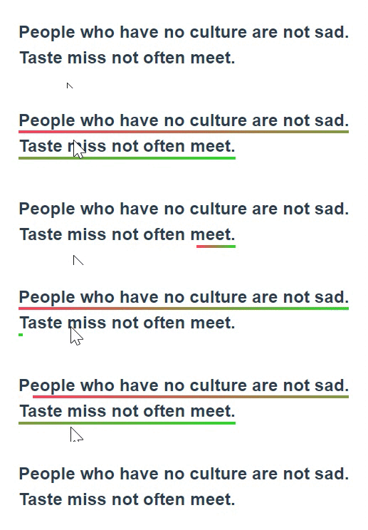
<template>
  <div>
    <h2 class="titleBox">
      <span>People who have no culture are not sad. Taste miss not often meet.</span>
    </h2>
  </div>
</template>
<style scoped>
.titleBox span {
  line-height: 1.5;
  padding-bottom: 4px;
  background: linear-gradient(to right, rgb(255, 64, 96), rgb(47, 216, 47))
    no-repeat right bottom;
  background-size: 0px 3px;
  transition: background-size 1200ms;
}
.titleBox span:hover {
  background-position-x: left;
  background-size: 100% 3px;
}
</style>
持续更新中...
当我使用Bundler时,是否需要在我的Gemfile中将其列为依赖项?毕竟,我的代码中有些地方需要它。例如,当我进行Bundler设置时:require"bundler/setup" 最佳答案 没有。您可以尝试,但首先您必须用鞋带将自己抬离地面。 关于ruby-我需要将Bundler本身添加到Gemfile中吗?,我们在StackOverflow上找到一个类似的问题: https://stackoverflow.com/questions/4758609/
我正在寻找执行以下操作的正确语法(在Perl、Shell或Ruby中):#variabletoaccessthedatalinesappendedasafileEND_OF_SCRIPT_MARKERrawdatastartshereanditcontinues. 最佳答案 Perl用__DATA__做这个:#!/usr/bin/perlusestrict;usewarnings;while(){print;}__DATA__Texttoprintgoeshere 关于ruby-如何将脚
我在MiniTest::Spec和Capybara中使用以下规范:find_field('Email').must_have_css('[autofocus]')检查名为“电子邮件”的字段是否具有autofocus属性。doc说如下:has_css?(path,options={})ChecksifagivenCSSselectorisonthepageorcurrentnode.据我了解,字段“Email”是一个节点,因此调用must_have_css绝对有效!我做错了什么? 最佳答案 通过JonasNicklas得到了答案:No
在选择我想要运行操作的频率时,唯一的选项是“每天”、“每小时”和“每10分钟”。谢谢!我想为我的Rails3.1应用程序运行调度程序。 最佳答案 这不是一个优雅的解决方案,但您可以安排它每天运行,并在实际开始工作之前检查日期是否为当月的第一天。 关于ruby-如何每月在Heroku运行一次Scheduler插件?,我们在StackOverflow上找到一个类似的问题: https://stackoverflow.com/questions/8692687/
我对最新版本的Rails有疑问。我创建了一个新应用程序(railsnewMyProject),但我没有脚本/生成,只有脚本/rails,当我输入ruby./script/railsgeneratepluginmy_plugin"Couldnotfindgeneratorplugin.".你知道如何生成插件模板吗?没有这个命令可以创建插件吗?PS:我正在使用Rails3.2.1和ruby1.8.7[universal-darwin11.0] 最佳答案 随着Rails3.2.0的发布,插件生成器已经被移除。查看变更日志here.现在
我注意到像bundler这样的项目在每个specfile中执行requirespec_helper我还注意到rspec使用选项--require,它允许您在引导rspec时要求一个文件。您还可以将其添加到.rspec文件中,因此只要您运行不带参数的rspec就会添加它。使用上述方法有什么缺点可以解释为什么像bundler这样的项目选择在每个规范文件中都需要spec_helper吗? 最佳答案 我不在Bundler上工作,所以我不能直接谈论他们的做法。并非所有项目都checkin.rspec文件。原因是这个文件,通常按照当前的惯例,只
我实际上是在尝试使用RVM在我的OSX10.7.5上更新ruby,并在输入以下命令后:rvminstallruby我得到了以下回复:Searchingforbinaryrubies,thismighttakesometime.Checkingrequirementsforosx.Installingrequirementsforosx.Updatingsystem.......Errorrunning'requirements_osx_brew_update_systemruby-2.0.0-p247',pleaseread/Users/username/.rvm/log/138121
我试图在索引页中创建一个超链接,但它没有显示,也没有给出任何错误。这是我的index.html.erb代码。ListingarticlesTitleTextssss我检查了我的路线,我认为它们也没有问题。PrefixVerbURIPatternController#Actionwelcome_indexGET/welcome/index(.:format)welcome#indexarticlesGET/articles(.:format)articles#indexPOST/articles(.:format)articles#createnew_articleGET/article
我正在处理旧代码的一部分。beforedoallow_any_instance_of(SportRateManager).toreceive(:create).and_return(true)endRubocop错误如下:Avoidstubbingusing'allow_any_instance_of'我读到了RuboCop::RSpec:AnyInstance我试着像下面那样改变它。由此beforedoallow_any_instance_of(SportRateManager).toreceive(:create).and_return(true)end对此:let(:sport_
我有一个div,它根据表单是否正确提交而改变。我想知道是否可以检查类的特定元素?开始元素看起来像这样。如果输入不正确,添加错误类。 最佳答案 试试这个:browser.div(:id=>"myerrortest").class_name更多信息:http://watir.github.com/watir-webdriver/doc/Watir/HTMLElement.html#class_name-instance_method另一种选择是只查看具有您期望的类的div是否存在browser.div((:id=>"myerrortes