CSS 响应式布局也称自适应布局,是 Ethan Marcotte 在 2010 年 5 月份提出的一个概念,简单来讲就是一个网站能够兼容多个不同的终端(设备),而不是为每个终端做一个特定的版本。这个概念是为解决移动端浏览网页而诞生的。响应式布局能够为使用不同终端的用户提供很好的用户体验,而且随着大屏智能手机的普及,用“大势所趋”来形容也不为过。
要实现响应式布局,常用的方式有以下几种:
接下来我们以媒体查询为例来具体演示一下响应式布局的实现。
首先,我们需要设置 meta 标签来告诉浏览器,让视口(网页的可视区域)的宽度等于设备的宽度,并禁止用户对页面的缩放,如下所示:
<meta name="viewport" content="width=device-width, initial-scale=1, maximum-scale=1, user-scalable=no">
在设置视口时需要注意,视口就是网页可见区域的尺寸,设置视口时只设置宽度就行,不用在乎高度,具体高度由网页内容自动撑开。上面 meta 标签中内容的含义如下:
CSS 媒体查询可以根据指定的条件,针对不同的媒体类型(screen print)定义不同的 CSS 样式,让使用不同设备的用户都能得到最佳的体验。
关于媒体查询有以下三种实现方式:
1、直接在 CSS 文件中使用,示例代码如下:
@media (max-width: 320px) {
    /*0~320*/
    body {
        background: pink;
    }
}
@media (min-width: 321px) and (max-width: 375px) {
    /*321~768*/
    body {
        background: red;
    }
}
@media (min-width: 376px) and (max-width: 425px) {
    /*376~425*/
    body {
        background: yellow;
    }
}
@media (min-width: 426px) and (max-width: 768px) {
    /*426~768*/
    body {
        background: blue;
    }
}
@media (min-width: 769px) {
    /*769~+∞*/
    body {
        background: green;
    }
}
2、使用 @import 导入,示例代码如下:
@import 'index01.css' screen and (max-width:1024px) and (min-width:720px)

@import 'index02.css' screen and (max-width:720px)
3、在 link 标签中使用,示例代码如下:
<link rel="stylesheet" type="text/css" href="index01.css" media="screen and (max-width:1024px) and (min-width:720px)"/>

<link rel="stylesheet" type="text/css" href="index02.css" media="screen and (max-width:720px)"/>
下面通过一个综合的示例来演示一下响应式布局的实现:
<!DOCTYPE html>
<html>
<head>
<meta charset="UTF-8">
<title>响应式布局</title>
<meta name="viewport"content="width=device-width,initial-scale=1.0,maximum-scale=1,user-scalable=no" />
<style>
*{
margin: 0px;
padding: 0px;
font-family: "微软雅黑";
}
#head, #foot, #main
{
height: 100px;
width: 1200px;
/*width: 85%;*/
background-color: goldenrod;
text-align: center;
font-size: 48px;
line-height: 100px;
margin: 0 auto;
}
#head div{
display: none;
font-size: 20px;
height: 30px;
width: 100px;
background-color: green;
float: right;
line-height: 30px;
margin-top: 35px;
}
#head ul{
width: 80%;
}
#head ul li{
width: 20%;
float: left;
text-align: center;
list-style: none;font-size: 20px;
}
#main{
height: auto;
margin: 10px auto;
overflow: hidden;
}
.left, .center, .right{
height: 600px;
line-height: 600px;
float: left;
width: 20%;
background-color: red
}
.center{
width: 60%;
border-left: 10px solid #FFF;
border-right: 10px solid #FFF;
box-sizing: border-box;
}
@media only screen and (max-width: 1200px) {
#head, #foot, #main{
width: 100%;
}
}
@media only screen and (max-width: 980px) {
.right{
display: none;
}
.left{
width: 30%;
}
.center{
width: 70%;
border-right: hidden;
}
}
@media only screen and (max-width: 640px) {
.left, .center, .right{
width: 100%;
display: block;
height: 200px;
line-height: 200px;
}
.center{
border: hidden;
border-top: 10px solid #FFFFFF;
border-bottom: 10px solid #FFFFFF;
height: 600px;
line-height: 600px;
}
#head ul{
display: none;
}
#head div{
display: block;
}
}
</style>
</head>
<body>
<div>
<header id="head">
<ul>
<li>header1</li>
<li>header2</li>
<li>header2</li>
<li>header2</li>
<li>header2</li>
</ul>
<div>icon</div>
</header>
<section id="main">
<div class="left">
left
</div>
<div class="center">
center
</div>
<div class="right">
right
</div>
</section>
<footer id="foot">
footer
</footer>
</div>
</body>
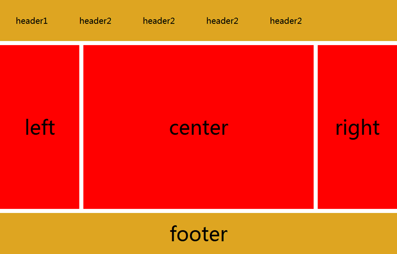
</html>当浏览器窗口小于 1200 像素大于 980 像素时,页面的样式如下图所示:
当浏览器窗口大于 640 像素小于 980 像素时,页面的样式如下图所示:

当浏览器窗口小于 640 像素时,页面的样式如下图所示:

我在MiniTest::Spec和Capybara中使用以下规范:find_field('Email').must_have_css('[autofocus]')检查名为“电子邮件”的字段是否具有autofocus属性。doc说如下:has_css?(path,options={})ChecksifagivenCSSselectorisonthepageorcurrentnode.据我了解,字段“Email”是一个节点,因此调用must_have_css绝对有效!我做错了什么? 最佳答案 通过JonasNicklas得到了答案:No
我是Google云的新手,我正在尝试对其进行首次部署。我的第一个部署是RubyonRails项目。我基本上是在关注thisguideinthegoogleclouddocumentation.唯一的区别是我使用的是我自己的项目,而不是他们提供的“helloworld”项目。这是我的app.yaml文件runtime:customvm:trueentrypoint:bundleexecrackup-p8080-Eproductionconfig.ruresources:cpu:0.5memory_gb:1.3disk_size_gb:10当我转到我的项目目录并运行gcloudprevie
是否可以为特定(或所有)项目使用多个布局?例如,我有几个项目,我想对其应用两种不同的布局。一个是绿色的,一个是蓝色的(但是)。我想将它们编译到我的输出目录中的两个不同文件夹中(例如v1和v2)。我一直在玩弄规则和编译block,但我不知道这是怎么回事。因为,每个项目在编译过程中只编译一次,我不能告诉nanoc第一次用layout1编译,第二次用layout2编译。我试过这样的东西,但它导致输出文件损坏。compile'*'doifitem.binary?#don’tfilterbinaryitemselsefilter:erblayout'layout1'layout'layout2'
我有一个div,它根据表单是否正确提交而改变。我想知道是否可以检查类的特定元素?开始元素看起来像这样。如果输入不正确,添加错误类。 最佳答案 试试这个:browser.div(:id=>"myerrortest").class_name更多信息:http://watir.github.com/watir-webdriver/doc/Watir/HTMLElement.html#class_name-instance_method另一种选择是只查看具有您期望的类的div是否存在browser.div((:id=>"myerrortes
在我做的一些网络开发中,我有多个操作开始,比如对外部API的GET请求,我希望它们同时开始,因为一个不依赖另一个的结果。我希望事情能够在后台运行。我找到了concurrent-rubylibrary这似乎运作良好。通过将其混合到您创建的类中,该类的方法具有在后台线程上运行的异步版本。这导致我编写如下代码,其中FirstAsyncWorker和SecondAsyncWorker是我编写的类,我在其中混合了Concurrent::Async模块,并编写了一个名为“work”的方法来发送HTTP请求:defindexop1_result=FirstAsyncWorker.new.async.
我开始了一个新的Rails3.2.5项目,Assets管道不再工作了。CSS和Javascript文件不再编译。这是尝试生成Assets时日志的输出:StartedGET"/assets/application.css?body=1"for127.0.0.1at2012-06-1623:59:11-0700Servedasset/application.css-200OK(0ms)[2012-06-1623:59:11]ERRORNoMethodError:undefinedmethod`each'fornil:NilClass/Users/greg/.rbenv/versions/1
rails新手。只是想了解\assests目录中的这两个文件。例如,application.js文件有如下行://=requirejquery//=requirejquery_ujs//=require_tree.我理解require_tree。只是将所有JS文件添加到当前目录中。根据上下文,我可以看出requirejquery添加了jQuery库。但是它从哪里得到这些jQuery库呢?我没有在我的Assets文件夹中看到任何jquery.js文件——或者直接在我的整个应用程序中没有看到任何jquery.js文件?同样,我正在按照一些说明安装TwitterBootstrap(http:
我正在尝试消除使用Bootstrap3的Rails4元素中的glyphicon错误。我没有使用任何Bootstrapgem将其添加到Assets管道中。我手动将bootstrap.css和bootstrap.js添加到各自的app/assets目录下,分别添加到application.css和application.js什么的我现在在网络浏览器的控制台中看到以下内容:GEThttp://localhost:3000/fonts/glyphicons-halflings-regular.woff404(NotFound)localhost/:1GEThttp://localhost:30
我有一个使用twitterbootstrap和sass的Rails元素。scss文件结构化到文件夹中,所以我有更好的概述。现在我想为包含我的颜色等的全局变量定义一个文件,并将这些值传递给其他文件,这样我就有更少的冗余代码。虽然所有代码都已正确导入和应用,变量不起作用。这是当前的设置:样式表/application.css.scss/**=require_self*=require_tree*//*stylesheets/||–base/||–_reset.scss#Reset/normalize||–_typography.scss#Typographyrules||–componen
有没有一种方法可以在jekyll站点中包含自定义css标签,同时将markdown用于入口文件?例如,当我想突出显示某个段落时? 最佳答案 Markdown和YAMLFrontMatter都内置了这个。但你可以自己制作。比如说,您有foo.css想要包含在某些帖子中。在_posts/2013-02-03-higligting-foo.markdown中:---css:footitle:"DrupalImagecachesecurityvulnarabilitywithDDOSattackexplained"tags:[drupal,