import pandas as pd
import matplotlib.pyplot as plt
import matplotlib.ticker as ticker
import matplotlib.gridspec as gridspec file_id = '1yM_F93NY4QkxjlKL3GzdcCQEnBiA2ltB'‘Python学习交流群:748989764 ’
url = f'https://drive.google.com/uc?id={file_id}'
df = pd.read_csv(url, index_col=0)
df数据长得是这样的:
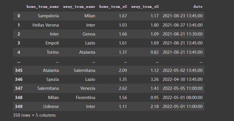
按照需要,对数据再做一些预处理,代码及效果如下:
home_df = df.copy()
home_df = home_df.melt(id_vars = ["date", "home_team_name", "away_team_name"])
home_df["venue"] = "H"
home_df.rename(columns = {"home_team_name":"team", "away_team_name":"opponent"}, inplace = True)
home_df.replace({"variable":{"home_team_xG":"xG_for", "away_team_xG":"xG_ag"}}, inplace = True)
away_df = df.copy()
away_df = away_df.melt(id_vars = ["date", "away_team_name", "home_team_name"])
away_df["venue"] = "A"
away_df.rename(columns = {"away_team_name":"team", "home_team_name":"opponent"}, inplace = True)
away_df.replace({"variable":{"away_team_xG":"xG_for", "home_team_xG":"xG_ag"}}, inplace = True)df = pd.concat([home_df, away_df]).reset_index(drop = True)
df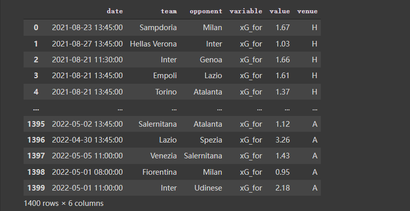
# ---- Filter the data

Y_for = df[(df["team"] == "Lazio") & (df["variable"] == "xG_for")]["value"].reset_index(drop = True)
Y_ag = df[(df["team"] == "Lazio") & (df["variable"] == "xG_ag")]["value"].reset_index(drop = True)
X_ = pd.Series(range(len(Y_for)))

# ---- Compute rolling average

Y_for = Y_for.rolling(window = 5, min_periods = 0).mean() # min_periods is for partial avg.
Y_ag = Y_ag.rolling(window = 5, min_periods = 0).mean()
fig, ax = plt.subplots(figsize = (7,3), dpi = 200)
ax.plot(X_, Y_for)
ax.plot(X_, Y_ag)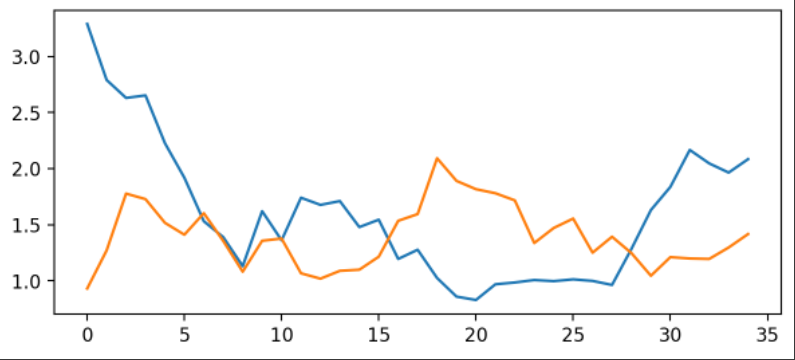
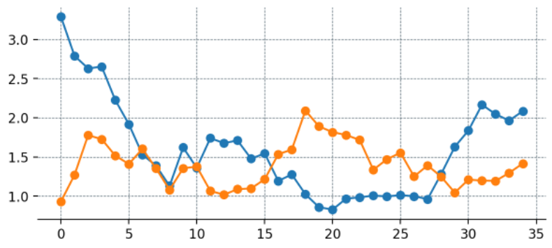
使用matplotlib倒是可以快速把图画好了,但是太丑了。接下来进行优化。
这里为每一个数据添加点
fig, ax = plt.subplots(figsize = (7,3), dpi = 200)

# --- Remove spines and add gridlines

ax.spines["left"].set_visible(False)
ax.spines["top"].set_visible(False)
ax.spines["right"].set_visible(False)

ax.grid(ls = "--", lw = 0.5, color = "#4E616C")

# --- The data

ax.plot(X_, Y_for, marker = "o")
ax.plot(X_, Y_ag, marker = "o")
fig, ax = plt.subplots(figsize = (7,3), dpi = 200)

# --- Remove spines and add gridlines

ax.spines["left"].set_visible(False)
ax.spines["top"].set_visible(False)
ax.spines["right"].set_visible(False)

ax.grid(ls = "--", lw = 0.25, color = "#4E616C")

# --- The data

ax.plot(X_, Y_for, marker = "o", mfc = "white", ms = 5)
ax.plot(X_, Y_ag, marker = "o", mfc = "white", ms = 5)

# --- Adjust tickers and spine to match the style of our grid

ax.xaxis.set_major_locator(ticker.MultipleLocator(2)) # ticker every 2 matchdays
xticks_ = ax.xaxis.set_ticklabels([x - 1 for x in range(0, len(X_) + 3, 2)])
# This last line outputs
# [-1, 1, 3, 5, 7, 9, 11, 13, 15, 17, 19, 21, 23, 25, 27, 29, 31, 33, 35]
# and we mark the tickers every two positions.

ax.xaxis.set_tick_params(length = 2, color = "#4E616C", labelcolor = "#4E616C", labelsize = 6)
ax.yaxis.set_tick_params(length = 2, color = "#4E616C", labelcolor = "#4E616C", labelsize = 6)

ax.spines["bottom"].set_edgecolor("#4E616C")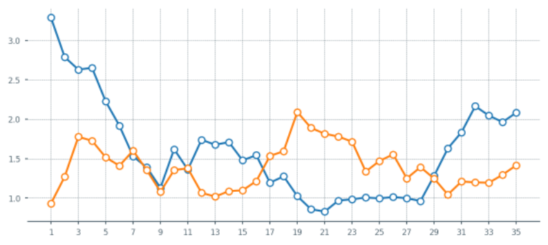
fig, ax = plt.subplots(figsize = (7,3), dpi = 200)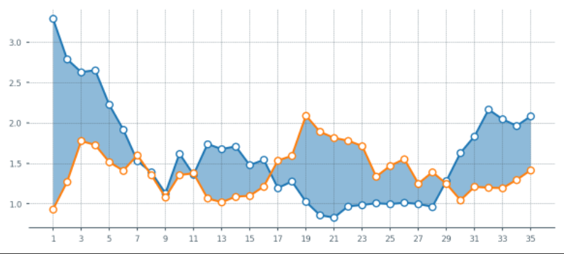
1.当橙色线更高时,希望填充为橙色。但是上面的还无法满足,这里再优化一下.
fig, ax = plt.subplots(figsize = (7,3), dpi = 200)

# --- Remove spines and add gridlines

ax.spines["left"].set_visible(False)
ax.spines["top"].set_visible(False)
ax.spines["right"].set_visible(False)

ax.grid(ls = "--", lw = 0.25, color = "#4E616C")

# --- The data

ax.plot(X_, Y_for, marker = "o", mfc = "white", ms = 5)
ax.plot(X_, Y_ag, marker = "o", mfc = "white", ms = 5)

# --- Fill between

# Identify points where Y_for > Y_ag

pos_for = (Y_for > Y_ag)
ax.fill_between(x = X_[pos_for], y1 = Y_for[pos_for], y2 = Y_ag[pos_for], alpha = 0.5)

pos_ag = (Y_for <= Y_ag)
ax.fill_between(x = X_[pos_ag], y1 = Y_for[pos_ag], y2 = Y_ag[pos_ag], alpha = 0.5)

# --- Adjust tickers and spine to match the style of our grid

ax.xaxis.set_major_locator(ticker.MultipleLocator(2)) # ticker every 2 matchdays
xticks_ = ax.xaxis.set_ticklabels([x - 1 for x in range(0, len(X_) + 3, 2)])

ax.xaxis.set_tick_params(length = 2, color = "#4E616C", labelcolor = "#4E616C", labelsize = 6)
ax.yaxis.set_tick_params(length = 2, color = "#4E616C", labelcolor = "#4E616C", labelsize = 6)

ax.spines["bottom"].set_edgecolor("#4E616C")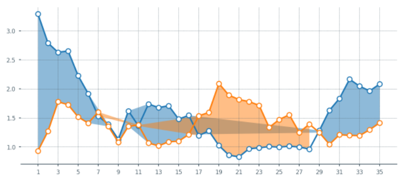
上面的图出现异常,再修改一下:
X_aux = X_.copy()
X_aux.index = X_aux.index * 10 # 9 aux points in between each match
last_idx = X_aux.index[-1] + 1
X_aux = X_aux.reindex(range(last_idx))
X_aux = X_aux.interpolate()


# --- Aux series for the xG created (Y_for)
Y_for_aux = Y_for.copy()
Y_for_aux.index = Y_for_aux.index * 10
last_idx = Y_for_aux.index[-1] + 1
Y_for_aux = Y_for_aux.reindex(range(last_idx))
Y_for_aux = Y_for_aux.interpolate()

# --- Aux series for the xG conceded (Y_ag)
Y_ag_aux = Y_ag.copy()
Y_ag_aux.index = Y_ag_aux.index * 10
last_idx = Y_ag_aux.index[-1] + 1
Y_ag_aux = Y_ag_aux.reindex(range(last_idx))
Y_ag_aux = Y_ag_aux.interpolate()


fig, ax = plt.subplots(figsize = (7,3), dpi = 200)

# --- Remove spines and add gridlines

ax.spines["left"].set_visible(False)
ax.spines["top"].set_visible(False)
ax.spines["right"].set_visible(False)

ax.grid(ls = "--", lw = 0.25, color = "#4E616C")

# --- The data

for_ = ax.plot(X_, Y_for, marker = "o", mfc = "white", ms = 5)
ag_ = ax.plot(X_, Y_ag, marker = "o", mfc = "white", ms = 5)

# --- Fill between

for index in range(len(X_aux) - 1):
    # Choose color based on which line's on top
    if Y_for_aux.iloc[index + 1] > Y_ag_aux.iloc[index + 1]:
        color = for_[0].get_color()
    else:
        color = ag_[0].get_color()

    # Fill between the current point and the next point in pur extended series.
    ax.fill_between([X_aux[index], X_aux[index+1]],
                    [Y_for_aux.iloc[index], Y_for_aux.iloc[index+1]],
                    [Y_ag_aux.iloc[index], Y_ag_aux.iloc[index+1]],
                    color=color, zorder = 2, alpha = 0.2, ec = None)

# --- Adjust tickers and spine to match the style of our grid

ax.xaxis.set_major_locator(ticker.MultipleLocator(2)) # ticker every 2 matchdays
xticks_ = ax.xaxis.set_ticklabels([x - 1 for x in range(0, len(X_) + 3, 2)])

ax.xaxis.set_tick_params(length = 2, color = "#4E616C", labelcolor = "#4E616C", labelsize = 6)
ax.yaxis.set_tick_params(length = 2, color = "#4E616C", labelcolor = "#4E616C", labelsize = 6)

ax.spines["bottom"].set_edgecolor("#4E616C")
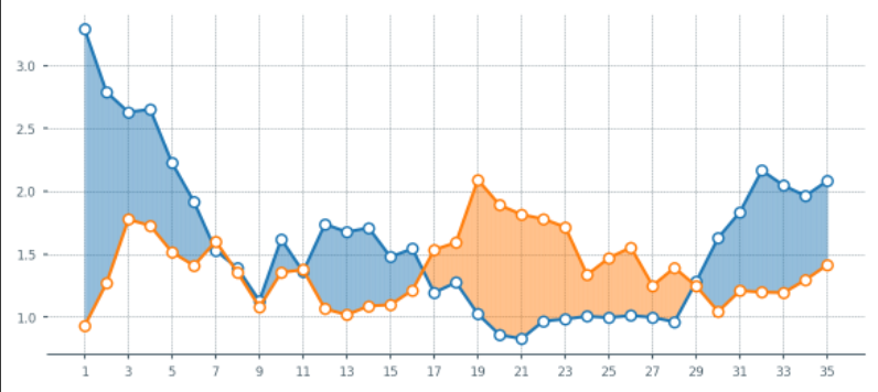
上面的样子都还不错啦,接下来把这些东西都打包成一个函数。方便后面直接出图。
def plot_xG_rolling(team, ax, window = 5, color_for = "blue", color_ag = "orange", data = df):
  '''
  This function creates a rolling average xG plot for a given team and rolling
  window.

  team (str): The team's name
  ax (obj): a Matplotlib axes.
  window (int): The number of periods for our rolling average.
  color_for (str): A hex color code for xG created.
  color_af (str): A hex color code for xG conceded.
  data (DataFrame): our df with the xG data.
  '''

  # -- Prepping the data
  home_df = data.copy()
  home_df = home_df.melt(id_vars = ["date", "home_team_name", "away_team_name"])
  home_df["venue"] = "H"
  home_df.rename(columns = {"home_team_name":"team", "away_team_name":"opponent"}, inplace = True)
  home_df.replace({"variable":{"home_team_xG":"xG_for", "away_team_xG":"xG_ag"}}, inplace = True)

  away_df = data.copy()
  away_df = away_df.melt(id_vars = ["date", "away_team_name", "home_team_name"])
  away_df["venue"] = "A"
  away_df.rename(columns = {"away_team_name":"team", "home_team_name":"opponent"}, inplace = True)
  away_df.replace({"variable":{"away_team_xG":"xG_for", "home_team_xG":"xG_ag"}}, inplace = True)

  df = pd.concat([home_df, away_df]).reset_index(drop = True)

  # ---- Filter the data

  Y_for = df[(df["team"] == team) & (df["variable"] == "xG_for")]["value"].reset_index(drop = True)
  Y_ag = df[(df["team"] == team) & (df["variable"] == "xG_ag")]["value"].reset_index(drop = True)
  X_ = pd.Series(range(len(Y_for)))

  if Y_for.shape[0] == 0:
    raise ValueError(f"Team {team} is not present in the DataFrame")

  # ---- Compute rolling average

  Y_for = Y_for.rolling(window = 5, min_periods = 0).mean() # min_periods is for partial avg.
  Y_ag = Y_ag.rolling(window = 5, min_periods = 0).mean()

  # ---- Create auxiliary series for filling between curves

  X_aux = X_.copy()
  X_aux.index = X_aux.index * 10 # 9 aux points in between each match
  last_idx = X_aux.index[-1] + 1
  X_aux = X_aux.reindex(range(last_idx))
  X_aux = X_aux.interpolate()

  # --- Aux series for the xG created (Y_for)
  Y_for_aux = Y_for.copy()
  Y_for_aux.index = Y_for_aux.index * 10
  last_idx = Y_for_aux.index[-1] + 1
  Y_for_aux = Y_for_aux.reindex(range(last_idx))
  Y_for_aux = Y_for_aux.interpolate()

  # --- Aux series for the xG conceded (Y_ag)
  Y_ag_aux = Y_ag.copy()
  Y_ag_aux.index = Y_ag_aux.index * 10
  last_idx = Y_ag_aux.index[-1] + 1
  Y_ag_aux = Y_ag_aux.reindex(range(last_idx))
  Y_ag_aux = Y_ag_aux.interpolate()

  # --- Plotting our data

  # --- Remove spines and add gridlines

  ax.spines["left"].set_visible(False)
  ax.spines["top"].set_visible(False)
  ax.spines["right"].set_visible(False)

  ax.grid(ls = "--", lw = 0.25, color = "#4E616C")

  # --- The data

  for_ = ax.plot(X_, Y_for, marker = "o", mfc = "white", ms = 4, color = color_for)
  ag_ = ax.plot(X_, Y_ag, marker = "o", mfc = "white", ms = 4, color = color_ag)

  # --- Fill between

  for index in range(len(X_aux) - 1):
      # Choose color based on which line's on top
      if Y_for_aux.iloc[index + 1] > Y_ag_aux.iloc[index + 1]:
          color = for_[0].get_color()
      else:
          color = ag_[0].get_color()

      # Fill between the current point and the next point in pur extended series.
      ax.fill_between([X_aux[index], X_aux[index+1]],
                      [Y_for_aux.iloc[index], Y_for_aux.iloc[index+1]],
                      [Y_ag_aux.iloc[index], Y_ag_aux.iloc[index+1]],
                      color=color, zorder = 2, alpha = 0.2, ec = None)


  # --- Ensure minimum value of Y-axis is zero
  ax.set_ylim(0)

  # --- Adjust tickers and spine to match the style of our grid

  ax.xaxis.set_major_locator(ticker.MultipleLocator(2)) # ticker every 2 matchdays
  xticks_ = ax.xaxis.set_ticklabels([x - 1 for x in range(0, len(X_) + 3, 2)])

  ax.xaxis.set_tick_params(length = 2, color = "#4E616C", labelcolor = "#4E616C", labelsize = 6)
  ax.yaxis.set_tick_params(length = 2, color = "#4E616C", labelcolor = "#4E616C", labelsize = 6)

  ax.spines["bottom"].set_edgecolor("#4E616C")

  # --- Legend and team name

  Y_for_last = Y_for.iloc[-1]
  Y_ag_last = Y_ag.iloc[-1]

  # -- Add the team's name
  team_ = ax.text(
            x = 0, y = ax.get_ylim()[1] + ax.get_ylim()[1]/20,
            s = f'{team}',
            color = "#4E616C",
            va = 'center',
            ha = 'left',
            size = 7
          )

  # -- Add the xG created label
  for_label_ = ax.text(
            x = X_.iloc[-1] + 0.75, y = Y_for_last,
            s = f'{Y_for_last:,.1f} xGF',
            color = color_for,
            va = 'center',
            ha = 'left',
            size = 6.5
          )

  # -- Add the xG conceded label
  ag_label_ = ax.text(
            x = X_.iloc[-1] + 0.75, y = Y_ag_last,
            s = f'{Y_ag_last:,.1f} xGA',
            color = color_ag,
            va = 'center',
            ha = 'left',
            size = 6.5
)file_id = '1yM_F93NY4QkxjlKL3GzdcCQEnBiA2ltB'
url = f'https://drive.google.com/uc?id={file_id}'
df = pd.read_csv(url, index_col=0)
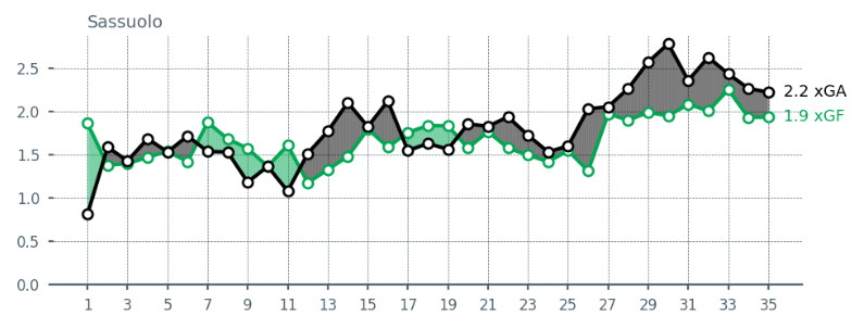
再设置更加丰富的颜色:
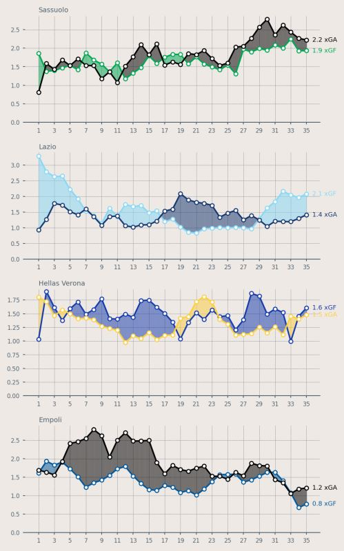
fig = plt.figure(figsize=(5, 8), dpi = 200, facecolor = "#EFE9E6")

ax1 = plt.subplot(411, facecolor = "#EFE9E6")
ax2 = plt.subplot(412, facecolor = "#EFE9E6")
ax3 = plt.subplot(413, facecolor = "#EFE9E6")
ax4 = plt.subplot(414, facecolor = "#EFE9E6")

plot_xG_rolling("Sassuolo", ax1, color_for = "#00A752", color_ag = "black", data = df)
plot_xG_rolling("Lazio", ax2, color_for = "#87D8F7", color_ag = "#15366F", data = df)
plot_xG_rolling("Hellas Verona", ax3, color_for = "#153aab", color_ag = "#fdcf41", data = df)
plot_xG_rolling("Empoli", ax4, color_for = "#00579C", color_ag = "black", data = df)

plt.tight_layout()
关闭。这个问题是opinion-based.它目前不接受答案。想要改进这个问题?更新问题,以便editingthispost可以用事实和引用来回答它.关闭4年前。Improvethisquestion我想在固定时间创建一系列低音和高音调的哔哔声。例如:在150毫秒时发出高音调的蜂鸣声在151毫秒时发出低音调的蜂鸣声200毫秒时发出低音调的蜂鸣声250毫秒的高音调蜂鸣声有没有办法在Ruby或Python中做到这一点?我真的不在乎输出编码是什么(.wav、.mp3、.ogg等等),但我确实想创建一个输出文件。
我有一个用户工厂。我希望默认情况下确认用户。但是鉴于unconfirmed特征,我不希望它们被确认。虽然我有一个基于实现细节而不是抽象的工作实现,但我想知道如何正确地做到这一点。factory:userdoafter(:create)do|user,evaluator|#unwantedimplementationdetailshereunlessFactoryGirl.factories[:user].defined_traits.map(&:name).include?(:unconfirmed)user.confirm!endendtrait:unconfirmeddoenden
这个问题在这里已经有了答案:关闭10年前。PossibleDuplicate:Pythonconditionalassignmentoperator对于这样一个简单的问题表示歉意,但是谷歌搜索||=并不是很有帮助;)Python中是否有与Ruby和Perl中的||=语句等效的语句?例如:foo="hey"foo||="what"#assignfooifit'sundefined#fooisstill"hey"bar||="yeah"#baris"yeah"另外,类似这样的东西的通用术语是什么?条件分配是我的第一个猜测,但Wikipediapage跟我想的不太一样。
什么是ruby的rack或python的Java的wsgi?还有一个路由库。 最佳答案 来自Python标准PEP333:Bycontrast,althoughJavahasjustasmanywebapplicationframeworksavailable,Java's"servlet"APImakesitpossibleforapplicationswrittenwithanyJavawebapplicationframeworktoruninanywebserverthatsupportstheservletAPI.ht
华为OD机试题本篇题目:明明的随机数题目输入描述输出描述:示例1输入输出说明代码编写思路最近更新的博客华为od2023|什么是华为od,od薪资待遇,od机试题清单华为OD机试真题大全,用Python解华为机试题|机试宝典【华为OD机试】全流程解析+经验分享,题型分享,防作弊指南华为o
我想解析一个已经存在的.mid文件,改变它的乐器,例如从“acousticgrandpiano”到“violin”,然后将它保存回去或作为另一个.mid文件。根据我在文档中看到的内容,该乐器通过program_change或patch_change指令进行了更改,但我找不到任何在已经存在的MIDI文件中执行此操作的库.他们似乎都只支持从头开始创建的MIDI文件。 最佳答案 MIDIpackage会为您完成此操作,但具体方法取决于midi文件的原始内容。一个MIDI文件由一个或多个音轨组成,每个音轨是十六个channel中任何一个上的
C#实现简易绘图工具一.引言实验目的:通过制作窗体应用程序(C#画图软件),熟悉基本的窗体设计过程以及控件设计,事件处理等,熟悉使用C#的winform窗体进行绘图的基本步骤,对于面向对象编程有更加深刻的体会.Tutorial任务设计一个具有基本功能的画图软件**·包括简单的新建文件,保存,重新绘图等功能**·实现一些基本图形的绘制,包括铅笔和基本形状等,学习橡皮工具的创建**·设计一个合理舒适的UI界面**注明:你可能需要先了解一些关于winform窗体应用程序绘图的基本知识,以及关于GDI+类和结构的知识二.实验环境Windows系统下的visualstudio2017C#窗体应用程序三.
本文主要介绍在使用Selenium进行自动化测试或者任务时,对于使用了iframe的页面,如何定位iframe中的元素文章目录场景描述解决方案具体代码场景描述当我们在使用Selenium进行自动化测试的时候,可能会遇到一些界面或者窗体是使用HTML的iframe标签进行承载的。对于iframe中的标签,如果直接查找是无法找到的,会抛出没有找到元素的异常。比如近在咫尺的例子就是,CSDN的登录窗体就是使用的iframe,大家可以尝试通过F12开发者模式查看到的tag_name,class_name,id或者xpath来定位中的页面元素,会抛出NoSuchElementException异常。解决
MIMO技术的优缺点优点通过下面三个增益来总体概括:阵列增益。阵列增益是指由于接收机通过对接收信号的相干合并而活得的平均SNR的提高。在发射机不知道信道信息的情况下,MIMO系统可以获得的阵列增益与接收天线数成正比复用增益。在采用空间复用方案的MIMO系统中,可以获得复用增益,即信道容量成倍增加。信道容量的增加与min(Nt,Nr)成正比分集增益。在采用空间分集方案的MIMO系统中,可以获得分集增益,即可靠性性能的改善。分集增益用独立衰落支路数来描述,即分集指数。在使用了空时编码的MIMO系统中,由于接收天线或发射天线之间的间距较远,可认为它们各自的大尺度衰落是相互独立的,因此分布式MIMO
2022/8/4更新支持加入水印水印必须包含透明图像,并且水印图像大小要等于原图像的大小pythonconvert_image_to_video.py-f30-mwatermark.pngim_dirout.mkv2022/6/21更新让命令行参数更加易用新的命令行使用方法pythonconvert_image_to_video.py-f30im_dirout.mkvFFMPEG命令行转换一组JPG图像到视频时,是将这组图像视为MJPG流。我需要转换一组PNG图像到视频,FFMPEG就不认了。pyav内置了ffmpeg库,不需要系统带有ffmpeg工具因此我使用ffmpeg的python包装p