
? 作者:韩信子@ShowMeAI
? 数据分析实战系列:https://www.showmeai.tech/tutorials/40
? AI 岗位&攻略系列:https://www.showmeai.tech/tutorials/47
? 本文地址:https://www.showmeai.tech/article-detail/402
? 声明:版权所有,转载请联系平台与作者并注明出处
? 收藏ShowMeAI查看更多精彩内容

数据科学在互联网、医疗、电信、零售、体育、航空、艺术等各个领域仍然越来越受欢迎。在 ?Glassdoor的美国最佳职位列表中,数据科学职位排名第三,2022 年有近 10,071 个职位空缺。
除了数据独特的魅力,数据科学相关岗位的薪资也备受关注,在本篇内容中,ShowMeAI会基于数据对下述问题进行分析:
我们本次用到的数据集是 ?数据科学工作薪水数据集,大家可以通过 ShowMeAI 的百度网盘地址下载。
? 实战数据集下载(百度网盘):公众号『ShowMeAI研究中心』回复『实战』,或者点击 这里 获取本文 [37]基于pandasql和plotly的数据科学家薪资分析与可视化 『ds_salaries数据集』
⭐ ShowMeAI官方GitHub:https://github.com/ShowMeAI-Hub
数据集包含 11 列,对应的名称和含义如下:
| 参数 | 含义 |
|---|---|
| work_year | 支付工资的年份 |
| experience_level : 发薪时的经验等级 | |
| employment_type | 就业类型 |
| job_title | 岗位名称 |
| salary | 支付的总工资总额 |
| salary_currency | 支付的薪水的货币 |
| salary_in_usd | 支付的标准化工资(美元) |
| employee_residence | 员工的主要居住国家 |
| remote_ratio | 远程完成的工作总量 |
| company_location | 雇主主要办公室所在的国家/地区 |
| company_size | 根据员工人数计算的公司规模 |

本篇分析使用到Pandas和SQL,欢迎大家阅读ShowMeAI的数据分析教程和对应的工具速查表文章,系统学习和动手实践:
我们先导入需要使用的工具库,我们使用pandas读取数据,使用 Plotly 和 matplotlib 进行可视化。并且我们在本篇中会使用 SQL 进行数据分析,我们这里使用到了 ?pandasql 工具库。
# For loading data
import pandas as pd
import numpy as np

# For SQL queries
import pandasql as ps

# For ploting graph / Visualization
import plotly.graph_objects as go
import plotly.express as px
from plotly.offline import iplot
import plotly.figure_factory as ff

import plotly.io as pio
import seaborn as sns
import matplotlib.pyplot as plt

# To show graph below the code or on same notebook
from plotly.offline import init_notebook_mode
init_notebook_mode(connected=True)

# To convert country code to country name
import country_converter as coco

import warnings
warnings.filterwarnings('ignore')
我们下载的数据集是 CSV 格式的,所以我们可以使用 read_csv 方法来读取我们的数据集。
# Loading data
salaries = pd.read_csv('ds_salaries.csv')
要查看前五个记录,我们可以使用 salaries.head() 方法。
借助 pandasql完成同样的任务是这样的:
# Function query to execute SQL queries
def query(query):
 return ps.sqldf(query)

# Showing Top 5 rows of data
query("""
        SELECT *
        FROM salaries
        LIMIT 5
""")
输出:
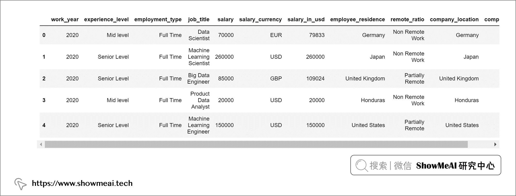
我们数据集中的第1列“Unnamed: 0”是没有用的,在分析之前我们把它剔除:
salaries = salaries.drop('Unnamed: 0', axis = 1)
我们查看一下数据集中缺失值情况:
salaries.isna().sum()
输出:
work_year             0
experience_level      0
employment_type       0
job_title             0
salary                0
salary_currency       0
salary_in_usd         0
employee_residence    0
remote_ratio          0
company_location      0
company_size          0
dtype: int64
我们的数据集中没有任何缺失值,因此不用做缺失值处理,employee_residence 和 company_location 使用的是短国家代码。我们映射替换为国家的全名以便于理解:
# Converting countries code to country names
salaries["employee_residence"] = coco.convert(names=salaries["employee_residence"], to="name")
salaries["company_location"] = coco.convert(names=salaries["company_location"], to="name")
这个数据集中的experience_level代表不同的经验水平,使用的是如下缩写:
为了更容易理解,我们也把这些缩写替换为全称。
# Replacing values in column - experience_level :
salaries['experience_level'] = query("""SELECT
                                          REPLACE(
                                            REPLACE(
                                              REPLACE(
                                                REPLACE(
                                                  experience_level, 'MI', 'Mid level'),
                                                                    'SE', 'Senior Level'),
                                                                    'EN', 'Entry Level'),
                                                                    'EX', 'Expert Level')
                                        FROM
                                          salaries""")
同样的方法,我们对工作形式也做全称替换
# Replacing values in column - experience_level :
salaries['employment_type'] = query("""SELECT
                                          REPLACE(
                                            REPLACE(
                                              REPLACE(
                                                REPLACE(
                                                  employment_type, 'PT', 'Part Time'),
                                                                    'FT', 'Full Time'),
                                                                    'FL', 'Freelance'),
                                                                    'CT', 'Contract')
                                        FROM
                                          salaries""")
数据集中公司规模字段处理如下:
# Replacing values in column - company_size :
salaries['company_size'] = query("""SELECT
                                       REPLACE(
                                         REPLACE(
                                           REPLACE(
                                             company_size, 'M', 'Medium'),
                                                           'L', 'Large'),
                                                           'S', 'Small')
                                    FROM
                                       salaries""")
我们对远程比率字段也做一些处理,以便更好理解
# Replacing values in column - remote_ratio :
salaries['remote_ratio'] = query("""SELECT
                                        REPLACE(
                                          REPLACE(
                                            REPLACE(
                                              remote_ratio, '100', 'Fully Remote'),
                                                            '50', 'Partially Remote'),
                                                            '0', 'Non Remote Work')
                                    FROM
                                      salaries""")
这是预处理后的最终输出。
top10_jobs = query("""
                    SELECT job_title,
                    Count(*) AS job_count
                    FROM salaries
                    GROUP BY job_title
                    ORDER BY job_count DESC
                    LIMIT 10
""")
我们绘制条形图以便更直观理解:
data = go.Bar(x = top10_jobs['job_title'], y = top10_jobs['job_count'],
             text = top10_jobs['job_count'], textposition = 'inside',
             textfont = dict(size = 12,
                            color = 'white'),
             marker = dict(color = px.colors.qualitative.Alphabet,
                          opacity = 0.9,
                          line_color = 'black',
                          line_width = 1))


layout = go.Layout(title = {'text': "<b>Top 10 Data Science Jobs</b>",
                            'x':0.5, 'xanchor': 'center'},
                   xaxis = dict(title = '<b>Job Title</b>', tickmode = 'array'),
                   yaxis = dict(title = '<b>Total</b>'),
                   width = 900,
                   height = 600)


fig = go.Figure(data = data, layout = layout)
fig.update_layout(plot_bgcolor = '#f1e7d2',
                 paper_bgcolor = '#f1e7d2')
fig.show()
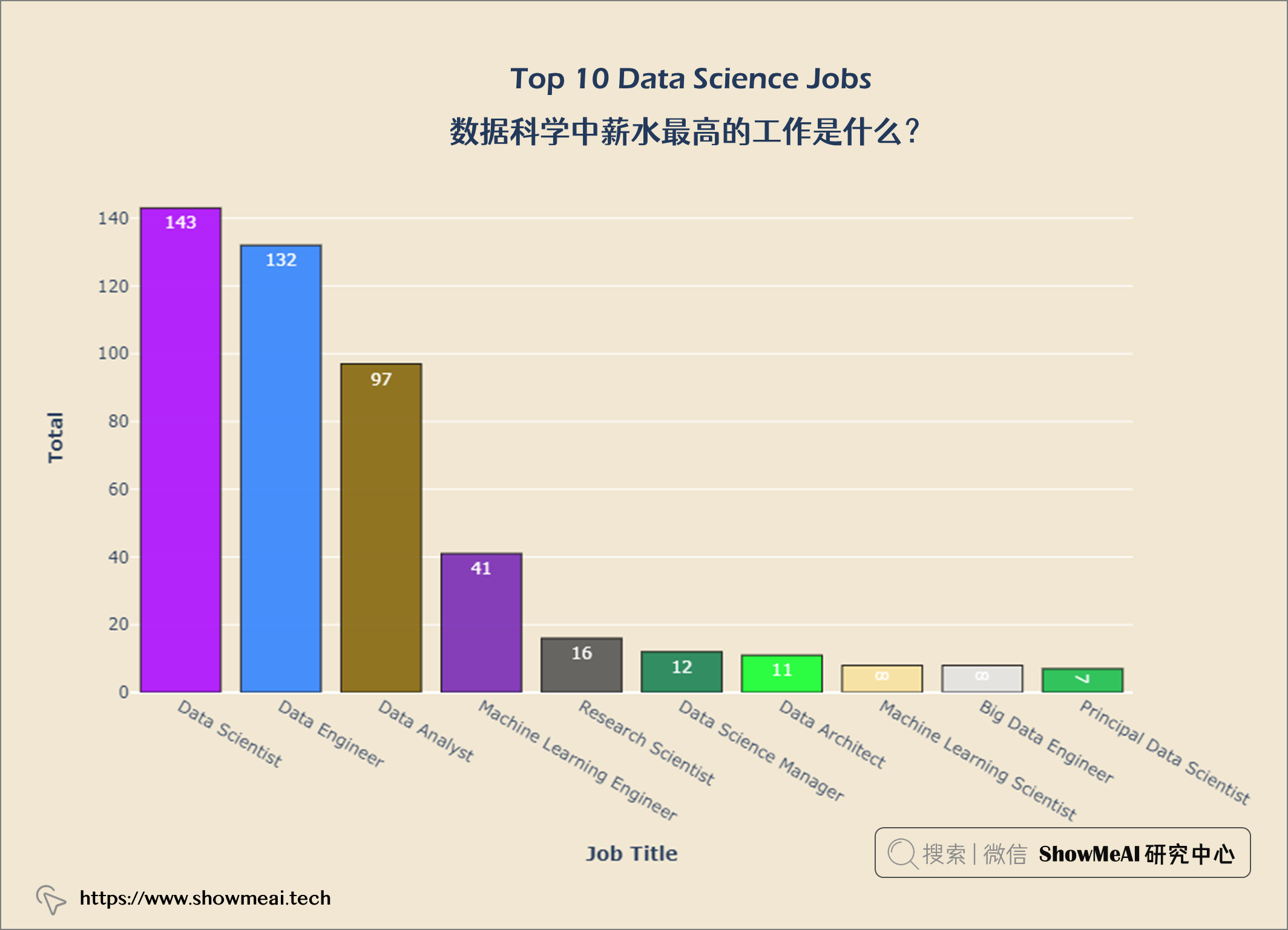
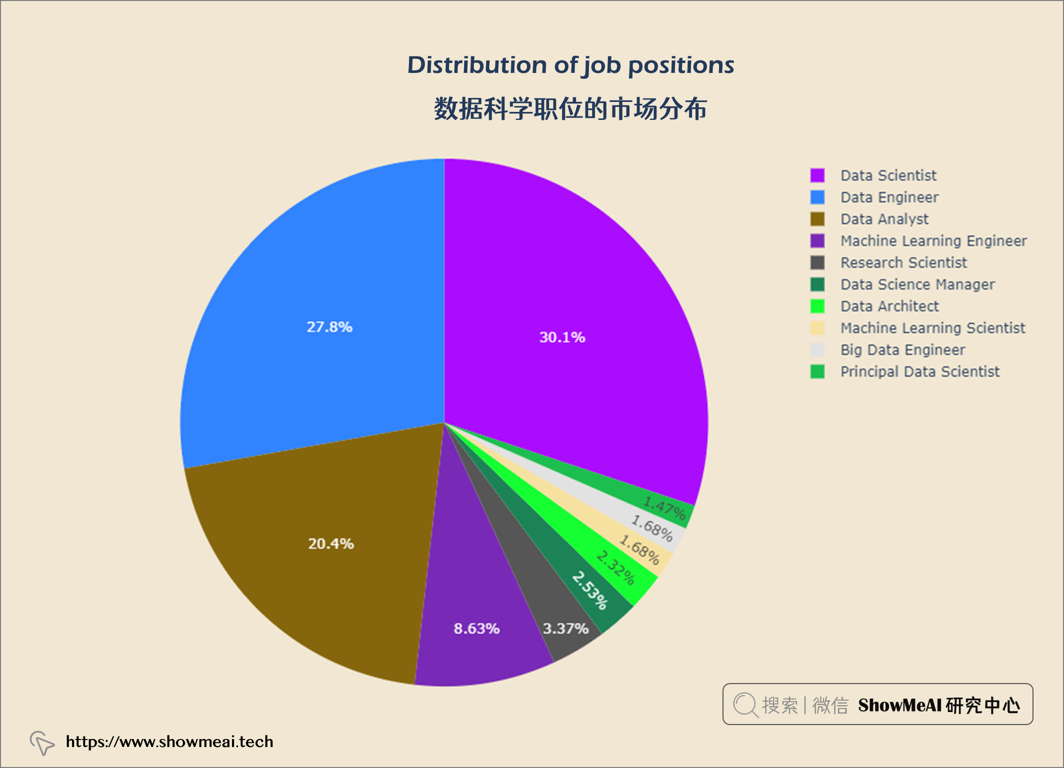
fig = px.pie(top10_jobs, values='job_count',
              names='job_title',
              color_discrete_sequence = px.colors.qualitative.Alphabet)


fig.update_layout(title = {'text': "<b>Distribution of job positions</b>",
                            'x':0.5, 'xanchor': 'center'},
                   width = 900,
                   height = 600)

fig.update_layout(plot_bgcolor = '#f1e7d2',
                 paper_bgcolor = '#f1e7d2')
fig.show()
top10_com_loc = query("""
                    SELECT company_location AS company,
                    Count(*) AS job_count
                    FROM salaries
                    GROUP BY company
                    ORDER BY job_count DESC
                    LIMIT 10
""")


data = go.Bar(x = top10_com_loc['company'], y = top10_com_loc['job_count'],
             textfont = dict(size = 12,
                            color = 'white'),
             marker = dict(color = px.colors.qualitative.Alphabet,
                          opacity = 0.9,
                          line_color = 'black',
                          line_width = 1))


layout = go.Layout(title = {'text': "<b>Top 10 Data Science Countries</b>",
                            'x':0.5, 'xanchor': 'center'},
                   xaxis = dict(title = '<b>Countries</b>', tickmode = 'array'),
                   yaxis = dict(title = '<b>Total</b>'),
                   width = 900,
                   height = 600)


fig = go.Figure(data = data, layout = layout)
fig.update_layout(plot_bgcolor = '#f1e7d2',
                 paper_bgcolor = '#f1e7d2')
fig.show()
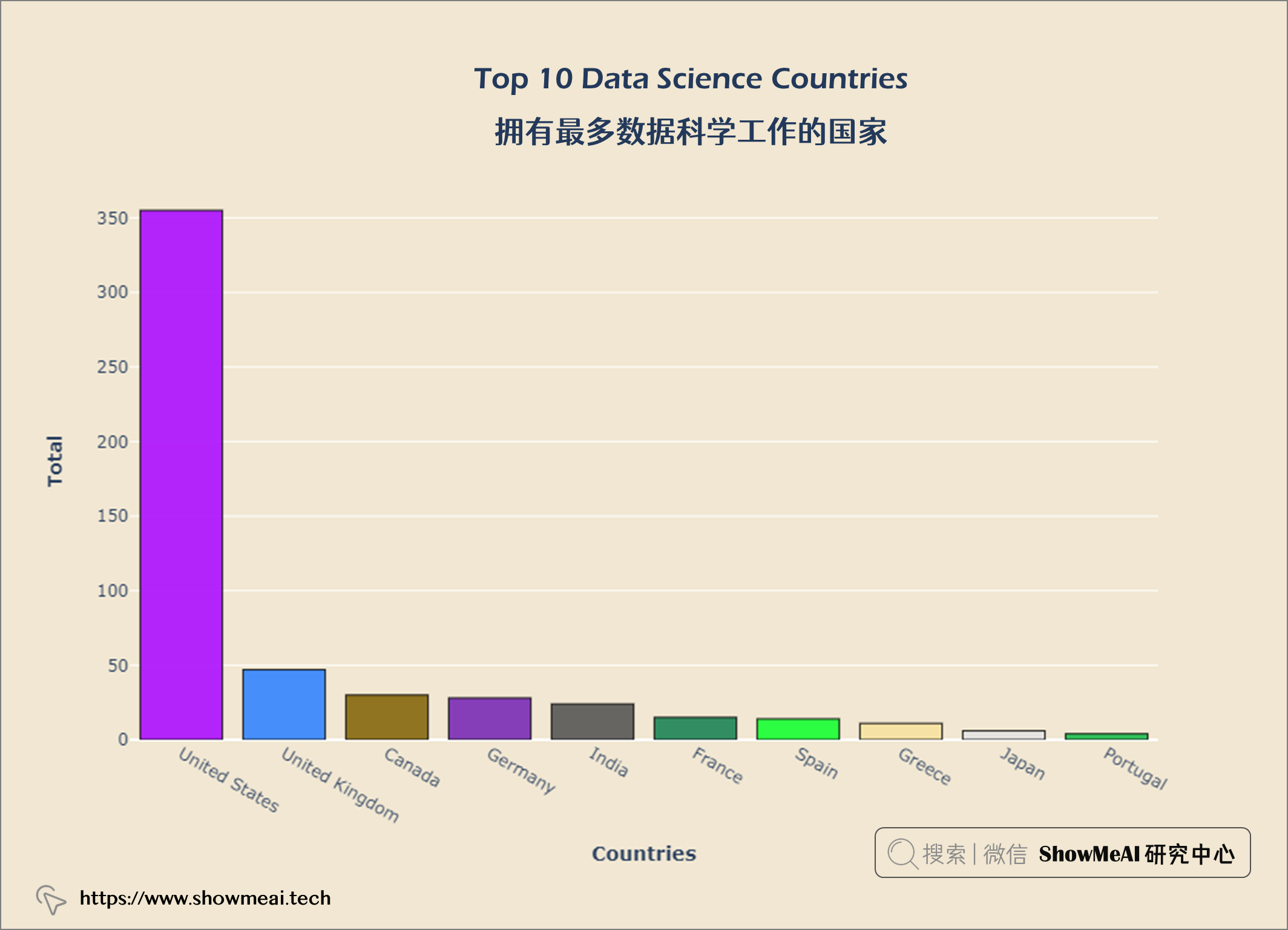
从上图中,我们可以看出美国在数据科学方面的工作机会最多。现在我们来看看世界各地的薪水。大家可以继续运行代码,查看可视化结果。
df = salaries
df["company_country"] = coco.convert(names = salaries["company_location"], to = 'name_short')

temp_df = df.groupby('company_country')['salary_in_usd'].sum().reset_index()
temp_df['salary_scale'] = np.log10(df['salary_in_usd'])


fig = px.choropleth(temp_df, locationmode = 'country names', locations = "company_country",
                   color = "salary_scale", hover_name = "company_country",
                   hover_data = temp_df[['salary_in_usd']],
                    color_continuous_scale = 'Jet',
                   )


fig.update_layout(title={'text':'<b>Salaries across the World</b>',
                         'xanchor': 'center','x':0.5})
fig.update_layout(plot_bgcolor = '#f1e7d2',
                 paper_bgcolor = '#f1e7d2')
fig.show()
df = salaries[['salary_currency','salary_in_usd']].groupby(['salary_currency'], as_index = False).mean().set_index('salary_currency').reset_index().sort_values('salary_in_usd', ascending = False)

#Selecting top 14
df = df.iloc[:14]
fig = px.bar(df, x = 'salary_currency',
            y = 'salary_in_usd',
            color = 'salary_currency',
            color_discrete_sequence = px.colors.qualitative.Safe,
            )

fig.update_layout(title={'text':'<b>Average salary as a function of currency</b>',
                         'xanchor': 'center','x':0.5},
                 xaxis_title = '<b>Currency</b>',
                 yaxis_title = '<b>Mean Salary</b>')
fig.update_layout(plot_bgcolor = '#f1e7d2',
                 paper_bgcolor = '#f1e7d2')
fig.show()
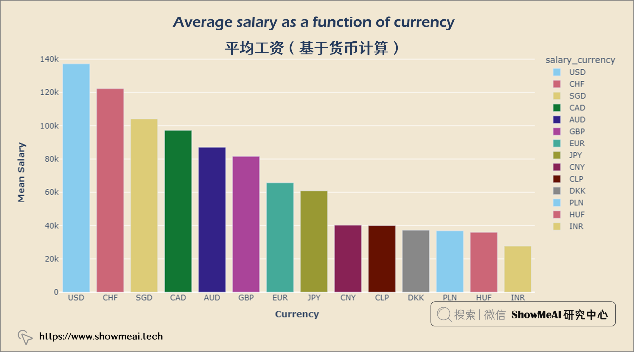
人们以美元赚取的收入最多,其次是瑞士法郎和新加坡元。
df = salaries[['company_country','salary_in_usd']].groupby(['company_country'], as_index = False).mean().set_index('company_country').reset_index().sort_values('salary_in_usd', ascending = False)


#Selecting top 14
df = df.iloc[:14]
fig = px.bar(df, x = 'company_country',
            y = 'salary_in_usd',
            color = 'company_country',
            color_discrete_sequence = px.colors.qualitative.Dark2,
            )


fig.update_layout(title = {'text': "<b>Average salary as a function of company location</b>",
                            'x':0.5, 'xanchor': 'center'},
                   xaxis = dict(title = '<b>Company Location</b>', tickmode = 'array'),
                   yaxis = dict(title = '<b>Mean Salary</b>'),
                   width = 900,
                   height = 600)


fig.update_layout(plot_bgcolor = '#f1e7d2',
                 paper_bgcolor = '#f1e7d2')
fig.show()
job_exp = query("""
            SELECT experience_level, Count(*) AS job_count
            FROM salaries
            GROUP BY experience_level
            ORDER BY job_count ASC
""")


data = go.Bar(x = job_exp['job_count'], y = job_exp['experience_level'],
              orientation = 'h', text = job_exp['job_count'],
             marker = dict(color = px.colors.qualitative.Alphabet,
                          opacity = 0.9,
                          line_color = 'white',
                          line_width = 2))


layout = go.Layout(title = {'text': "<b>Jobs on Experience Levels</b>",
                           'x':0.5, 'xanchor':'center'},
                  xaxis = dict(title='<b>Total</b>', tickmode = 'array'),
                  yaxis = dict(title='<b>Experience lvl</b>'),
                  width = 900,
                  height = 600)

fig = go.Figure(data = data, layout = layout)
fig.update_layout(plot_bgcolor = '#f1e7d2',
                  paper_bgcolor = '#f1e7d2')
fig.show()
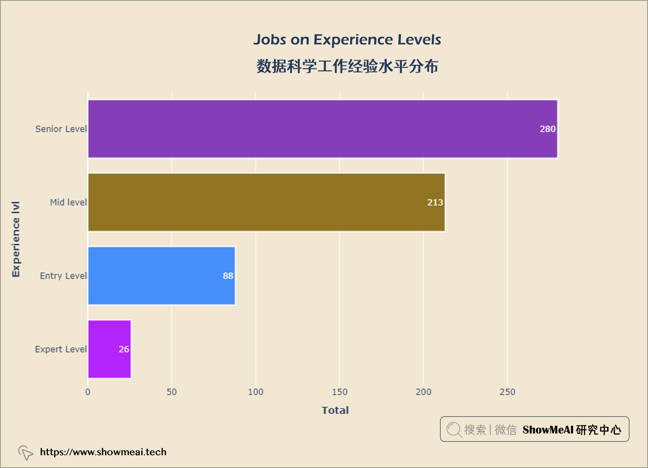
从上图可以看出,大多数数据科学都是 高级水平 ,专家级很少。
job_emp = query("""
SELECT employment_type,
COUNT(*) AS job_count
FROM salaries
GROUP BY employment_type
ORDER BY job_count ASC
""")


data =  go.Bar(x = job_emp['job_count'], y = job_emp['employment_type'],
               orientation ='h',text = job_emp['job_count'],
               textposition ='outside',
               marker = dict(color = px.colors.qualitative.Alphabet,
                             opacity = 0.9,
                             line_color = 'white',
                             line_width = 2))


layout = go.Layout(title = {'text': "<b>Jobs on Employment Type</b>",
                           'x':0.5, 'xanchor': 'center'},
                   xaxis = dict(title='<b>Total</b>', tickmode = 'array'),
                   yaxis =dict(title='<b>Emp Type lvl</b>'),
                   width = 900,
                   height = 600)


fig = go.Figure(data = data, layout = layout)
fig.update_layout(plot_bgcolor = '#f1e7d2',
                  paper_bgcolor = '#f1e7d2')
fig.show()
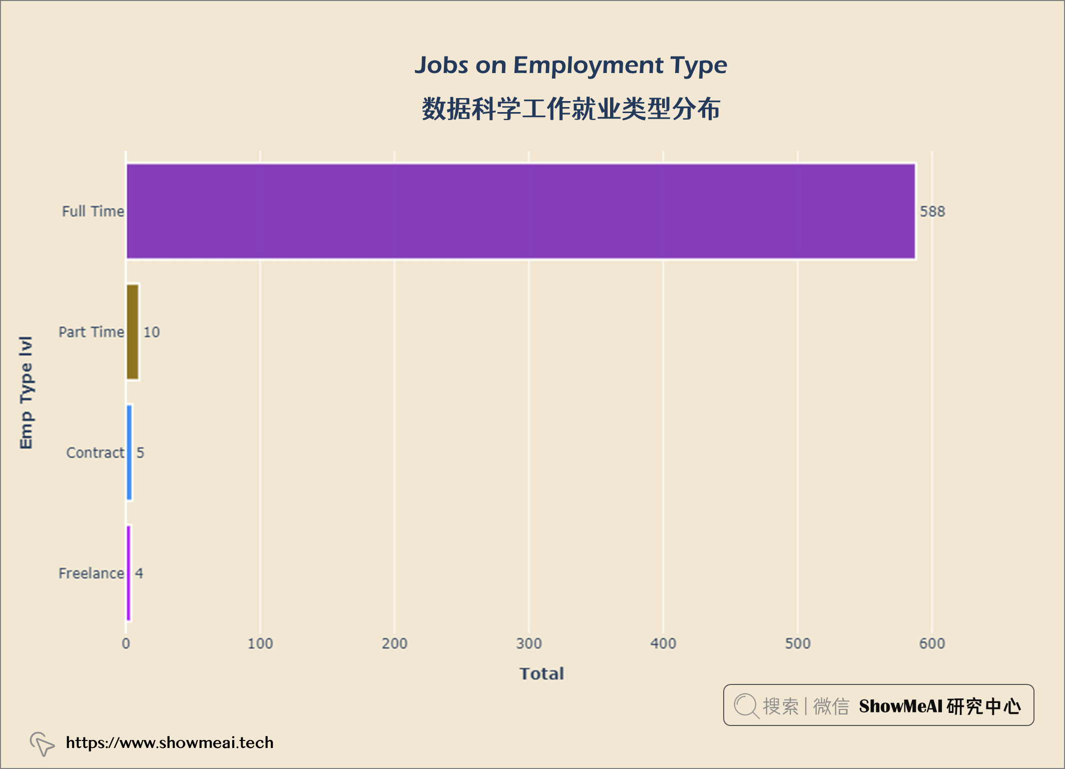
从上图中,我们可以看到大多数数据科学家从事 全职工作 ,而合同工和自由职业者 则较少
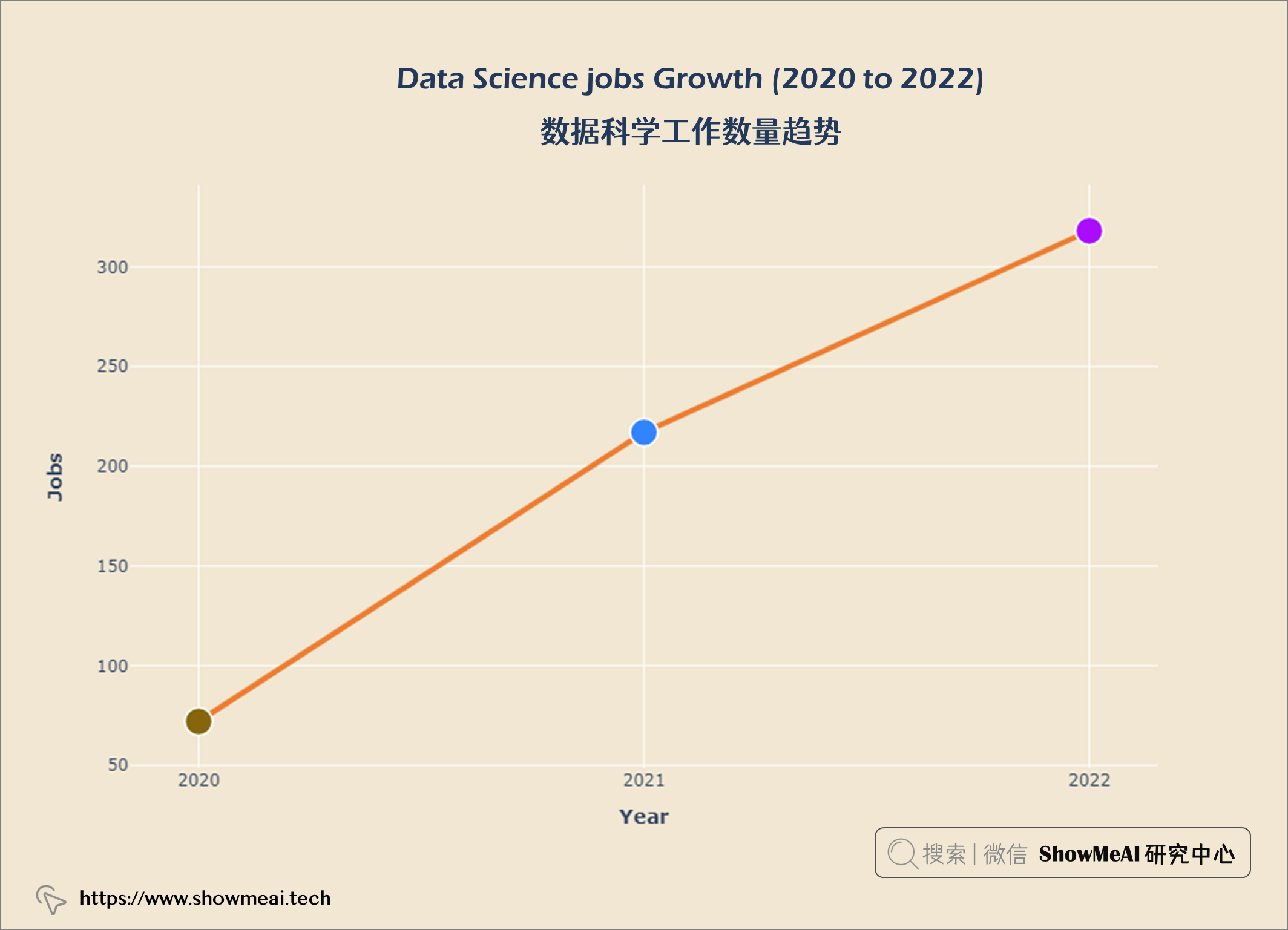
job_year = query("""
    SELECT work_year, COUNT(*) AS 'job count'
    FROM salaries
    GROUP BY work_year
    ORDER BY 'job count' DESC
""")


data = go.Scatter(x = job_year['work_year'], y = job_year['job count'],
                  marker = dict(size = 20,
                                line_width = 1.5,
                                line_color = 'white',
                                color = px.colors.qualitative.Alphabet),
                  line = dict(color = '#ED7D31', width = 4), mode = 'lines+markers')


layout  = go.Layout(title = {'text' : "<b><i>Data Science jobs Growth (2020 to 2022)</i></b>",
                             'x' : 0.5, 'xanchor' : 'center'},
                    xaxis = dict(title = '<b>Year</b>'),
                    yaxis = dict(title = '<b>Jobs</b>'),
                    width = 900,
                    height = 600)


fig = go.Figure(data = data, layout = layout)
fig.update_xaxes(tickvals = ['2020','2021','2022'])
fig.update_layout(plot_bgcolor = '#f1e7d2',
                 paper_bgcolor = '#f1e7d2')
fig.show()
salary_usd = query("""
                    SELECT salary_in_usd
                    FROM salaries
""")


import matplotlib.pyplot as plt

plt.figure(figsize = (20, 8))
sns.set(rc = {'axes.facecolor' : '#f1e7d2',
             'figure.facecolor' : '#f1e7d2'})

p = sns.histplot(salary_usd["salary_in_usd"],
                kde = True, alpha = 1, fill = True,
                edgecolor = 'black', linewidth = 1)
p.axes.lines[0].set_color("orange")
plt.title("Data Science Salary Distribution \n", fontsize = 25)
plt.xlabel("Salary", fontsize = 18)
plt.ylabel("Count", fontsize = 18)
plt.show()
salary_hi10 = query("""
    SELECT job_title,
    MAX(salary_in_usd) AS salary
    FROM salaries
    GROUP BY salary
    ORDER BY salary DESC
    LIMIT 10
""")

data = go.Bar(x = salary_hi10['salary'],
             y = salary_hi10['job_title'],
             orientation = 'h',
             text = salary_hi10['salary'],
             textposition = 'inside',
             insidetextanchor = 'middle',
              textfont = dict(size = 13,
                             color = 'black'),
              marker = dict(color = px.colors.qualitative.Alphabet,
                           opacity = 0.9,
                           line_color = 'black',
                           line_width = 1))

layout = go.Layout(title = {'text': "<b>Top 10 Highest paid Data Science Jobs</b>",
                           'x':0.5,
                           'xanchor': 'center'},
                   xaxis = dict(title = '<b>salary</b>', tickmode = 'array'),
                   yaxis = dict(title = '<b>Job Title</b>'),
                   width = 900,
                   height = 600)
fig = go.Figure(data = data, layout
                = layout)
fig.update_layout(plot_bgcolor = '#f1e7d2',
                 paper_bgcolor = '#f1e7d2')
fig.show()
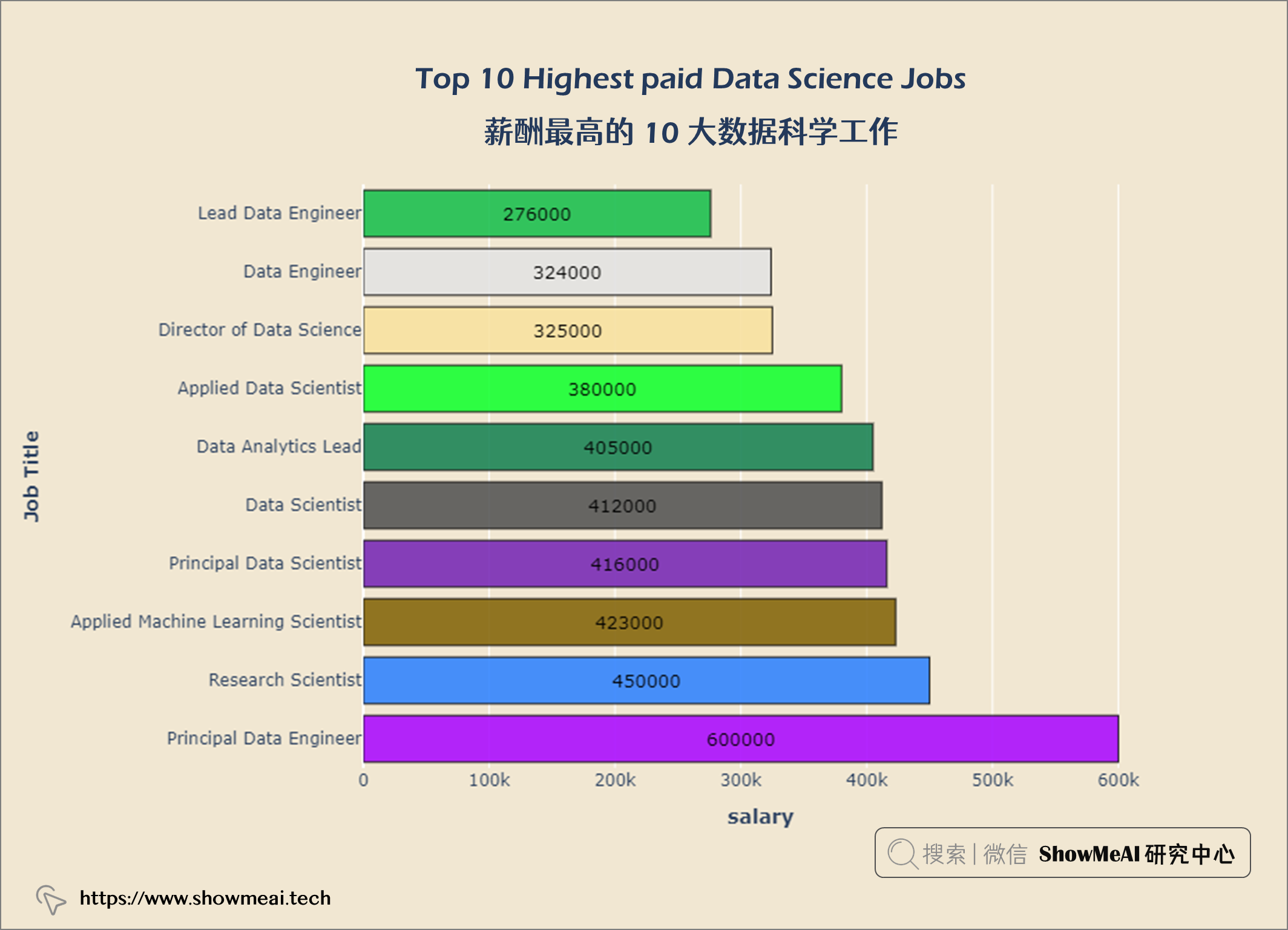
首席数据工程师 是数据科学领域的高薪工作。
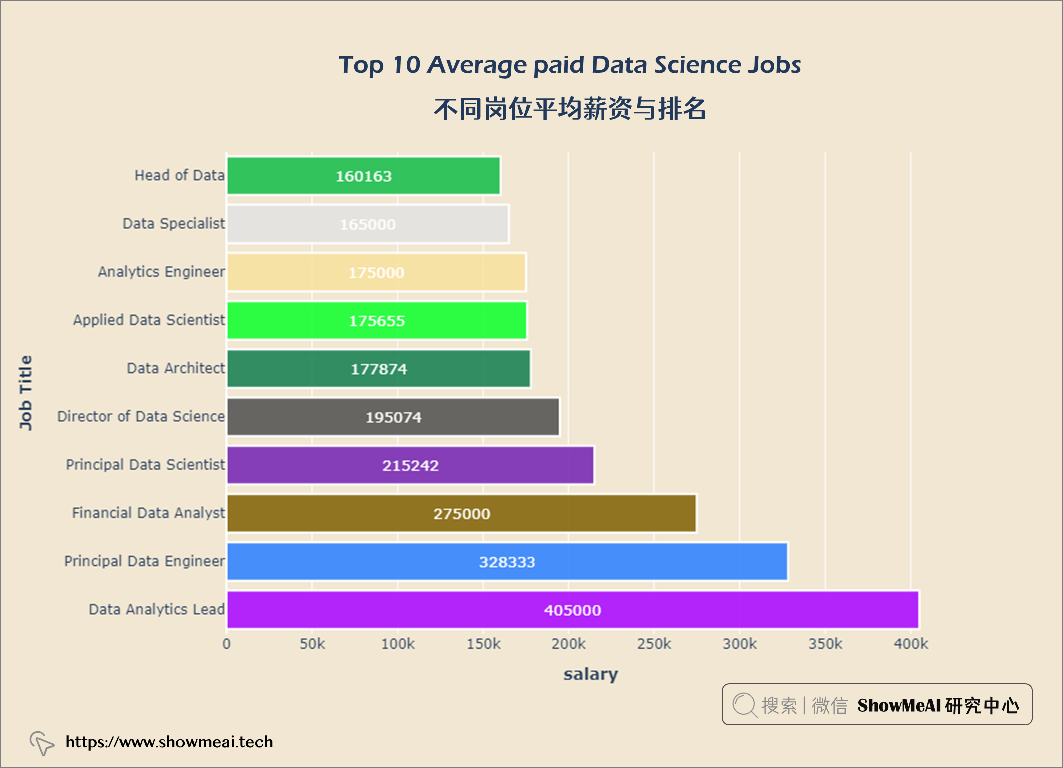
salary_av10 = query("""
    SELECT job_title,
    ROUND(AVG(salary_in_usd)) AS salary
    FROM salaries
    GROUP BY job_title
    ORDER BY salary DESC
    LIMIT 10
""")

data = go.Bar(x = salary_av10['salary'],
             y = salary_av10['job_title'],
             orientation = 'h',
             text = salary_av10['salary'],
             textposition = 'inside',
             insidetextanchor = 'middle',
              textfont = dict(size = 13,
                             color = 'white'),
              marker = dict(color = px.colors.qualitative.Alphabet,
                           opacity = 0.9,
                           line_color = 'white',
                           line_width = 2))

layout = go.Layout(title = {'text': "<b>Top 10 Average paid Data Science Jobs</b>",
                           'x':0.5,
                           'xanchor': 'center'},
                   xaxis = dict(title = '<b>salary</b>', tickmode = 'array'),
                   yaxis = dict(title = '<b>Job Title</b>'),
                   width = 900,
                   height = 600)
fig = go.Figure(data = data, layout = layout)
fig.update_layout(plot_bgcolor = '#f1e7d2',
                 paper_bgcolor = '#f1e7d2')
fig.show()
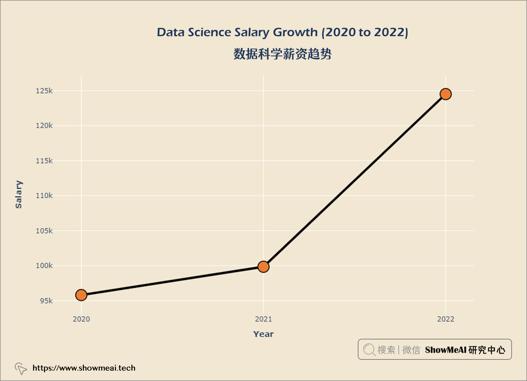
salary_year = query("""
    SELECT ROUND(AVG(salary_in_usd)) AS salary,
    work_year AS year
    FROM salaries
    GROUP BY year
    ORDER BY salary DESC
""")

data = go.Scatter(x = salary_year['year'],
                 y = salary_year['salary'],
                 marker = dict(size = 20,
                 line_width = 1.5,
                 line_color = 'black',
                 color = '#ED7D31'),
                 line = dict(color = 'black', width = 4), mode = 'lines+markers')

layout = go.Layout(title = {'text' : "<b>Data Science Salary Growth (2020 to 2022) </b>",
                            'x' : 0.5,
                            'xanchor' : 'center'},
                   xaxis = dict(title = '<b>Year</b>'),
                   yaxis = dict(title = '<b>Salary</b>'),
                   width = 900,
                   height = 600)


fig = go.Figure(data = data, layout = layout)
fig.update_xaxes(tickvals = ['2020','2021','2022'])
fig.update_layout(plot_bgcolor = '#f1e7d2',
                 paper_bgcolor = '#f1e7d2')
fig.show()
salary_exp = query("""
    SELECT experience_level AS 'Experience Level',
    salary_in_usd AS Salary
    FROM salaries
""")

fig = px.violin(salary_exp, x = 'Experience Level', y = 'Salary', color = 'Experience Level', box = True)

fig.update_layout(title = {'text': "<b>Salary on Experience Level</b>",
                            'xanchor': 'center','x':0.5},
                   xaxis = dict(title = '<b>Experience level</b>'),
                   yaxis = dict(title = '<b>salary</b>',
                                ticktext = [-300000, 0, 100000, 200000, 300000, 400000, 500000, 600000, 700000]),
                   width = 900,
                   height = 600)

fig.update_layout(paper_bgcolor= '#f1e7d2',
                  plot_bgcolor = '#f1e7d2',
                  showlegend = False)
fig.show()
tmp_df = salaries.groupby(['work_year', 'experience_level']).median()
tmp_df.reset_index(inplace = True)

fig = px.line(tmp_df, x='work_year', y='salary_in_usd', color='experience_level', symbol="experience_level")

fig.update_layout(title = {'text': "<b>Median Salary Trend By Experience Level</b>",
                            'x':0.5, 'xanchor': 'center'},
                  xaxis = dict(title = '<b>Working Year</b>', tickvals = [2020, 2021, 2022], tickmode = 'array'),
                  yaxis = dict(title = '<b>Salary</b>'),
                  width = 900,
                  height = 600)

fig.update_layout(plot_bgcolor = '#f1e7d2',
                 paper_bgcolor = '#f1e7d2')
fig.show()
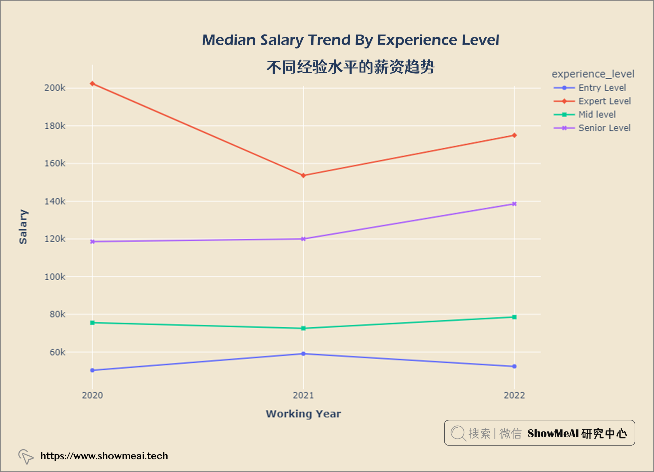
观察 1. 在COVID-19大流行期间(2020 年至 2021 年),专家级员工薪资非常高,但是呈现部分下降趋势。 2. 2021年以后专家级和高级职称人员工资有所上涨。
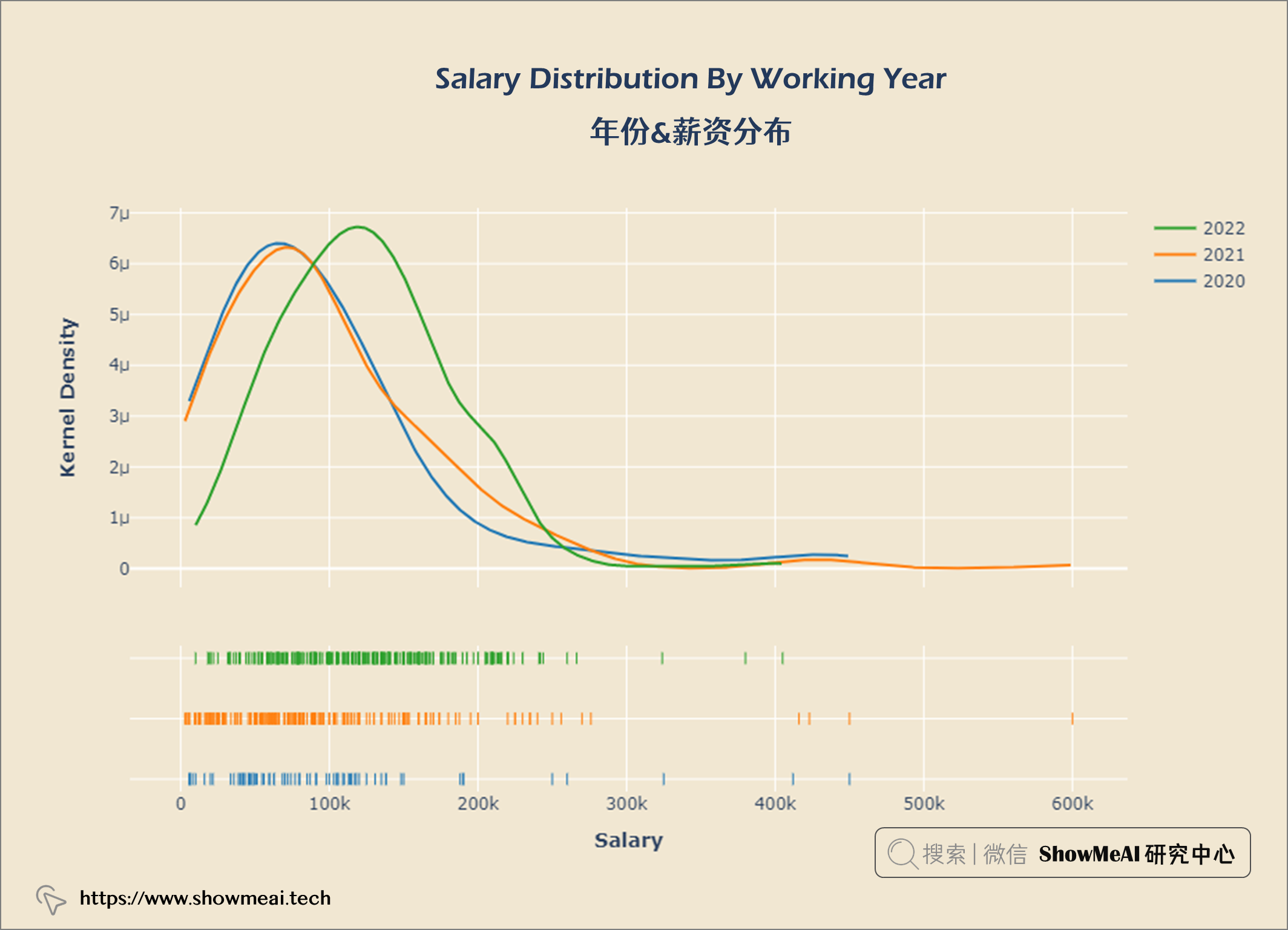
year_gp = salaries.groupby('work_year')
hist_data = [year_gp.get_group(2020)['salary_in_usd'],
             year_gp.get_group(2021)['salary_in_usd'],
            year_gp.get_group(2022)['salary_in_usd']]
group_labels = ['2020', '2021', '2022']

fig = ff.create_distplot(hist_data, group_labels, show_hist = False)


fig.update_layout(title = {'text': "<b>Salary Distribution By Working Year</b>",
                            'x':0.5, 'xanchor': 'center'},
                  xaxis = dict(title = '<b>Salary</b>'),
                  yaxis = dict(title = '<b>Kernel Density</b>'),
                  width = 900,
                  height = 600)

fig.update_layout(plot_bgcolor = '#f1e7d2',
                 paper_bgcolor = '#f1e7d2')
fig.show()
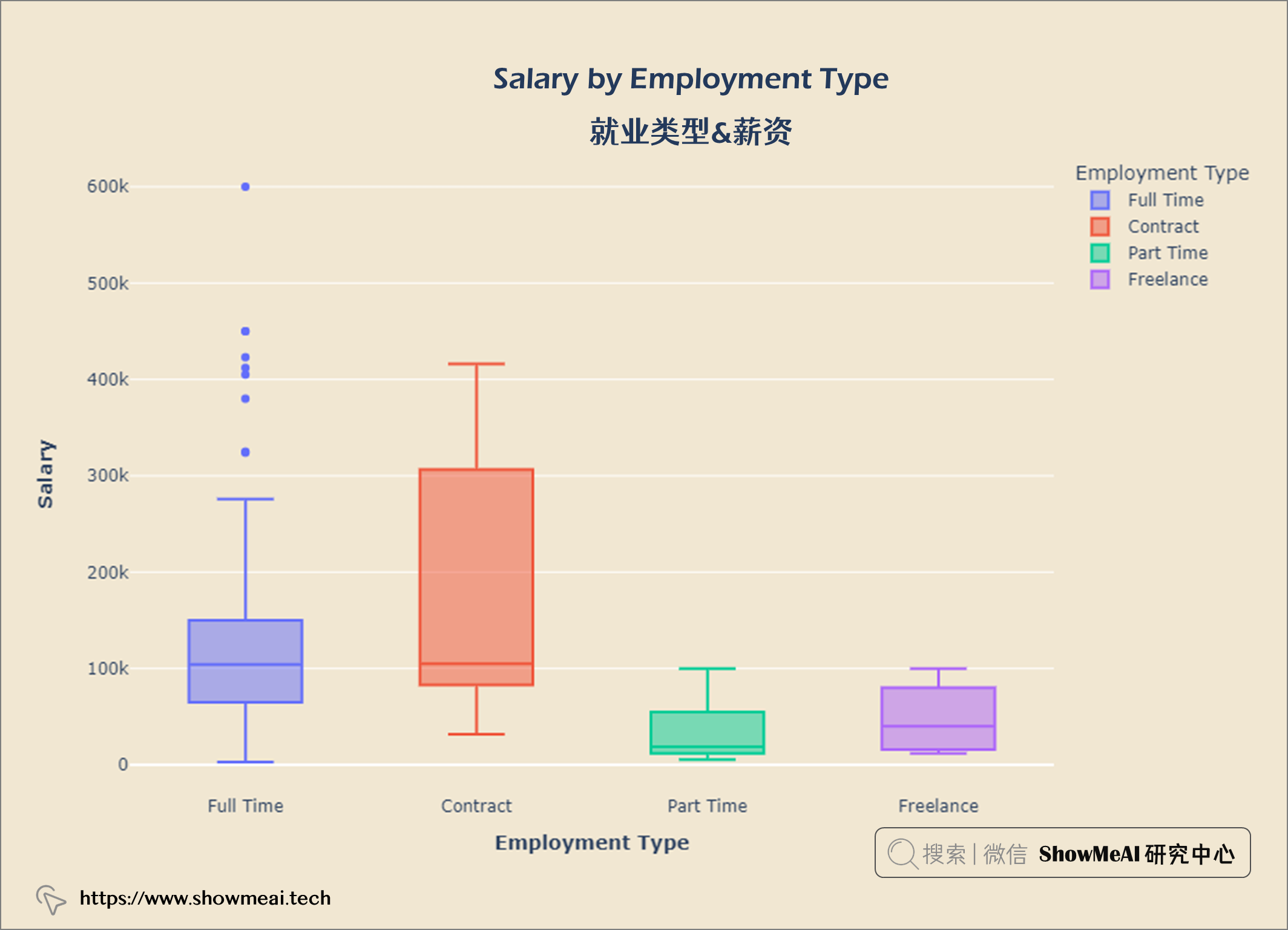
salary_emp = query("""
    SELECT employment_type AS 'Employment Type',
    salary_in_usd AS Salary
    FROM salaries
""")

fig = px.box(salary_emp,x='Employment Type',y='Salary',
       color = 'Employment Type')


fig.update_layout(title = {'text': "<b>Salary by Employment Type</b>",
                            'x':0.5, 'xanchor': 'center'},
                  xaxis = dict(title = '<b>Employment Type</b>'),
                  yaxis = dict(title = '<b>Salary</b>'),
                  width = 900,
                  height = 600)

fig.update_layout(plot_bgcolor = '#f1e7d2',
                 paper_bgcolor = '#f1e7d2')
fig.show()
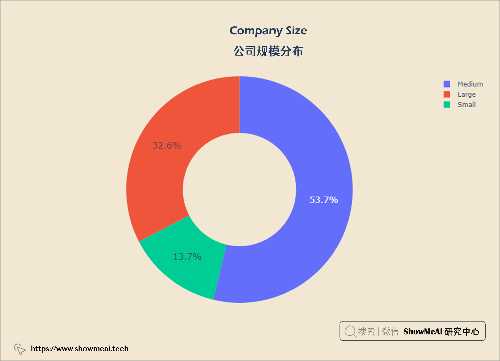
comp_size = query("""
                SELECT company_size,
                COUNT(*) AS count
                FROM salaries
                GROUP BY company_size
""")


import plotly.graph_objects as go
data = go.Pie(labels = comp_size['company_size'],
              values = comp_size['count'].values,
              hoverinfo = 'label',
              hole = 0.5,
              textfont_size = 16,
              textposition = 'auto')
fig = go.Figure(data = data)


fig.update_layout(title = {'text': "<b>Company Size</b>",
                            'x':0.5, 'xanchor': 'center'},
                  xaxis = dict(title = '<b></b>'),
                  yaxis = dict(title = '<b></b>'),
                  width = 900,
                  height = 600)

fig.update_layout(plot_bgcolor = '#f1e7d2',
                 paper_bgcolor = '#f1e7d2')
fig.show()
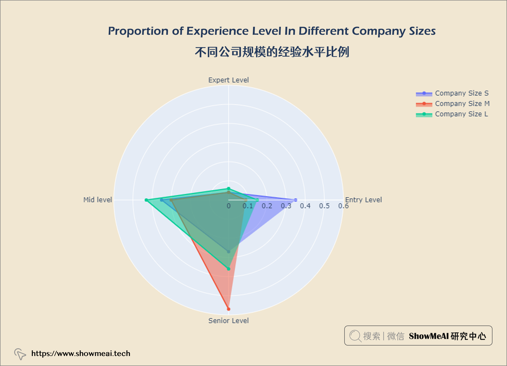
df = salaries.groupby(['company_size', 'experience_level']).size()
comp_s = np.round(df['Small'].values / df['Small'].values.sum(),2)
comp_m = np.round(df['Medium'].values / df['Medium'].values.sum(),2)
comp_l = np.round(df['Large'].values / df['Large'].values.sum(),2)

fig = go.Figure()
categories = ['Entry Level', 'Expert Level','Mid level','Senior Level']

fig.add_trace(go.Scatterpolar(
    r = comp_s,
    theta = categories,
    fill = 'toself',
    name = 'Company Size S'))

fig.add_trace(go.Scatterpolar(
    r = comp_m,
    theta = categories,
    fill = 'toself',
    name = 'Company Size M'))

fig.add_trace(go.Scatterpolar(
    r = comp_l,
    theta = categories,
    fill = 'toself',
    name = 'Company Size L'))

fig.update_layout(
    polar = dict(
    radialaxis = dict(range = [0, 0.6])),
    showlegend = True,
)


fig.update_layout(title = {'text': "<b>Proportion of Experience Level In Different Company Sizes</b>",
                            'x':0.5, 'xanchor': 'center'},
                  xaxis = dict(title = '<b></b>'),
                  yaxis = dict(title = '<b></b>'),
                  width = 900,
                  height = 600)

fig.update_layout(plot_bgcolor = '#f1e7d2',
                 paper_bgcolor = '#f1e7d2')
fig.show()
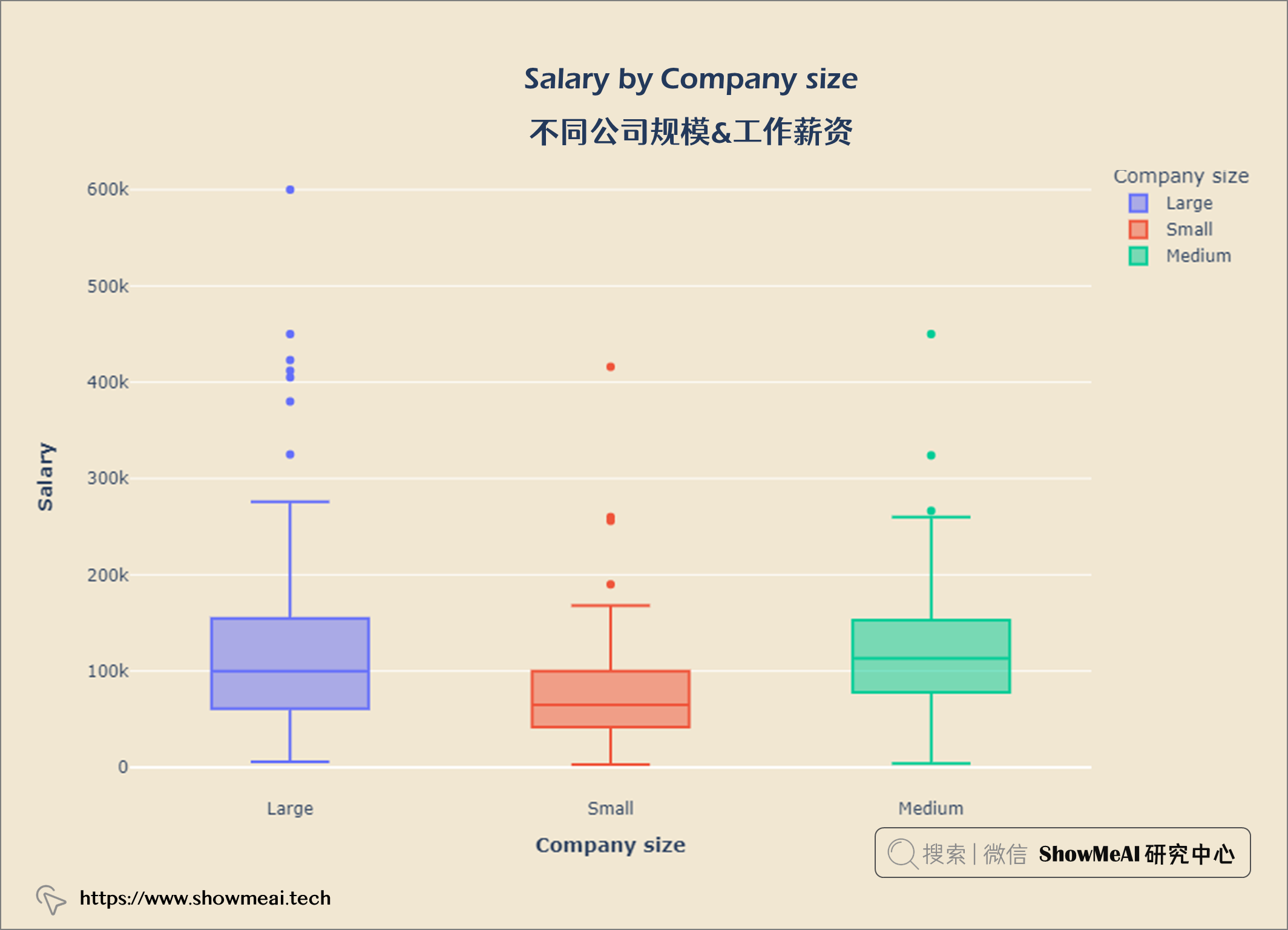
salary_size = query("""
    SELECT company_size AS 'Company size',
    salary_in_usd AS Salary
    FROM salaries
""")

fig = px.box(salary_size, x='Company size', y = 'Salary',
             color = 'Company size')


fig.update_layout(title = {'text': "<b>Salary by Company size</b>",
                            'x':0.5, 'xanchor': 'center'},
                  xaxis = dict(title = '<b>Company size</b>'),
                  yaxis = dict(title = '<b>Salary</b>'),
                  width = 900,
                  height = 600)

fig.update_layout(plot_bgcolor = '#f1e7d2',
                 paper_bgcolor = '#f1e7d2')
fig.show()
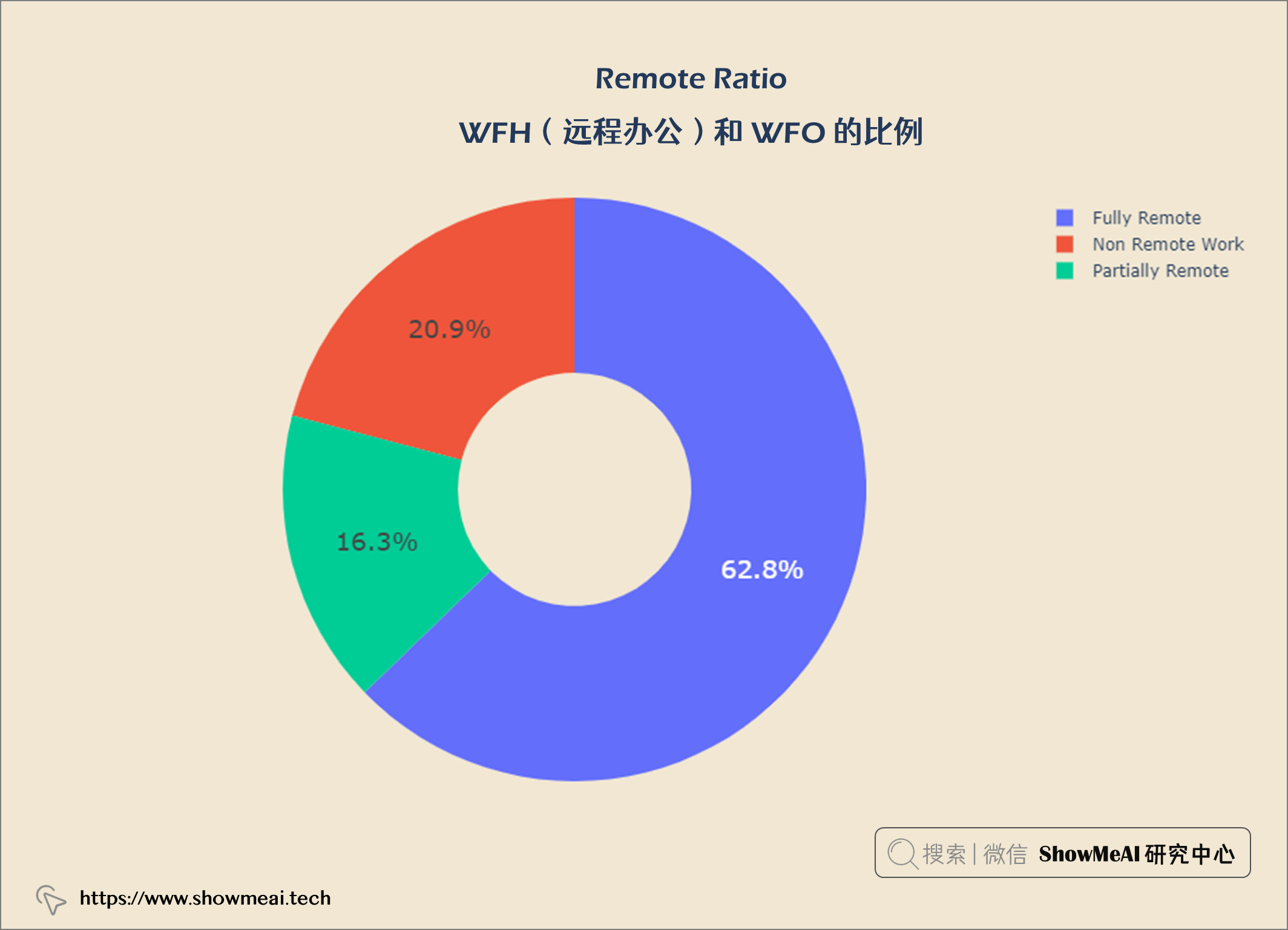
rem_type = query("""
    SELECT remote_ratio,
    COUNT(*) AS total
    FROM salaries
    GROUP BY remote_ratio
""")


data = go.Pie(labels = rem_type['remote_ratio'], values = rem_type['total'].values,
             hoverinfo = 'label',
             hole = 0.4,
             textfont_size = 18,
             textposition = 'auto')

fig = go.Figure(data = data)

fig.update_layout(title = {'text': "<b>Remote Ratio</b>",
                            'x':0.5, 'xanchor': 'center'},
                  width = 900,
                  height = 600)

fig.update_layout(plot_bgcolor = '#f1e7d2',
                 paper_bgcolor = '#f1e7d2')
fig.show()
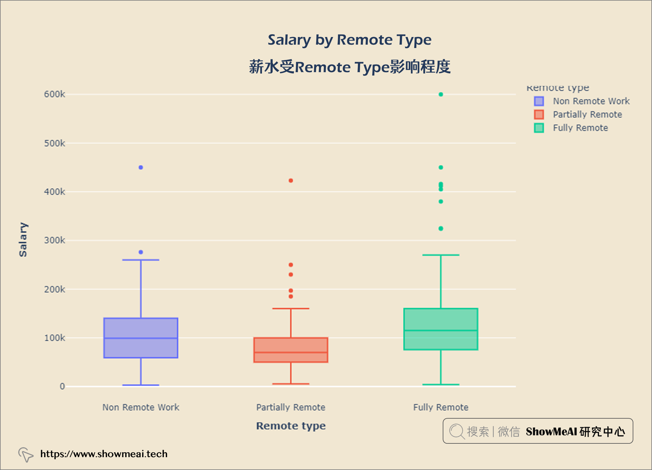
salary_remote = query("""
    SELECT remote_ratio AS 'Remote type',
    salary_in_usd AS Salary
    From salaries
""")

fig = px.box(salary_remote, x = 'Remote type', y = 'Salary', color = 'Remote type')


fig.update_layout(title = {'text': "<b>Salary by Remote Type</b>",
                            'x':0.5, 'xanchor': 'center'},
                  xaxis = dict(title = '<b>Remote type</b>'),
                  yaxis = dict(title = '<b>Salary</b>'),
                  width = 900,
                  height = 600)

fig.update_layout(plot_bgcolor = '#f1e7d2',
                 paper_bgcolor = '#f1e7d2')
fig.show()
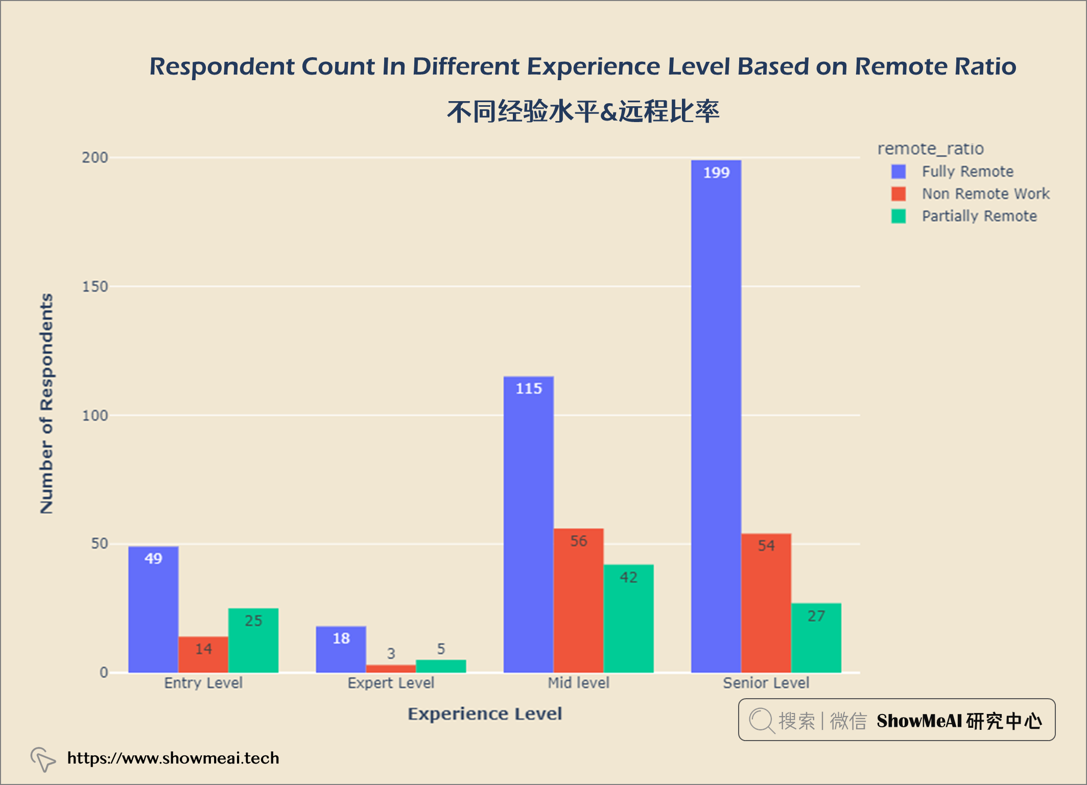
exp_remote = salaries.groupby(['experience_level', 'remote_ratio']).count()
exp_remote.reset_index(inplace = True)

fig = px.histogram(exp_remote, x = 'experience_level',
                  y = 'work_year', color = 'remote_ratio',
                  barmode = 'group',
                  text_auto = True)


fig.update_layout(title = {'text': "<b>Respondent Count In Different Experience Level Based on Remote Ratio</b>",
                            'x':0.5, 'xanchor': 'center'},
                  xaxis = dict(title = '<b>Experience Level</b>'),
                  yaxis = dict(title = '<b>Number of Respondents</b>'),
                  width = 900,
                  height = 600)

fig.update_layout(plot_bgcolor = '#f1e7d2',
                 paper_bgcolor = '#f1e7d2')
fig.show()
数据科学领域Top3多的职位是数据科学家、数据工程师和数据分析师。
数据科学工作越来越受欢迎。员工比例从2020年的11.9%增加到2022年的52.4%。
美国是数据科学公司最多的国家。
工资分布的IQR在62.7k和150k之间。
在数据科学员工中,大多数是高级水平,而专家级则更少。
大多数数据科学员工都是全职工作,很少有合同工和自由职业者。
首席数据工程师是薪酬最高的数据科学工作。
数据科学的最低工资(入门级经验)为4000美元,具有专家级经验的数据科学的最高工资为60万美元。
公司构成:53.7%中型公司,32.6%大型公司,13.7%小型数据科学公司。
工资也受公司规模影响,规模大的公司支付更高的薪水。
62.8%的数据科学是完全远程工作,20.9%是非远程工作,16.3%是部分远程工作。
数据科学薪水随时间和经验积累而增长。
我主要使用Ruby来执行此操作,但到目前为止我的攻击计划如下:使用gemsrdf、rdf-rdfa和rdf-microdata或mida来解析给定任何URI的数据。我认为最好映射到像schema.org这样的统一模式,例如使用这个yaml文件,它试图描述数据词汇表和opengraph到schema.org之间的转换:#SchemaXtoschema.orgconversion#data-vocabularyDV:name:namestreet-address:streetAddressregion:addressRegionlocality:addressLocalityphoto:i
有时我需要处理键/值数据。我不喜欢使用数组,因为它们在大小上没有限制(很容易不小心添加超过2个项目,而且您最终需要稍后验证大小)。此外,0和1的索引变成了魔数(MagicNumber),并且在传达含义方面做得很差(“当我说0时,我的意思是head...”)。散列也不合适,因为可能会不小心添加额外的条目。我写了下面的类来解决这个问题:classPairattr_accessor:head,:taildefinitialize(h,t)@head,@tail=h,tendend它工作得很好并且解决了问题,但我很想知道:Ruby标准库是否已经带有这样一个类? 最佳
我即将开始一个将录制和编辑音频文件的项目,我正在寻找一个好的库(最好是Ruby,但会考虑Java或.NET以外的任何库)以进行实时可视化波形。有人知道我应该从哪里开始搜索吗? 最佳答案 要流入浏览器的数据量很大。Flash或Flex图表可能是唯一能提高内存效率的解决方案。Javascript图表往往会因大型数据集而崩溃。 关于ruby-Ruby中的波形可视化,我们在StackOverflow上找到一个类似的问题: https://stackoverflow.c
当谈到运行时自省(introspection)和动态代码生成时,我认为ruby没有任何竞争对手,可能除了一些lisp方言。前几天,我正在做一些代码练习来探索ruby的动态功能,我开始想知道如何向现有对象添加方法。以下是我能想到的3种方法:obj=Object.new#addamethoddirectlydefobj.new_method...end#addamethodindirectlywiththesingletonclassclass这只是冰山一角,因为我还没有探索instance_eval、module_eval和define_method的各种组合。是否有在线/离线资
我正在尝试使用Curbgem执行以下POST以解析云curl-XPOST\-H"X-Parse-Application-Id:PARSE_APP_ID"\-H"X-Parse-REST-API-Key:PARSE_API_KEY"\-H"Content-Type:image/jpeg"\--data-binary'@myPicture.jpg'\https://api.parse.com/1/files/pic.jpg用这个:curl=Curl::Easy.new("https://api.parse.com/1/files/lion.jpg")curl.multipart_form_
无论您是想搭建桌面端、WEB端或者移动端APP应用,HOOPSPlatform组件都可以为您提供弹性的3D集成架构,同时,由工业领域3D技术专家组成的HOOPS技术团队也能为您提供技术支持服务。如果您的客户期望有一种在多个平台(桌面/WEB/APP,而且某些客户端是“瘦”客户端)快速、方便地将数据接入到3D应用系统的解决方案,并且当访问数据时,在各个平台上的性能和用户体验保持一致,HOOPSPlatform将帮助您完成。利用HOOPSPlatform,您可以开发在任何环境下的3D基础应用架构。HOOPSPlatform可以帮您打造3D创新型产品,HOOPSSDK包含的技术有:快速且准确的CAD
导读:随着叮咚买菜业务的发展,不同的业务场景对数据分析提出了不同的需求,他们希望引入一款实时OLAP数据库,构建一个灵活的多维实时查询和分析的平台,统一数据的接入和查询方案,解决各业务线对数据高效实时查询和精细化运营的需求。经过调研选型,最终引入ApacheDoris作为最终的OLAP分析引擎,Doris作为核心的OLAP引擎支持复杂地分析操作、提供多维的数据视图,在叮咚买菜数十个业务场景中广泛应用。作者|叮咚买菜资深数据工程师韩青叮咚买菜创立于2017年5月,是一家专注美好食物的创业公司。叮咚买菜专注吃的事业,为满足更多人“想吃什么”而努力,通过美好食材的供应、美好滋味的开发以及美食品牌的孵
本教程将在Unity3D中混合Optitrack与数据手套的数据流,在人体运动的基础上,添加双手手指部分的运动。双手手背的角度仍由Optitrack提供,数据手套提供双手手指的角度。 01 客户端软件分别安装MotiveBody与MotionVenus并校准人体与数据手套。MotiveBodyMotionVenus数据手套使用、校准流程参照:https://gitee.com/foheart_1/foheart-h1-data-summary.git02 数据转发打开MotiveBody软件的Streaming,开始向Unity3D广播数据;MotionVenus中设置->选项选择Unit
文章目录一、概述简介原理模块二、配置Mysql使用版本环境要求1.操作系统2.mysql要求三、配置canal-server离线下载在线下载上传解压修改配置单机配置集群配置分库分表配置1.修改全局配置2.实例配置垂直分库水平分库3.修改group-instance.xml4.启动监听四、配置canal-adapter1修改启动配置2配置映射文件3启动ES数据同步查询所有订阅同步数据同步开关启动4.验证五、配置canal-admin一、概述简介canal是Alibaba旗下的一款开源项目,Java开发。基于数据库增量日志解析,提供增量数据订阅&消费。Git地址:https://github.co
C#实现简易绘图工具一.引言实验目的:通过制作窗体应用程序(C#画图软件),熟悉基本的窗体设计过程以及控件设计,事件处理等,熟悉使用C#的winform窗体进行绘图的基本步骤,对于面向对象编程有更加深刻的体会.Tutorial任务设计一个具有基本功能的画图软件**·包括简单的新建文件,保存,重新绘图等功能**·实现一些基本图形的绘制,包括铅笔和基本形状等,学习橡皮工具的创建**·设计一个合理舒适的UI界面**注明:你可能需要先了解一些关于winform窗体应用程序绘图的基本知识,以及关于GDI+类和结构的知识二.实验环境Windows系统下的visualstudio2017C#窗体应用程序三.