ax=plt.gca()  #gca:get current axis得到当前轴
#设置图片的右边框和上边框为不显示
ax.spines['right'].set_color('none')
ax.spines['top'].set_color('none')
plt.figure(figsize=(10, 5), dpi=400)https://blog.csdn.net/qwe2508/article/details/88078746
plt.figure()
for i in range(1,32):
    plt.subplot(4,8,i)
    plt.imshow(img_test[i-1])
plt.show()
参考https://blog.csdn.net/TeFuirnever/article/details/88947248
plt.text(x,
	y,
	string,
	fontsize=15,
	verticalalignment="top",
	horizontalalignment="right"
)
参数:
fig, axes = plt.subplots(nrows=2, ncols=2,figsize=(11, 7),dpi=400)
# 选择画布
ax = axes[1][1]
或者
plt.subplot(122)
plt.legend() 在画图的时候每个图加一个label就可以line1, = plt.plot(xxx, label='女生购物欲望')
line2, = plt.plot(xxx, label='男生购物欲望')
# 或者这样进行修改
plt.legend(handles=[line1, line2], labels=['girl购物欲望','boy购物欲望'], loc='best',title="图例标题")
如果没有line的话,通过这种方式获得,参考https://www.cnblogs.com/MTandHJ/p/10850415.html
handles, labels = ax.get_legend_handles_labels()
ax.legend(handles, labels)
可选loc参数
best
upper right
upper left
lower left
lower right
right
center left
center right
lower center
upper center
center
ax.get_figure().savefig('name',dpi=400)
# 或者
plt.savefig('name',dpi=400)
设置背景透明
参考https://blog.csdn.net/hfut_jf/article/details/52648033
# 设置图例透明
legend = ax.legend()
frame = legend.get_frame()
frame.set_alpha(1)
frame.set_facecolor('none') # 设置图例legend背景透明

# 给每个数据矩形标注数值
plt.savefig('{路径}', format='png', bbox_inches='tight', transparent=True, dpi=600) # bbox_inches='tight' 图片边界空白紧致, 背景透明
检查字体
import matplotlib as mpl
mpl.font_manager.fontManager.ttflist
根据字体的名字修改设置
import matplotlib.pyplot as plt
# 支持中文
plt.rcParams['font.sans-serif'] = ['SimHei']  # 用来正常显示中文,这个字体和上述的ttflist中出现的名字一致
plt.rcParams['axes.unicode_minus'] = False  # 用来正常显示负号
参考官方文档https://matplotlib.org/2.0.2/examples/pylab_examples/colorbar_tick_labelling_demo.html
import matplotlib.pyplot as plt

# 随机设置 10*10 的矩阵
x = np.random.random([10, 10])

# 初始化出图设置
fig = plt.figure()
ax = fig.gca()
im = ax.imshow(x)

# 这里设定在colorbar上的位置,一个是horizontal(底部横着),另一个是vertical(右侧竖着)
quater = (x.max()+x.min())/4
cbar =fig.colorbar(im, ticks=[x.min(), quater ,quater*2, quater*3, x.max()], orientation='horizontal',
fraction=0.04, pad = 0.01,# fraction表示这个条的长度比例, pad表示这个条和图的距离
)
# cbar =fig.colorbar(im, ticks=[x.min(), (x.max()+x.min())/2, x.max()], orientation='vertical')

# 和上面的位置一一对应的字符串
cbar.ax.set_xticklabels(['Low', '123','Medium', '哈哈哈','High'])  # horizontal colorbar
# cbar.ax.set_yticklabels(['Low', 'Medium', 'High'])  # vertical colorbar

plt.show()
详见https://blog.csdn.net/sinat_32570141/article/details/105226330
sns.color_palette("Blues", 10)
参考https://blog.csdn.net/qq_23044461/article/details/117703854
import matplotlib as mpl

color_normal = mpl.colors.LinearSegmentedColormap.from_list('自定义的颜色名字',
                                             [(0,    '#F0DD72'),
                                              (0.5,  '#FFD1A8'),
                                              (1,    '#F0A090'),], N=3) # N用来定义颜色被拆分成多少份
red_color_normal
参考https://blog.csdn.net/weixin_46649052/article/details/115321326
import matplotlib.pyplot as plt

labels = 'Frogs', 'Hogs', 'Dogs', 'Logs'  # 定义标签
sizes = [15, 30, 45, 10]  # 每一块的比例
colors = ['yellowgreen', 'gold', 'lightskyblue', 'lightcoral']  # 每一块的颜色
explode = (0, 0.1, 0, 0)  # 突出显示,这里仅仅突出显示第二块(即'Hogs')

plt.pie(sizes, explode=explode, labels=labels, colors=colors, autopct='%1.1f%%', shadow=True, startangle=90)
plt.axis('equal')  # 显示为圆(避免比例压缩为椭圆)
plt.show()
参考https://zhuanlan.zhihu.com/p/110656183
import matplotlib.pyplot as plt
n = [0, 1, 2, 3, 4]
m = [2, 3, -1, 1, -2]
plt.plot(n, m,
         color = 'k',
         linestyle = '-.',
         linewidth = 3,
         marker = 'p',
         markersize = 15,
         markeredgecolor = 'b',
         markerfacecolor = 'r')
plt.show()
参考https://zhuanlan.zhihu.com/p/25128216
import numpy as np
import matplotlib.pyplot as plt

size = 5
x = np.arange(size)
a = np.random.random(size)
b = np.random.random(size)
c = np.random.random(size)

total_width, n = 0.8, 3
width = total_width / n
x = x - (total_width - width) / 2

plt.bar(x, a,  width=width, label='a')
plt.bar(x + width, b, width=width, label='b')
plt.bar(x + 2 * width, c, width=width, label='c')
plt.legend()
plt.show()
横过来的柱状图
import numpy as np
import matplotlib.pyplot as plt

a = np.array([5, 20, 15, 25, 10])
b = np.array([10, 15, 20, 15, 5])

plt.barh(range(len(a)), a)
plt.barh(range(len(b)), -b)
plt.show()
极坐标柱状图
import numpy as np
import matplotlib.pyplot as plt

N = 8 # 分成8份
theta = np.linspace(0.0, 2 * np.pi, N, endpoint=False)
radii = np.random.randint(3,15,size = N)
width = np.pi / 4
colors = np.random.rand(8,3) # 随机⽣成颜⾊
ax = plt.subplot(111, projection='polar') # polar表示极坐标
ax.bar(
    x=theta,       # 柱子的位置
    height=radii, # 柱子的高度
    width=width,    # 柱子的宽度
    bottom=bottom,  # 开始画的位置
    linewidth=2,    # 线段宽度
    edgecolor='white',# 用白色分开
    color=colors      # 每个柱子的颜色
)
参考https://blog.csdn.net/weixin_45880844/article/details/121649879
#导入模块
import matplotlib
import pandas as pd
#准备数据
df = pd.DataFrame({
    'han': [30, 20, 20, 10, 20, 10],
    'shu': [7, 9, 6, 8, 1, 7],
    'huan': [11, 12, 18, 16, 17, 15],
}, index=pd.date_range(start='2021/12/01', end='2022/06/01', freq='M'))
colorDic = dict(han='DarkGreen', shu='DarkOrange', huan='DarkBlue')
ax = df.plot.area(stacked=False,color=colorDic,figsize=(20,10))
matplotlib.pyplot.show()
参考https://www.cnblogs.com/Big-Big-Watermelon/p/14052165.html
普通marker
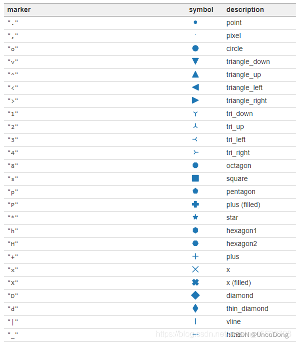
数学符号marker
可以显示的形状    marker名称
ϖ   \varpi
ϱ   \varrho
ς   \varsigma
ϑ   \vartheta
ξ   \xi
ζ   \zeta
Δ   \Delta
Γ   \Gamma
Λ   \Lambda
Ω   \Omega
Φ   \Phi
Π   \Pi
Ψ   \Psi
Σ   \Sigma
Θ   \Theta
Υ   \Upsilon
Ξ   \Xi
℧   \mho
∇   \nabla
ℵ   \aleph
ℶ   \beth
ℸ   \daleth
ℷ   \gimel
/   /
[   [
⇓   \Downarrow
⇑   \Uparrow
‖   \Vert
↓   \downarrow
⟨   \langle
⌈   \lceil
⌊   \lfloor
⌞   \llcorner
⌟   \lrcorner
⟩   \rangle
⌉   \rceil
⌋   \rfloor
⌜   \ulcorner
↑   \uparrow
⌝   \urcorner
\vert
{   \{
\|
}   \}
]   ]
|
⋂   \bigcap
⋃   \bigcup
⨀   \bigodot
⨁   \bigoplus
⨂   \bigotimes
⨄   \biguplus
⋁   \bigvee
⋀   \bigwedge
∐   \coprod
∫   \int
∮   \oint
∏   \prod
∑   \sum
自定义marker
import matplotlib.pyplot as plt
plt.rcParams['font.sans-serif']=['SimHei']  # 用于显示中文
plt.rcParams['axes.unicode_minus'] = False  # 用于显示中文
plt.figure(dpi=200)
#常规marker使用
plt.plot([1,2,3],[1,2,3],marker=4, markersize=15, color='lightblue',label='常规marker')
plt.plot([1.8,2.8,3.8],[1,2,3],marker='2', markersize=15, color='#ec2d7a',label='常规marker')

#非常规marker使用
#注意使用两个$符号包围名称
plt.plot([1,2,3],[4,5,6],marker='$\circledR$', markersize=15, color='r', alpha = 0.5 ,label='非常规marker')
plt.plot([1.5,2.5,3.5],[1.25,2.1,6.5],marker='$\heartsuit$', markersize=15, color='#f19790', alpha=0.5,label='非常规marker')
plt.plot([1,2,3],[2.5,6.2,8],marker='$\clubsuit$', markersize=15, color='g', alpha=0.5,label='非常规marker')

#自定义marker
plt.plot([1.2,2.2,3.2],[1,2,3],marker='$666$', markersize=15, color='#2d0c13',label='自定义marker')
plt.legend(loc='upper left')
for i in ['top','right']:
    plt.gca().spines[i].set_visible(False)
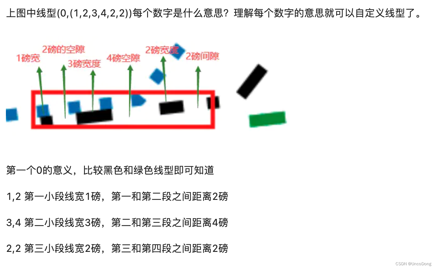
字符型linestyle
linestyle_str = [
('solid', 'solid'), # Same as (0, ()) or '-';solid’, (0, ()) , '-'三种都代表实线。
('dotted', 'dotted'), # Same as (0, (1, 1)) or '.'
('dashed', 'dashed'), # Same as '--'
('dashdot', 'dashdot')] # Same as '-.'
元组型linestyle
可以通过修改元组中的数字来呈现出不同的线型,因此可以构造出无数种线型。
linestyle_tuple = [
('loosely dotted', (0, (1, 10))),
('dotted', (0, (1, 1))),
('densely dotted', (0, (1, 2))), ('loosely dashed', (0, (5, 10))),
('dashed', (0, (5, 5))),
('densely dashed', (0, (5, 1))), ('loosely dashdotted', (0, (3, 10, 1, 10))),
('dashdotted', (0, (3, 5, 1, 5))),
('densely dashdotted', (0, (3, 1, 1, 1))), ('dashdotdotted', (0, (3, 5, 1, 5, 1, 5))),
('loosely dashdotdotted', (0, (3, 10, 1, 10, 1, 10))),
('densely dashdotdotted', (0, (3, 1, 1, 1, 1, 1)))]
线型使用代码:
import matplotlib.pyplot as plt
plt.figure(dpi=120)
#字符型linestyle使用方法
plt.plot([1,2,3],[1,2,13],linestyle='dotted', color='#1661ab', linewidth=5, label='字符型线型:dotted')

#元组型lintstyle使用方法
plt.plot([0.8,0.9,1.5],[0.8,0.9,21.5],linestyle=(0,(3, 1, 1, 1, 1, 1)), color='#ec2d7a', linewidth=5, label='元组型线型:(0,(3, 1, 1, 1, 1, 1)')

for i in ['top','right']:
    plt.gca().spines[i].set_visible(False)

#自定义inestyle
plt.plot([1.5,2.5,3.5],[1,2,13],linestyle=(0,(1,2,3,4,2,2)), color='black', linewidth=5, label='自定义线型:(0,(1,2,3,4,2,2)))')
plt.plot([2.5,3.5,4.5],[1,2,13],linestyle=(2,(1,2,3,4,2,2)), color='g', linewidth=5, label='自定义线型:(1,(1,2,3,4,2,2)))')
plt.legend()
不得不说这哥们写的真好
图片都是我从人家博客复制来的,csdn这个beyond自己打了水印
装了seaborn扩展的话,在字典seaborn.xkcd_rgb中包含所有的xkcd crowdsourced color names。
我想做一个网络画图程序。基本上我想在Web应用程序中模仿WindowsPaint程序。我真的不知道如何实现的功能是:在网络浏览器中绘制二维形状(线、圆等)拖放动态调整大小(移动鼠标调整大小时查看预览)我猜会有HTML5、CSS3和Javascript。我主要想知道是否有Javascript库可以让我的生活更轻松。最好的问候 最佳答案 是的,您想使用Canvas(“新Flash”)。它是一种HTML5元素,在较新的(移动)浏览器中得到广泛支持。以下是一些帮助您入门的链接:acompletems-paintcopysalvagedfro
前言:部署小程序后台(非云开发)需要:1.一台云服务器(购买三个月以上,不然域名备案不了)2.备案了的域名(小程序上线审核非常麻烦,域名一定要提前备案,通过审核大概要十几天)一、购买服务器,注册域名并备案阿里云或腾讯云都可,哪个便宜买哪个。腾讯云的轻量服务器就有自带的宝塔面板,免安装。阿里云也有,好好找一下。1.安装宝塔面板,服务器有可略过。宝塔Linux面板安装教程-2022年2月18日更新-7.9.0正式版-Linux面板-宝塔面板论坛 什么系统就找对应的命令在终端安装。2.在云服务器的安全组这里,打开对应端口端口作用8888宝塔默认端口80http默认端口443https默认端口22ss
总览1.安装CH343驱动2.下载microPython固件3.安装烧录软件flash_download_tool_3.9.3.exe并开始烧录4.安装ThonnyIDE软件并配置编译环境一、安装CH343驱动1.驱动下载https://www.wch.cn/downloads/CH343SER_EXE.html2.操作流程步骤1:通过Type-C数据线将ESP32S3与电脑连接(有坑)一定要连接COM端口(如下图所示右侧的端口)!连接左侧是无法用驱动的!步骤2:驱动下载好后,以管理员身份运行,并点击“安装”步骤3:打开“设备管理器”,能看到电脑识别了我们的ESP32S3二、下载microPy
这个问题在这里已经有了答案:Howtoallocateanon-constantsizedarrayinGo(1个回答)关闭7年前。我有这段代码:fmt.Scanf("%dx%d",&sizex,&sizey)vargrid[sizex][sizey]int我目前收到“非常量数组绑定(bind)sizex”错误。如何创建具有用户选择的维度的数组?当然,后面我不想修改它的大小,但是我显然不能使用常量。
我正在尝试使用模板绘制图像,模板图像如下我想用自定义颜色为图像着色红色、绿色、蓝色和黄色,并实现如下效果:为了实现这一点,我目前使用这张图片作为基础然后使用draw.Draw(outfitImage,outfitImage.Bounds(),generatorImage,image.ZP,draw.Over)在模板上绘制然而,这给出了一个非常奇怪的结果(与预期结果相去甚远),这就是我替换像素的方式funcpaintPixels(img*image.NRGBA,basecolor.Color,dstcolor.Color){br,bg,bb,ba:=base.RGBA()dr,dg,db
散点图的应用很广泛,以前介绍过很多画图方法:Python画图(直方图、多张子图、二维图形、三维图形以及图中图),漏掉了这个,现在补上,用法很简单,我们可以help(plt.scatter)看下它的用法:Helponfunctionscatterinmodulematplotlib.pyplot:scatter(x,y,s=None,c=None,marker=None,cmap=None,norm=None,vmin=None,vmax=None,alpha=None,linewidths=None,verts=None,edgecolors=None,hold=None,da
这个问题已经被问到其他语言,甚至对于那些其他语言,我发现他们的答案缺乏如何准确地做到这一点,干净利落(没有困惑的屏幕重绘等)。是否可以从C#绘制到Windows桌面?如果可能的话,我正在寻找一个例子。 最佳答案 尝试以下操作:usingSystem;usingSystem.Drawing;usingSystem.Drawing.Drawing2D;usingSystem.Runtime.InteropServices;classProgram{[DllImport("User32.dll")]staticexternIntPtrGe
本教程收集于:AIGC从入门到精通教程汇总之前给大家介绍过了Midjourney的注册教程:AI绘画:Midjourney注册(保姆级教程)也有StableDiffusion(开源)的本地搭建教程:AI数字绘画:stable-diffusion本地部署教程你是不是遇到以下问题:1.Midjourney会员怎么自建绘图服务器,不受其他人的打扰?2.Midjourney会员共享账号如何自建服务器,供其他人使用?3.在官方服务器作图,频道里面的人太多了,自己的指令刷一下就到上面了,翻来翻去太麻烦了,如何解决?今天详细的教大家创建一个自己的画图机器人。添加官方服务器如果您的账号未加入服务器,可以点击邀
当我尝试将一个元素放入Java数组中时,我从构造函数参数中获取数组大小,它会抛出一个ArrayIndexOutOfBoundsException异常。但是,当我在声明添加元素的数组时设置大小时有效。这是我的代码:publicclassStack{publicintsize;publicStack(intsize){this.size=size;}publicint[]arr=newint[size];publicinttop=-1;//Methodspublicvoidpush(intvalue){top++;arr[top]=value;}}以下抛出异常:newStack(10)
我有以下类(class):publicclassMyClass{publicvoiddeleteOrganization(Organizationorganization){/*Deleteorganization*//*Deleterelatedusers*/for(Useruser:organization.getUsers()){deleteUser(user);}}publicvoiddeleteUser(Useruser){/*Deleteuserlogic*/}}此类表示一种自用,因为其公共(public)方法deleteOrganization使用其其他公共(public