Sass: Sass Basics (sass-lang.com)
SCSS 是 CSS 的预处理器,它比常规 CSS 更强大。
npm install -g sass

sass input.scss output.css ::单次编译
sass --watch scss/index.scss css/index.css ::多次编译

<link rel="stylesheet" href="css/index.css"> ::写在HTML里
Refused to apply style from 'http://127.0.0.1:5500/CSS媒体查询/css/style.css' because its MIME type ('text/html') is not a supported stylesheet MIME type, and strict MIME checking is enabled.
解决方法: 404 Not Found,提供的文件地址有误。
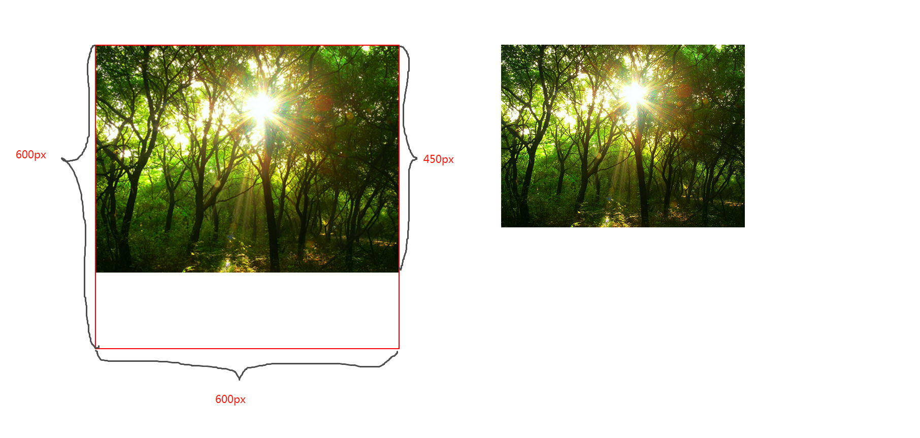
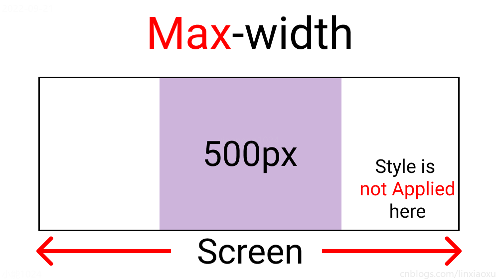
图片宽高比不变,缩放至图片自身能完全显示出来,所以容器会有留白区域
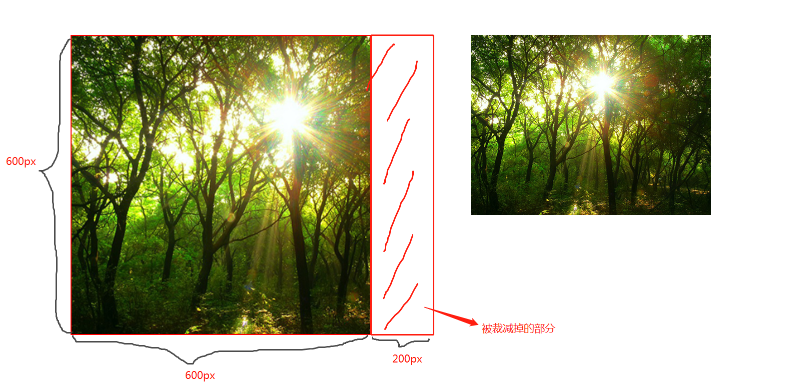
图片宽高比不变,铺满整个容器的宽高,而图片多出的部分则会被截掉
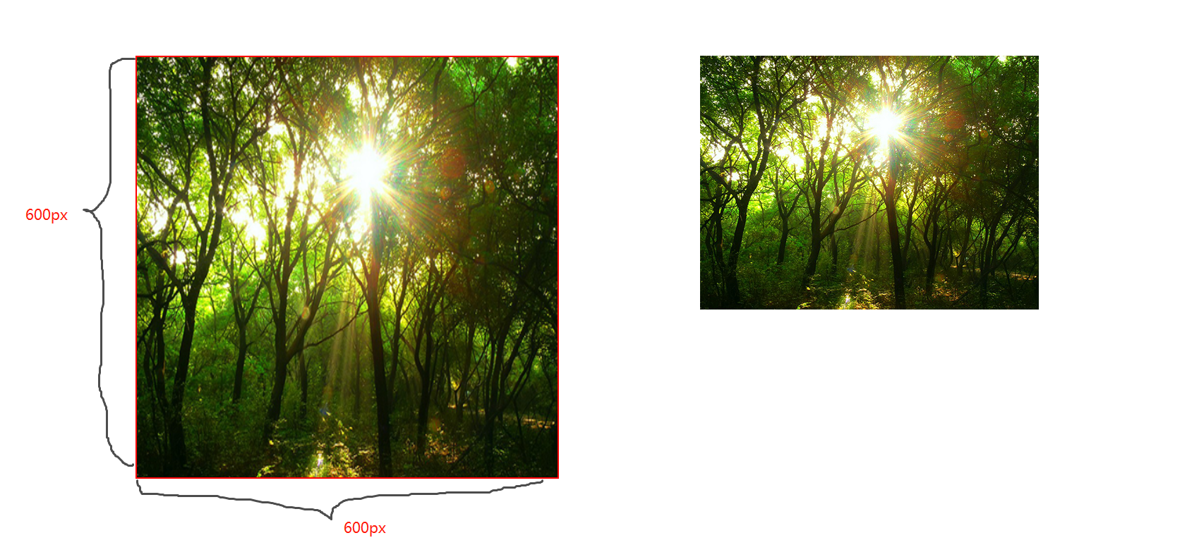
图片宽高比改变,缩放至和div宽高一致的尺寸。
CSS媒体查询允许您创建从桌面到移动设备的所有屏幕尺寸的响应式网站。
@media screen and (max-width: 768px){
  .container{
   // 你的代码
  }
}
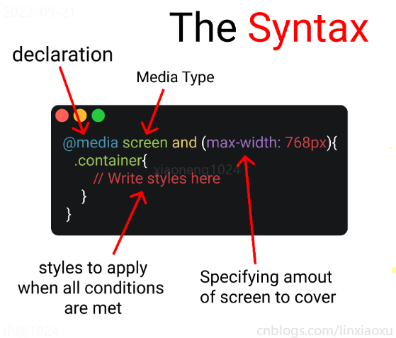
媒体查询以@media声明开头。目的是告诉浏览器我们已指定媒体查询。
@media screen
在肯德基买东西,你想要炸鸡和汉堡,这是两个需求条件。
现在你已经确定了一个条件,即 screen 媒体查询类型。你要指定其他条件,比如想要规定在某一个屏幕范围内,那么就可以用 and 来连接。
@media screen and (max-width : 768px) {
  .container{
     // 在screen媒体类型,屏幕宽度<=768px时这部分代码将被触发
  }
}
你可以只用 min-width & max-width 来跳过媒体查询类型。
@media (min-width : 480px) and (max-width : 768px) {
  .container{
     // 在屏幕宽度为 480px 和 768px 之间这部分代码将被触发
  }
}
当条件大于等于三个时,可以用 comma 连接。
@media screen, (min-width : 480px) and (max-width : 768px) {
  .container{
     // 在screen媒体类型,屏幕宽度为 480px 和 768px 之间这部分代码将被触发
  }
}
屏幕断点(screen break-point)用于规定一个范围内的屏幕宽度所属类别,目前没有标准的屏幕断点。
让我们试着写一个响应式页面 。新建main.js、media.html、style.scss,即时编译并watch style.scss。
// 当改变窗口大小、窗口加载时触发 screen
window.onresize = screen;
window.onload = screen;

// 一个函数获取当前屏幕宽度并将内容设置在ID为size的元素上

function screen() {
  Width = window.innerWidth;
  document.getElementById("size").innerHTML
   = "Width : " + Width + " px"
}
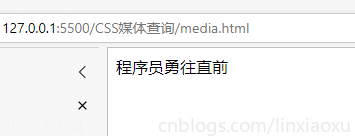
首先我们先建立一个media.html。然后导入刚刚写的main.js。导入style.css,是scss即时编译的css文件。
<!DOCTYPE html>
<html lang="en">
<head>
  <title></title>
  <meta charset="UTF-8">
  <meta name="viewport" content="width=device-width, initial-scale=1">
  <link href="./style.css" rel="stylesheet">
  <script type="text/javascript" src="./main.js"></script>
</head>

<body>
  <div class="container">
    <div id="size">
      程序员勇往直前,当导入main.js后,这句话会被替换掉
    </div>
  </div>
</body>
</html>
SCSS创建四个变量分别保存十六进制RGB
$color-1 : #cdb4db ; // 手机端
$color-2 : #fff1e6 ; // 平板端
$color-3 : #52b788 ; // 笔记本端
$color-4 : #bee1e6 ; // 台式大屏
.container {

  display: grid;
  place-items: center;

  background-color: $color-1;
  height: 100vh;
}
place-items 是 align-items 、 justify-items 的简写。
@media screen and (max-width : 500px) {
  .container {
    background-color: $color-1;
  }
}
$color-1 : #cdb4db; // 手机端
$color-2 : #fff1e6; // 平板端
$color-3 : #52b788; // 笔记本端
$color-4 : #bee1e6; // 台式大屏

* {
  margin: 0px;
  padding: 0px;
  box-sizing: border-box;

  body {
    font-size: 35px;
    font-family: sans-serif;
  }
}

.container {
  //元素居中

  display: grid;
  place-items: center;

  background-color: $color-1;
  height: 100vh;
}

#size {
  position: absolute;

  top: 60%;
  left: 50%;

  transform: translateX(-50%);

  color: red;
  font-size: 35px;
}

.text {
  // 还没添加内容
}

.container {
  background-color: white;
  height: 100vh;
  display: grid;
  place-items: center;
}


@media screen and (max-width : 500px) {
  .container {
    background-color: $color-1;
  }
}
@media screen and (min-width : 500px){
  .container{
    background-color: $color-1;
  }
}
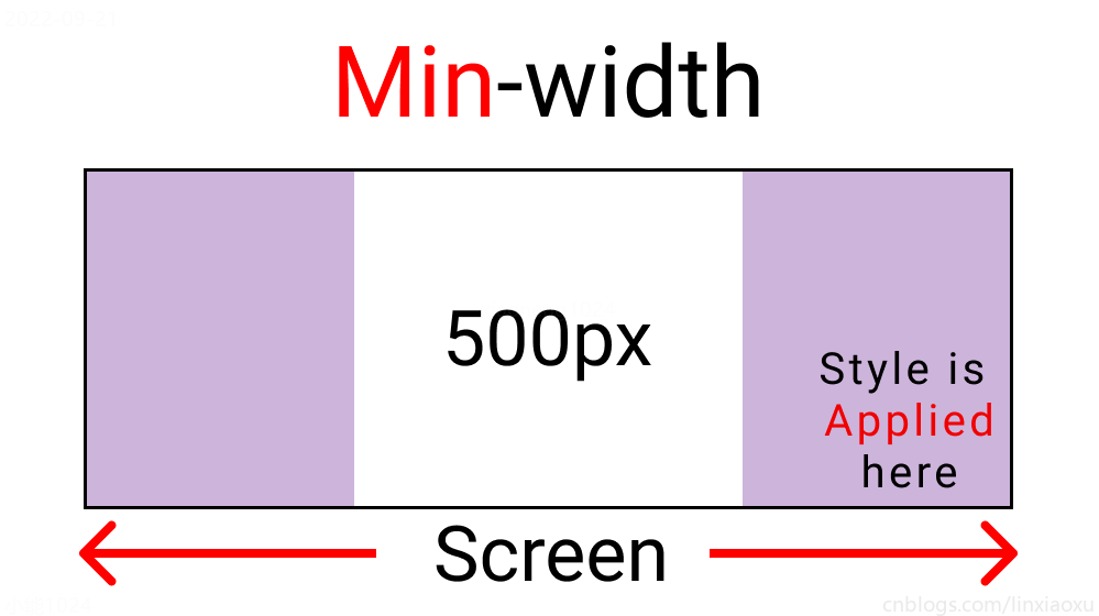
与max-width相反。宽度>=500px时代码生效。
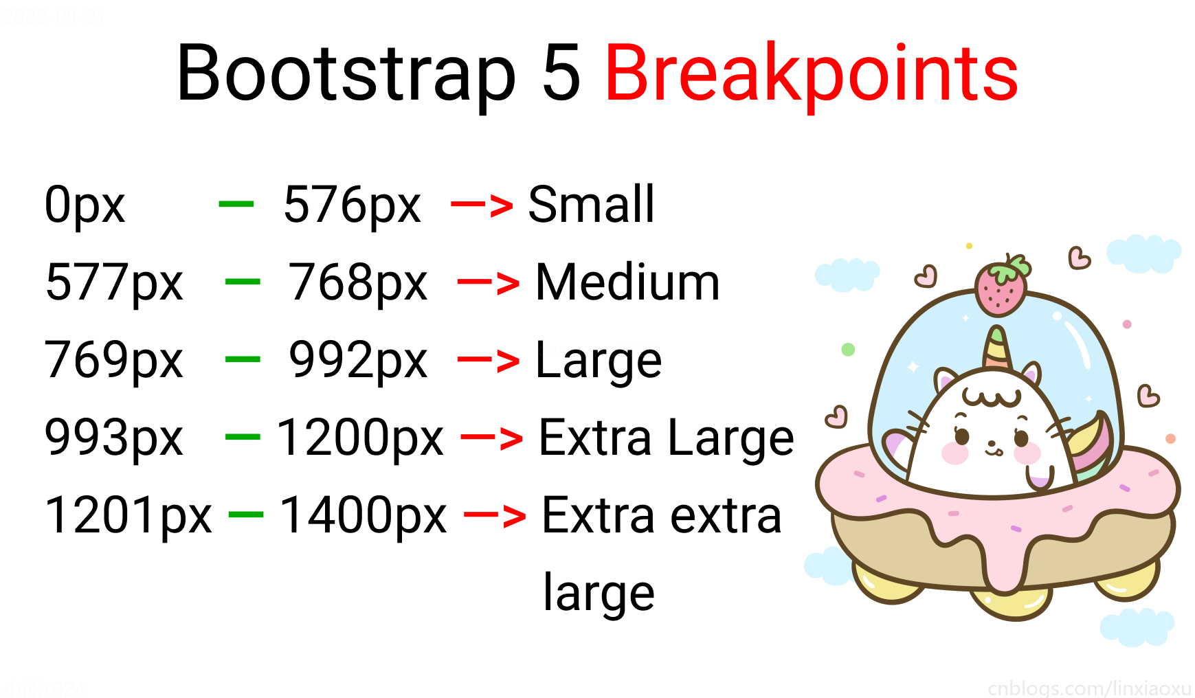
根据四种类型,我们将有四个媒体查询。
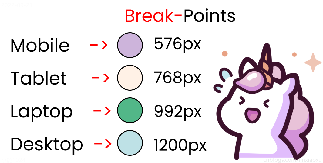
给scss添加新的变量
$mobile : 576px;
$tablet : 768px;
$laptop : 992px;
$desktop : 1200px;
在添加媒体查询时,需要遵循正确的数据,从最大宽度到最小宽度。
@media screen and (max-width: $desktop){
  .container{
    background-color: $color-4;
  }
}
@media screen and (max-width: $laptop){
  .container{
    background-color: $color-3;
  }
}
@media screen and (max-width: $tablet){
  .container{
    background-color: $color-2;
  }
}
@media screen and (max-width : $mobile){
  .container{
    background-color: $color-1;
  }
}
现在改变屏幕宽度将显示不同的背景颜色。
<!DOCTYPE html>
<html lang="en">
<head>
<title></title>
<meta charset="UTF-8">
<meta name="viewport" content="width=device-width, initial-scale=1">
</head>
<body>
<div class="container">
<div class="header"></div>
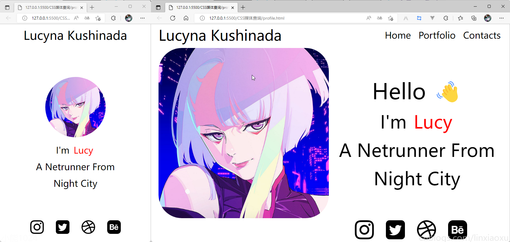
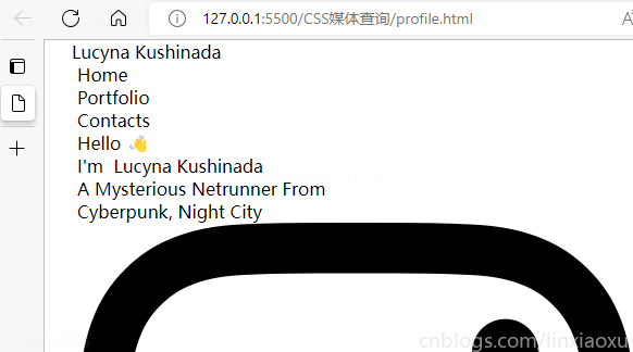
<div class="header__logo">Lucyna Kushinada</div>
<div class="header__menu">
<div class="header__menu-1"> Home </div>
<div class="header__menu-2"> Portfolio </div>
<div class="header__menu-3"> Contacts </div>
</div>
<div class="main">
<div class="main">
<div class="main__image"></div>
<div class="main__text">
<div class="main__text-1">Hello ?</div>
<div class="main__text-2">I'm <span>Lucy</span></div>
<div class="main__text-3">A Netrunner From</div>
<div class="main__text-4">Night City</div>
</div>
</div>
</div>
<div class="footer">
<div class="footer__instagram">
<img src="./images/instagram.png" alt="">
</div>
<div class="footer__twitter">
<img src="./images/twitter-sign.png" alt="">
</div>
<div class="footer__dribbble">
<img src="./images/dribbble-logo.png" alt="">
</div>
<div class="footer__behance">
<img src="./images/behance.png" alt="">
</div>
</div>
</div>
</body>
</html>
scss需要编译成css再导入到html中,我们先修改全局默认样式。
* {
  margin: 0px 5px;

  padding: 0px;
  box-sizing: border-box;

  body {
    font-family: sans-serif;
  }
}
如果你不会Flexbox属性请看 我的Vue之旅、01 深入Flexbox布局完全指南 - 小能日记
先把所有样式类与子级结构写好。嵌套在样式类中的&__logo是.header__logo的快捷方式
.header{
  &__logo{}
  &__menu{}
}

.main{
  &__image{}
  &__text{}
}

.footer{
  [class ^="footer__"]{}
}
然后添加样式,.container采用flex布局,按列布局。.header__menu也采用flex布局的方式。
.container{
  height: 100vh;
  display: flex;
  flex-direction: column;
}

.header{
  display: flex;
  flex-direction: row;
  border: 2px solid red;
  height: 10%;

  &__logo{}

  &__menu{
    display: flex;
    flex-direction: row;
  }
}

.main{
  border: 2px solid black;
  height: 80%;
}

.footer{
  border: 2px solid green;
  height: 10%;
}
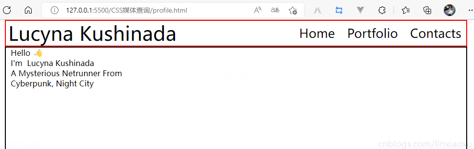
我们修改 .header
.header {
  display: flex;
  flex-direction: row;
  border: 2px solid red;
  height: 10%;
  // 元素垂直居中
  align-items: center;
  // 元素均匀分布
  justify-content: space-between;
  &__logo {
    font-size: 4vw;
  }

  &__menu {
    display: flex;
    flex-direction: row;
    font-size: 2.5vw;
    // 让各个元素产生一定间隔距离
    gap: 15px;
  }
}
再修改 .main
.main {
  // 图片和文字块排版会采用行形式
  display: flex;
  flex-direction: row;

  border: 2px solid black;
  height: 80%;

  &__image {
    // 添加图片
    background-image: url("./images/Portrait.jpg");
    // 宽度为main宽度的50%
    width: 50%;
    // 缩放至图片自身能完全显示出来,足够大的容器会有留白区域
    background-size: contain;
    // 不重复平铺图片
    background-repeat: no-repeat;
    background-position: left center;
  }

  &__text {
    // 宽度为main宽度的50%
    width: 50%;
  }
}
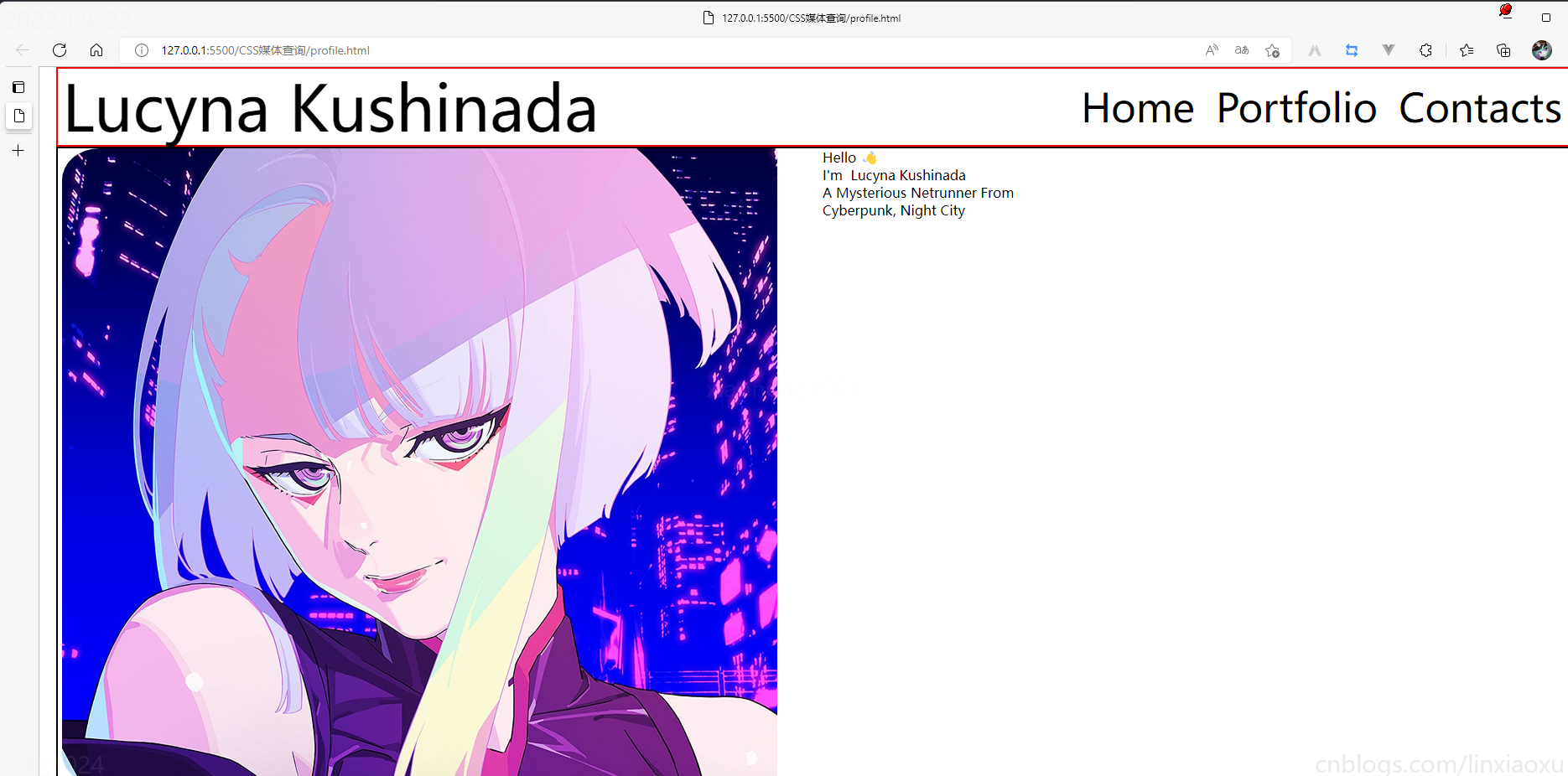
给文字加样式
  &__text {
    // 宽度为main一半宽度
    width: 50%;
    // 让每行字按列排列
    display: flex;
    flex-direction: column;

    // 居中
    justify-content: center;
    align-items: center;

    gap: 15px;

    &-1 {
      font-size: 10vw;
    }

    &-2,
    &-3,
    &-4 {
      font-size: 5vw;
    }
  }

  span {
    color: red;
  }
}
接下来给图片添加样式
.footer{
  // 类匹配器,能够选择一个类的集合,如style class 为footer__1、footer__2
  [class^="footer__"] {
    img {
      width: 5.3vw;
    }
  }
}

.footer{
  display: flex;
  flex-direction: row;

  align-items: center;
  justify-content: flex-end;
  gap: 20px;

  margin-right: 10%;
}
我们还需要添加媒体查询
@media (max-width: 650px) {
  .header {

    justify-content: center;

    &__logo {
      font-size: 40px;
    }

    // 隐藏menu
    &__menu {
      display: none;
    }
  }

  .main {
    flex-direction: column;
    justify-content: center;
    align-items: center;

    &__image {
      // 图片大小
      height: 200px;
      width: 200px;
      background-size: 100%;

      // 圆形图片
      border-radius: 100%;
      background-position: center;
      margin-bottom: 5%;
    }

    // 修改字体样式
    &__text {
      width: 100%;

      &-1 {
        // 让hello不显示
        display: none;
      }

      &-2,
      &-3,
      &-4 {
        font-size: 30px;
      }
    }
  }

  .footer {
    // 元素按中心对齐
    justify-content: center;
    margin: 0px;

    // gap: 20px;  注意这个没有改,默认还是生效的
    [class^="footer__"] {

      // 重新修改图片大小适应移动端
      img {
        width: 45px;
        height: 45px;
      }
    }
  }
}
* {
  margin: 0px 5px;

  padding: 0px;
  box-sizing: border-box;

  body {
    font-family: sans-serif;
  }
}

.container {
  height: 100vh;
  display: flex;
  flex-direction: column;
}

.header {
  display: flex;
  flex-direction: row;
  height: 10%;

  // 元素垂直居中
  align-items: center;
  // 元素均匀分布
  justify-content: space-between;

  &__logo {
    font-size: 4vw;
  }

  &__menu {
    display: flex;
    flex-direction: row;

    font-size: 2.5vw;
    // 让各个元素产生一定间隔距离
    gap: 15px;
  }
}

.main {
  // 图片和文字块排版会采用行形式
  display: flex;
  flex-direction: row;

  height: 80%;

  &__image {
    // 添加图片
    background-image: url("./images/Portrait.png");
    // 宽度为main宽度的50%
    width: 50%;
    // 缩放至图片自身能完全显示出来,足够大的容器会有留白区域
    background-size: contain;
    // 不重复平铺图片
    background-repeat: no-repeat;
    background-position: left center;
  }

  &__text {
    // 宽度为main一半宽度
    width: 50%;
    // 让每行字按列排列
    display: flex;
    flex-direction: column;

    // 居中
    justify-content: center;
    align-items: center;

    gap: 15px;

    &-1 {
      font-size: 6vw;
    }

    &-2,
    &-3,
    &-4 {
      font-size: 5vw;
    }
  }

  span {
    color: red;
  }
}

.footer {
  [class^="footer__"] {
    img {
      width: 5.3vw;
    }
  }
}

.footer {
  display: flex;
  flex-direction: row;

  align-items: center;
  justify-content: flex-end;
  gap: 20px;

  margin-right: 10%;

  [class^="footer__"] {
    img {
      width: 5.3vw;
    }
  }
}

@media (max-width: 650px) {
  .header {

    justify-content: center;

    &__logo {
      font-size: 40px;
    }

    // 隐藏menu
    &__menu {
      display: none;
    }
  }

  .main {
    flex-direction: column;
    justify-content: center;
    align-items: center;

    &__image {
      // 图片大小
      height: 200px;
      width: 200px;
      background-size: 100%;

      // 圆形图片
      border-radius: 100%;
      background-position: center;
      margin-bottom: 5%;
    }

    // 修改字体样式
    &__text {
      width: 100%;

      &-1 {
        // 让hello不显示
        display: none;
      }

      &-2,
      &-3,
      &-4 {
        font-size: 30px;
      }
    }
  }

  .footer {
    // 元素按中心对齐
    justify-content: center;
    margin: 0px;

    // gap: 20px;  注意这个没有改,默认还是生效的
    [class^="footer__"] {

      // 重新修改图片大小适应移动端
      img {
        width: 45px;
        height: 45px;
      }
    }
  }
}
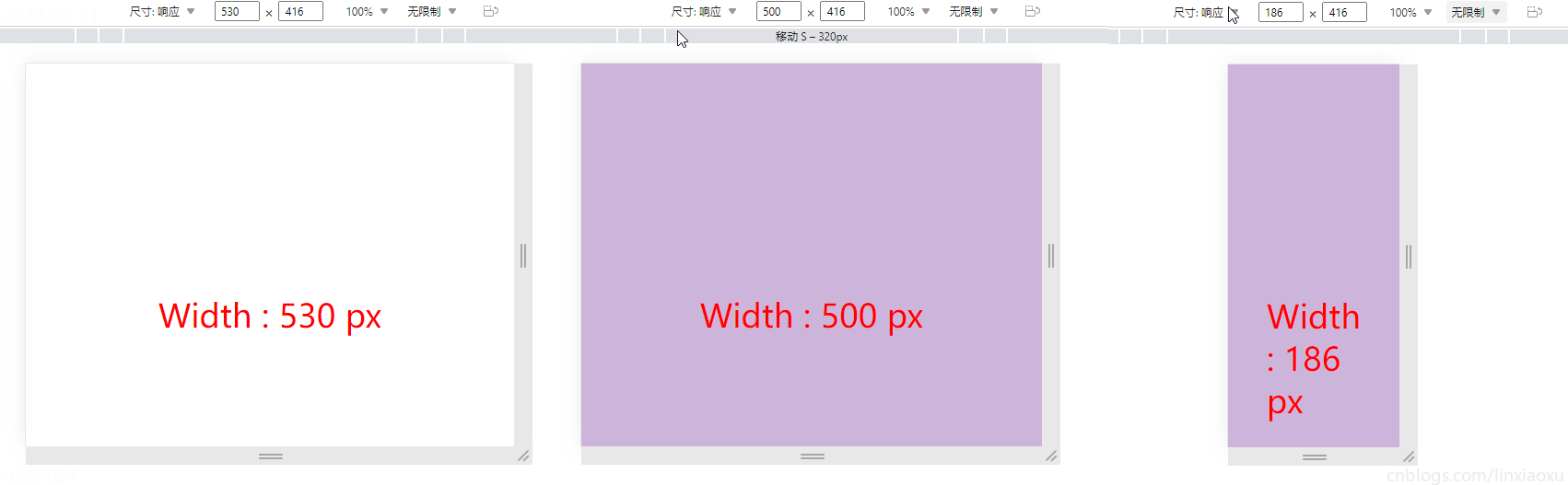
我们会用到第一个例子中的 main.js 函数来显示窗口宽度。
<!DOCTYPE html>
<html lang="en">
<head>
<title></title>
<meta charset="UTF-8">
<meta name="viewport" content="width=device-width, initial-scale=1">
<link href="css/style.css" rel="stylesheet">
<script type="text/javascript" src="./main.js"></script>
</head>
<body>
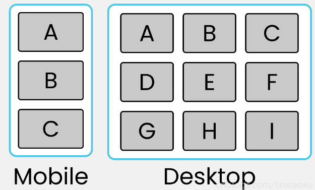
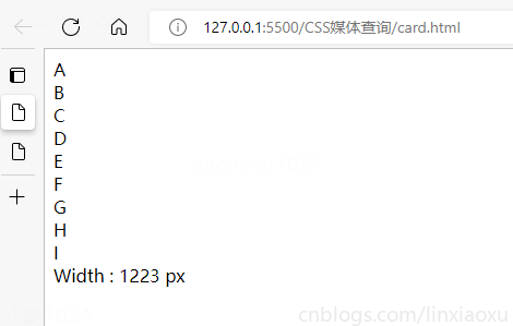
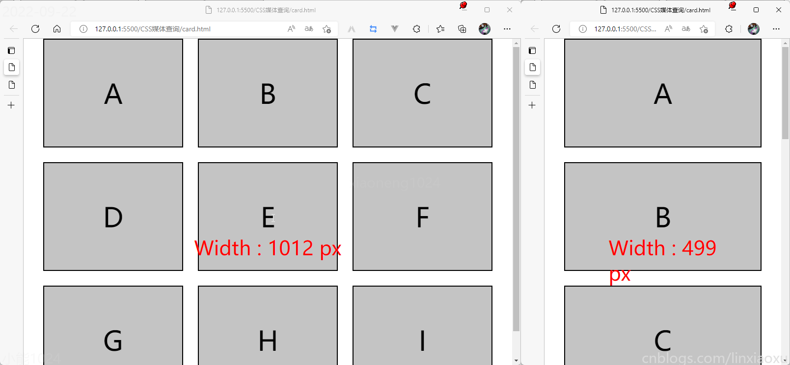
<div class="container">
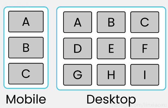
<div class="row-1">
<div class="box-1">A</div>
<div class="box-2">B</div>
<div class="box-3">C</div>
</div>
<div class="row-2">
<div class="box-4">D</div>
<div class="box-5">E</div>
<div class="box-6">F</div>
</div>
<div class="row-3">
<div class="box-7">G</div>
<div class="box-8">H</div>
<div class="box-9">I</div>
</div>
</div>
<div id="size"></div>
</body>
</html>
* {
  margin: 0px;
  padding: 0px 10px;
  box-sizing: border-box;

  body {
    font-family: sans-serif;
    font-size: 55px;
  }
}

#size {
  position: absolute;
  // 设置为绝对定位
  top: 60%;
  left: 50%;
  // 水平居中
  transform: translateX(-50%);
  color: red;
  font-size: 40px;
}

.container {
  display: flex;
  flex-direction: column;
  height: 100vh;

  gap: 30px;
}

[class ^="row-"] {
  display: flex;
  flex-direction: row;
  gap: 30px;
}

[class ^="box-"] {

  background-color: #c4c4c4;
  border: 2px solid black;

  width: (100%)/3;
  // 设置为当前视窗大小的三分之一
  height: (100vh)/3;

  // 元素居中
  display: grid;
  place-items: center;
}

@media (max-width: 650px) {

  [class ^="row-"] {
    flex-direction: column;
  }

  [class ^="box-"] {
    width: 100%;
  }
}
我正在用Ruby编写一个简单的程序来检查域列表是否被占用。基本上它循环遍历列表,并使用以下函数进行检查。require'rubygems'require'whois'defcheck_domain(domain)c=Whois::Client.newc.query("google.com").available?end程序不断出错(即使我在google.com中进行硬编码),并打印以下消息。鉴于该程序非常简单,我已经没有什么想法了-有什么建议吗?/Library/Ruby/Gems/1.8/gems/whois-2.0.2/lib/whois/server/adapters/base.
我在MiniTest::Spec和Capybara中使用以下规范:find_field('Email').must_have_css('[autofocus]')检查名为“电子邮件”的字段是否具有autofocus属性。doc说如下:has_css?(path,options={})ChecksifagivenCSSselectorisonthepageorcurrentnode.据我了解,字段“Email”是一个节点,因此调用must_have_css绝对有效!我做错了什么? 最佳答案 通过JonasNicklas得到了答案:No
我打算为ruby脚本创建一个安装程序,但我希望能够确保机器安装了RVM。有没有一种方法可以完全离线安装RVM并且不引人注目(通过不引人注目,就像创建一个可以做所有事情的脚本而不是要求用户向他们的bash_profile或bashrc添加一些东西)我不是要脚本本身,只是一个关于如何走这条路的快速指针(如果可能的话)。我们还研究了这个很有帮助的问题:RVM-isthereawayforsimpleofflineinstall?但有点误导,因为答案只向我们展示了如何离线在RVM中安装ruby。我们需要能够离线安装RVM本身,并查看脚本https://raw.github.com/wayn
我是一个Rails初学者,但我想从我的RailsView(html.haml文件)中查看Ruby变量的内容。我试图在ruby中打印出变量(认为它会在终端中出现),但没有得到任何结果。有什么建议吗?我知道Rails调试器,但更喜欢使用inspect来打印我的变量。 最佳答案 您可以在View中使用puts方法将信息输出到服务器控制台。您应该能够在View中的任何位置使用Haml执行以下操作:-puts@my_variable.inspect 关于ruby-on-rails-如何在我的R
我知道我可以指定某些字段来使用pluck查询数据库。ids=Item.where('due_at但是我想知道,是否有一种方法可以指定我想避免从数据库查询的某些字段。某种反拔?posts=Post.where(published:true).do_not_lookup(:enormous_field) 最佳答案 Model#attribute_names应该返回列/属性数组。您可以排除其中一些并传递给pluck或select方法。像这样:posts=Post.where(published:true).select(Post.attr
我喜欢使用Textile或Markdown为我的项目编写自述文件,但是当我生成RDoc时,自述文件被解释为RDoc并且看起来非常糟糕。有没有办法让RDoc通过RedCloth或BlueCloth而不是它自己的格式化程序运行文件?它可以配置为自动检测文件后缀的格式吗?(例如README.textile通过RedCloth运行,但README.mdown通过BlueCloth运行) 最佳答案 使用YARD直接代替RDoc将允许您包含Textile或Markdown文件,只要它们的文件后缀是合理的。我经常使用类似于以下Rake任务的东西:
rails中是否有任何规定允许站点的所有AJAXPOST请求在没有authenticity_token的情况下通过?我有一个调用Controller方法的JqueryPOSTajax调用,但我没有在其中放置任何真实性代码,但调用成功。我的ApplicationController确实有'request_forgery_protection'并且我已经改变了config.action_controller.consider_all_requests_local在我的environments/development.rb中为false我还搜索了我的代码以确保我没有重载ajaxSend来发送
我只想对我一直在思考的这个问题有其他意见,例如我有classuser_controller和classuserclassUserattr_accessor:name,:usernameendclassUserController//dosomethingaboutanythingaboutusersend问题是我的User类中是否应该有逻辑user=User.newuser.do_something(user1)oritshouldbeuser_controller=UserController.newuser_controller.do_something(user1,user2)我
我有一个div,它根据表单是否正确提交而改变。我想知道是否可以检查类的特定元素?开始元素看起来像这样。如果输入不正确,添加错误类。 最佳答案 试试这个:browser.div(:id=>"myerrortest").class_name更多信息:http://watir.github.com/watir-webdriver/doc/Watir/HTMLElement.html#class_name-instance_method另一种选择是只查看具有您期望的类的div是否存在browser.div((:id=>"myerrortes
其实做自媒体的成本并不高,入门只需要一部手机即可!在手机上找视频素材、使用手机剪辑视频、最后使用手机发布视频作品获得收益!方法并不难,今天这期内容就来给粉丝们分享一种小方法,每天稳定收益100-300,抓紧点赞收藏!1、找素材(1)使用手机拍摄自己喜欢的经典段落,使用程序把文案内容提取出来(2)也可以在豆瓣、知乎、微博等网站中找一些自己需要的文案素材(3)把文案进行润色修改,可以加入一些自己的观点(4)视频素材可以使用软件中自带的素材,也可以在素材网站中下载完整版的素材2、文案配音(1)把复制好的文案直接导入小程序中(2)调整音色、音调后一键合成音频即可(3)可以选择自己朗读配音,需要花一点时