为什么会有这篇文章呢,是因为之前关于TabLayout的使用陆陆续续也写了好几篇了,感觉比较分散,且不成体系,写这篇文章的目的就是希望能把各种效果的实现一次性讲齐,所以也有了标题的「看这篇就够了」。
TabLayout作为导航组件来说,使用场景非常的多,也意味着要满足各种各样的需求。
在效果实现上,有同学会选择自定义View来做,定制性高,但易用性、稳定性、维护性不敢保证,使用官方组件能避免这些不确定性,一是开源,有很多大佬共建,会不停的迭代;二是经过大型app验证,比如google play;有了这两点,基本可以放心大胆的使用官方组件了。
那可能有的同学又会说,道理我都懂,可是不满足需求啊,只能自定义了。是的,早期的api确实不够丰富,在某些需求的实现上显得捉襟见肘,但是google也在不断的迭代,目前为止,常见的样式都能满足。

Material Design 组件最新正式版依赖:
implementation 'com.google.android.material:material:1.5.0'
    <com.google.android.material.tabs.TabLayout
        android:id="@+id/tab_layout1"
        android:layout_width="match_parent"
        android:layout_height="wrap_content"
        android:background="@color/white"
        app:tabIndicatorColor="@color/colorPrimary"
        app:tabMaxWidth="200dp"
        app:tabMinWidth="100dp"
        app:tabMode="fixed"
        app:tabSelectedTextColor="@color/colorPrimary"
        app:tabTextColor="@color/gray" />
只写一个Layout,item可以配合ViewPager来生成。
 <com.google.android.material.tabs.TabLayout
         android:layout_height="wrap_content"
         android:layout_width="match_parent">

     <com.google.android.material.tabs.TabItem
             android:text="@string/tab_text"/>

     <com.google.android.material.tabs.TabItem
             android:icon="@drawable/ic_android"/>

 </com.google.android.material.tabs.TabLayout>
属于固定写法,比如我们非常确定item有几个,可以通过TabItem显式声明。
    val tab = mBinding.tabLayout7.newTab()
    tab.text = it.key
    //...
    mBinding.tabLayout7.addTab(tab)
这种情况适合Tab的数据是动态的,比如接口数据回来之后,再创建Tab并添加到TabLayout中。
mBinding.tabLayout2.getTabAt(index)?.setIcon(R.mipmap.ic_launcher)
获取Tab然后设置icon。
Tab内部其实是一个TextView和ImageView,添加图标就是给ImageView设置icon。
通过app:tabTextAppearance给TabLayout设置文本样式
    <com.google.android.material.tabs.TabLayout
		...
        app:tabTextAppearance="@style/MyTabLayout"
		/>
style:
    <style name="MyTabLayout">
        <item name="android:textSize">20sp</item>
        <item name="android:textStyle">bold</item>
        <item name="android:textAllCaps">false</item>
    </style>
比如这里设置了字体大小和加粗。
默认字体大小14sp:
<dimen name="design_tab_text_size">14sp</dimen>

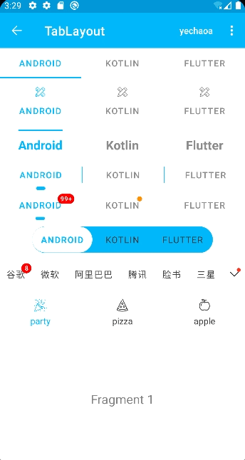
长按Tab时会有一个提示文字,类似Toast一样。
    /**
     * 隐藏长按显示文本
     */
    private fun hideToolTipText(tab: TabLayout.Tab) {
        // 取消长按事件
        tab.view.isLongClickable = false
        // api 26 以上 设置空text
        if (Build.VERSION.SDK_INT > Build.VERSION_CODES.O) {
            tab.view.tooltipText = ""
        }
    }
可以取消长按事件,在api26以上也可以设置提示文本为空。
app:tabIndicatorHeight="0dp"
设置高度为0即可。
注意,单纯设置tabIndicatorColor为透明,其实不准确,默认还是有2dp的,根本瞒不过射鸡师的眼睛。

通过app:tabIndicator可以设置自定义的样式,比如通过shape设置圆角和宽度。
    <com.google.android.material.tabs.TabLayout
        ...
        app:tabIndicator="@drawable/shape_tab_indicator"
        app:tabIndicatorColor="@color/colorPrimary"
		/>
注意:Indicator的颜色在shape中设置是无效的,需要通过app:tabIndicatorColor设置才可以
shape:
<?xml version="1.0" encoding="utf-8"?>
<layer-list xmlns:android="http://schemas.android.com/apk/res/android">
    <item
        android:width="15dp"
        android:height="5dp"
        android:gravity="center">
        <shape>
            <corners android:radius="5dp" />
            <!--color无效,源码用tabIndicatorColor-->
            <solid android:color="@color/colorPrimary" />
        </shape>
    </item>
</layer-list>

默认情况下,tabIndicator的宽度是填充整个Tab的,比如上图中的第一个,我们可以简单的设置不填充,与文本对齐,即第二个效果
app:tabIndicatorFullWidth="false"
也可以像上一节那样,通过shape自定义tabIndicator的宽度。

  /** A {@link LinearLayout} containing {@link Tab} instances for use with {@link TabLayout}. */
  public final class TabView extends LinearLayout {

  }
通过源码可以看到内部实现TabView继承至LinearLayout,我们知道LinearLayout是可以给子view设置分割线的,那我们就可以通过遍历来添加分割线
        //设置 分割线
        for (index in 0..mBinding.tabLayout4.tabCount) {
            val linearLayout = mBinding.tabLayout4.getChildAt(index) as? LinearLayout
            linearLayout?.let {
                it.showDividers = LinearLayout.SHOW_DIVIDER_MIDDLE
                it.dividerDrawable = ContextCompat.getDrawable(this, R.drawable.shape_tab_divider)
                it.dividerPadding = 30
            }
        }
shape_tab_divider:
<?xml version="1.0" encoding="utf-8"?>
<shape xmlns:android="http://schemas.android.com/apk/res/android">
    <solid android:color="@color/colorPrimary" />
    <size android:width="1dp" android:height="10dp" />
</shape>

上图中的效果其实是TabLayout样式+tabIndicator样式形成的一个「整体」的效果。
TabLayout是两边半圆的一个长条,这个我们通过编写shape设置给其背景即可实现。
shape_tab_bg:
<?xml version="1.0" encoding="utf-8"?>
<shape xmlns:android="http://schemas.android.com/apk/res/android">
    <corners android:radius="999dp" />
    <solid android:color="@color/colorPrimary" />
</shape>
这个效果的关键在于tabIndicator的高度与TabLayout的高度相同,所以二者高度设置一致即可。
shape_full_tab_indicator:
<?xml version="1.0" encoding="utf-8"?>
<layer-list xmlns:android="http://schemas.android.com/apk/res/android">
    <item android:gravity="center" android:top="0.5dp" android:bottom="0.5dp">
        <shape>
            <!-- 上下边距合计1dp 高度减少1dp -->
            <size android:height="41dp" />
            <corners android:radius="999dp" />
            <solid android:color="@color/white" />
        </shape>
    </item>
</layer-list>
TabLayout:
    <com.google.android.material.tabs.TabLayout
        android:id="@+id/tab_layout6"
        android:layout_width="wrap_content"
        android:layout_height="42dp"
        android:layout_gravity="center"
        android:layout_marginTop="10dp"
        android:background="@drawable/shape_tab_bg"
        app:tabIndicator="@drawable/shape_full_tab_indicator"
        app:tabIndicatorColor="@color/white"
        app:tabIndicatorFullWidth="true"
        app:tabIndicatorHeight="42dp"
        app:tabMinWidth="96dp"
        app:tabMode="fixed"
        app:tabSelectedTextColor="@color/colorPrimary"
        app:tabTextColor="@color/black" />

添加小红点的功能还是比较常见的,好在TabLayout也提供了这种能力,其实添加起来也非常简单,难在未知。
可以设置带数字的红点,也可以设置没有数字单纯的一个点。
通过getOrCreateBadge可以对红点进行简单的配置:
        // 数字
        mBinding.tabLayout5.getTabAt(defaultIndex)?.let { tab ->
            tab.orCreateBadge.apply {
                backgroundColor = Color.RED
                maxCharacterCount = 3
                number = 99999
                badgeTextColor = Color.WHITE
            }
        }

        // 红点
        mBinding.tabLayout5.getTabAt(1)?.let { tab ->
            tab.orCreateBadge.backgroundColor = ContextCompat.getColor(this, R.color.orange)
        }
getOrCreateBadge实际上是获取或创建BadgeDrawable。
通过源码发现,BadgeDrawable除了TabLayout引用之外,还有NavigationBarItemView、NavigationBarMenuView、NavigationBarView,意味着它们也同样具备着小红点这种能力。其实别的view也是可以具备的。
关于小红点这里就不展开了,非常推荐查看我之前写的这篇:【涨姿势】你没用过的BadgeDrawable
Author:yechaoa

上一节中我们实现了小红点效果,那如果一屏显示不够的情况下,如何提示未展示的信息呢,比如上面我们如何把未显示的tab且有数字的Tab提示出来呢?常见的解决方案都是在尾部加一个红点提示。
那么问题来了,如何判断某一个Tab是否可见呢,翻看了源码,可惜并没有提供相应的api,那只能我们自己实现了。
我们前面添加小红点是根据Tab添加的,Tab内部实现也是一个view,那view就可以判断其是否可见。
    private fun isShowDot(): Boolean {
        var showIndex = 0
        var tipCount = 0
        companyMap.keys.forEachIndexed { index, _ ->
            mBinding.tabLayout7.getTabAt(index)?.let { tab ->
                val tabView = tab.view as LinearLayout
                val rect = Rect()
                val visible = tabView.getLocalVisibleRect(rect)
                // 可见范围小于80%也在计算范围之内,剩下20%宽度足够红点透出(可自定义)
                if (visible && rect.right > tab.view.width * 0.8) {
                    showIndex = index
                } else {
                    //if (index > showIndex) // 任意一个有count的tab隐藏就会显示,比如第一个在滑动过程中会隐藏,也在计算范围之内
                    if (index > lastShowIndex) { // 只检测右侧隐藏且有count的tab 才在计算范围之内
                        tab.badge?.let { tipCount += it.number }
                    }
                }

            }
        }
        lastShowIndex = showIndex
        return tipCount > 0
    }
上面的方法中就是判断是否需要显示右侧提示的小红点。
计算规则:Tab不可见,且Tab上的红点数字大于0的即在计算范围之内。
这里有一个优化的点,比如上图中的“腾讯”Tab,它是可见的,但是红点不可见,那么问题就来了,如果我们没有提示到,是很容易产生客诉的,所以这里在计算的时候也加了一个条件,就是可见范围小于80%也在计算范围之内,剩下20%的宽度是足够Tab上的红点透出的(也可自定义)。
同时在TabLayout滑动的过程中也应该加上判断显示的逻辑:
        // mBinding.tabLayout7.setOnScrollChangeListener() // min api 23 (6.0)
        // 适配 5.0  滑动过程中判断右侧小红点是否需要显示
        mBinding.tabLayout7.viewTreeObserver.addOnScrollChangedListener {
            mBinding.vArrowDot.visibility = if (isShowDot()) View.VISIBLE else View.INVISIBLE
        }
还有初始化时的判断逻辑:
    override fun onResume() {
        super.onResume()
        // 初始化判断右侧小红点是否需要显示
        mBinding.tabLayout7.viewTreeObserver.addOnGlobalLayoutListener(object : ViewTreeObserver.OnGlobalLayoutListener {
            override fun onGlobalLayout() {
                mBinding.vArrowDot.visibility = if (isShowDot()) View.VISIBLE else View.INVISIBLE
                mBinding.tabLayout7.viewTreeObserver.removeOnGlobalLayoutListener(this)
            }
        })
    }

细心的同学会发现,这个TabLayout的item左右间距都是一样的,不管标题是两个字还是四个字的,左右间距都是相等的,而实际上的效果是两个字的Tab要比四个字的Tab左右间距要大一些的,那这个效果是怎么实现的呢?
实际上是我们设置了tabMinWidth:
app:tabMinWidth="50dp"
源码中默认的是:
  private int getTabMinWidth() {
    if (requestedTabMinWidth != INVALID_WIDTH) {
      // If we have been given a min width, use it
      return requestedTabMinWidth;
    }
    // Else, we'll use the default value
    return (mode == MODE_SCROLLABLE || mode == MODE_AUTO) ? scrollableTabMinWidth : 0;
  }
scrollable的情况下,会返回默认配置,否则为0,即tabMode为fixed的情况。系统默认配置scrollableTabMinWidth:
<dimen name="design_tab_scrollable_min_width">72dp</dimen>
在两个字和四个字的标题都存在的情况下,两个字用这个默认宽度就会有多余的间距,所以会出现间距不均等的情况,通过设置覆盖默认即可解决。

前面讲到Tab内部实现是一个View,那我们就可以通过官方提供api(setCustomView)来自定义这个view。
setCustomView的两种方式:
我们先编写一个自定义的布局文件,布局文件比较简单,一个LottieAnimationView和TextView。

再通过Tab添加进去即可。
        val animMap = mapOf("party" to R.raw.anim_confetti, "pizza" to R.raw.anim_pizza, "apple" to R.raw.anim_apple)

        animMap.keys.forEach { s ->
            val tab = mBinding.tabLayout8.newTab()
            val view = LayoutInflater.from(this).inflate(R.layout.item_tab, null)
            val imageView = view.findViewById<LottieAnimationView>(R.id.lav_tab_img)
            val textView = view.findViewById<TextView>(R.id.tv_tab_text)
            imageView.setAnimation(animMap[s]!!)
            imageView.setColorFilter(Color.BLUE)
            textView.text = s
            tab.customView = view
            mBinding.tabLayout8.addTab(tab)
        }

Lottie是一个可以在多平台展示动画的库,相信很多同学都已经用过了,就不详细展开了,感兴趣的可以查看Lottie官方文档。
Lottie依赖:
implementation "com.airbnb.android:lottie:5.0.1"
上一节中我们实现了自定义TabLayout的Item View,在这个自定义的布局中,我们用LottieAnimationView来承载动画的展示。
<?xml version="1.0" encoding="utf-8"?>
<androidx.appcompat.widget.LinearLayoutCompat xmlns:android="http://schemas.android.com/apk/res/android"
    xmlns:app="http://schemas.android.com/apk/res-auto"
    android:id="@+id/item_tab"
    android:layout_width="match_parent"
    android:layout_height="wrap_content"
    android:gravity="center"
    android:orientation="vertical">

    <com.airbnb.lottie.LottieAnimationView
        android:id="@+id/lav_tab_img"
        android:layout_width="30dp"
        android:layout_height="30dp"
        app:lottie_colorFilter="@color/black"
        app:lottie_rawRes="@raw/anim_confetti" />

    <TextView
        android:id="@+id/tv_tab_text"
        android:layout_width="wrap_content"
        android:layout_height="wrap_content"
        android:text="@string/app_name"
        android:textColor="@color/black"
        android:textSize="14sp" />

</androidx.appcompat.widget.LinearLayoutCompat>
添加的方式也在上一节中讲过了,我们只需要控制好选中、未选中的状态即可。
        mBinding.tabLayout8.addOnTabSelectedListener(object : OnTabSelectedListener {
            override fun onTabSelected(tab: TabLayout.Tab?) {
                tab?.setSelected()
                tab?.let { mBinding.viewPager.currentItem = it.position }
            }

            override fun onTabUnselected(tab: TabLayout.Tab?) {
                tab?.setUnselected()
            }

            override fun onTabReselected(tab: TabLayout.Tab?) {

            }
        })
这里通过两个扩展方法分别处理不同的状态。
    /**
     * 选中状态
     */
    fun TabLayout.Tab.setSelected() {
        this.customView?.let {
            val textView = it.findViewById<TextView>(R.id.tv_tab_text)
            val selectedColor = ContextCompat.getColor(this@TabLayoutActivity, R.color.colorPrimary)
            textView.setTextColor(selectedColor)

            val imageView = it.findViewById<LottieAnimationView>(R.id.lav_tab_img)
            if (!imageView.isAnimating) {
                imageView.playAnimation()
            }
            setLottieColor(imageView, true)
        }
    }
    /**
     * 未选中状态
     */
    fun TabLayout.Tab.setUnselected() {
        this.customView?.let {
            val textView = it.findViewById<TextView>(R.id.tv_tab_text)
            val unselectedColor = ContextCompat.getColor(this@TabLayoutActivity, R.color.black)
            textView.setTextColor(unselectedColor)

            val imageView = it.findViewById<LottieAnimationView>(R.id.lav_tab_img)
            if (imageView.isAnimating) {
                imageView.cancelAnimation()
                imageView.progress = 0f // 还原初始状态
            }
            setLottieColor(imageView, false)
        }
    }
关于修改lottie icon的颜色,目前网上的答案参差不齐,还是源码来的直接。
源码:
    if (ta.hasValue(R.styleable.LottieAnimationView_lottie_colorFilter)) {
      int colorRes = ta.getResourceId(R.styleable.LottieAnimationView_lottie_colorFilter, -1);
      ColorStateList csl = AppCompatResources.getColorStateList(getContext(), colorRes);
      SimpleColorFilter filter = new SimpleColorFilter(csl.getDefaultColor());
      KeyPath keyPath = new KeyPath("**");
      LottieValueCallback<ColorFilter> callback = new LottieValueCallback<>(filter);
      addValueCallback(keyPath, LottieProperty.COLOR_FILTER, callback);
    }
所以直接借鉴即可:
    /**
     * set lottie icon color
     */
    private fun setLottieColor(imageView: LottieAnimationView?, isSelected: Boolean) {
        imageView?.let {
            val color = if (isSelected) R.color.colorPrimary else R.color.black
            val csl = AppCompatResources.getColorStateList(this@TabLayoutActivity, color)
            val filter = SimpleColorFilter(csl.defaultColor)
            val keyPath = KeyPath("**")
            val callback = LottieValueCallback<ColorFilter>(filter)
            it.addValueCallback(keyPath, LottieProperty.COLOR_FILTER, callback)
        }
    }
动画文件的下载网站推荐: lordicon
    private inner class SimpleFragmentPagerAdapter constructor(fm: FragmentManager) :
        FragmentPagerAdapter(fm, BEHAVIOR_RESUME_ONLY_CURRENT_FRAGMENT) {

        private val tabTitles = arrayOf("Android", "Kotlin", "Flutter")
        private val fragment = arrayOf(Fragment1(), Fragment2(), Fragment3())

        override fun getItem(position: Int): Fragment {
            return fragment[position]
        }

        override fun getCount(): Int {
            return fragment.size
        }

        override fun getPageTitle(position: Int): CharSequence {
            return tabTitles[position]
        }
    }
mBinding.viewPager.adapter = SimpleFragmentPagerAdapter(supportFragmentManager)
mBinding.tabLayout1.setupWithViewPager(mBinding.viewPager)
以上即可把TabLayout和ViewPager关联起来,TabLayout的Tab也会由FragmentPagerAdapter中的标题自动生成。
究竟是怎么关联起来的呢?
下面是setupWithViewPager中的部分源码:
        if (viewPager != null) {
            this.viewPager = viewPager;
            if (this.pageChangeListener == null) {
            	// 步骤1
                this.pageChangeListener = new TabLayout.TabLayoutOnPageChangeListener(this);
            }

            this.pageChangeListener.reset();
            viewPager.addOnPageChangeListener(this.pageChangeListener);
            // 步骤2
            this.currentVpSelectedListener = new TabLayout.ViewPagerOnTabSelectedListener(viewPager);
            // 步骤3
            this.addOnTabSelectedListener(this.currentVpSelectedListener);
            PagerAdapter adapter = viewPager.getAdapter();
            if (adapter != null) {
                this.setPagerAdapter(adapter, autoRefresh);
            }

            if (this.adapterChangeListener == null) {
                this.adapterChangeListener = new TabLayout.AdapterChangeListener();
            }

            this.adapterChangeListener.setAutoRefresh(autoRefresh);
            // 步骤4
            viewPager.addOnAdapterChangeListener(this.adapterChangeListener);
            this.setScrollPosition(viewPager.getCurrentItem(), 0.0F, true);
        }
你来我往的操作之后,设置TabLayout的选中下标和设置ViewPager的选中下标,其实效果是一毛一样的,因为联动起来了…另外,FragmentPagerAdapter已经废弃了,官方推荐使用viewpager2 和 FragmentStateAdapter 代替。
Deprecated Switch to androidx.viewpager2.widget.ViewPager2 and use androidx.viewpager2.adapter.FragmentStateAdapter instead.
| API | 含义 |
|---|---|
| background | TabLayout背景颜色 |
| tabIndicator | 指示器(一般下划线) |
| tabIndicatorColor | 指示器颜色 |
| tabIndicatorHeight | 指示器高度,不显示写0dp |
| tabIndicatorFullWidth | 指示器宽度是否撑满item |
| tabMode | tab显示形式,1.auto自动,2.fixed固定宽度,3.scrollable可滑动 |
| tabSelectedTextColor | tab选中文字颜色 |
| tabTextColor | tab未选中文字颜色 |
| tabRippleColor | tab点击效果颜色 |
| tabGravity | tab对齐方式 |
| tabTextAppearance | tab文本样式,可引用style |
| tabMaxWidth | tab最大宽度 |
| tabMinWidth | tab最小宽度 |
| setupWithViewPager | tabLayout关联ViewPager |
| addOnTabSelectedListener | tab选中监听事件 |
| API | 含义 |
|---|---|
| setCustomView | 设置tab自定义view |
| setIcon | 设置tab icon |
| setText | 设置tab文本 |
| getOrCreateBadge | 获取或创建badge(小红点) |
| removeBadge | 移除badge(小红点) |
| select | 设置tab选中 |
| isSelected | 获取tab选中状态 |
| API | 含义 |
|---|---|
| setVisible | 设置显示状态 |
| setBackgroundColor | 设置小红点背景颜色 |
| getBadgeTextColor | 设置小红点文本颜色 |
| setNumber | 设置小红点显示数量 |
| clearNumber | 清除小红点数量 |
| setBadgeGravity | 设置小红点位置对齐方式 |
https://github.com/yechaoa/MaterialDesign
写作不易,感谢点赞支持 ^ - ^
我正在学习如何使用Nokogiri,根据这段代码我遇到了一些问题:require'rubygems'require'mechanize'post_agent=WWW::Mechanize.newpost_page=post_agent.get('http://www.vbulletin.org/forum/showthread.php?t=230708')puts"\nabsolutepathwithtbodygivesnil"putspost_page.parser.xpath('/html/body/div/div/div/div/div/table/tbody/tr/td/div
我有一个字符串input="maybe(thisis|thatwas)some((nice|ugly)(day|night)|(strange(weather|time)))"Ruby中解析该字符串的最佳方法是什么?我的意思是脚本应该能够像这样构建句子:maybethisissomeuglynightmaybethatwassomenicenightmaybethiswassomestrangetime等等,你明白了......我应该一个字符一个字符地读取字符串并构建一个带有堆栈的状态机来存储括号值以供以后计算,还是有更好的方法?也许为此目的准备了一个开箱即用的库?
我有一个Ruby程序,它使用rubyzip压缩XML文件的目录树。gem。我的问题是文件开始变得很重,我想提高压缩级别,因为压缩时间不是问题。我在rubyzipdocumentation中找不到一种为创建的ZIP文件指定压缩级别的方法。有人知道如何更改此设置吗?是否有另一个允许指定压缩级别的Ruby库? 最佳答案 这是我通过查看rubyzip内部创建的代码。level=Zlib::BEST_COMPRESSIONZip::ZipOutputStream.open(zip_file)do|zip|Dir.glob("**/*")d
类classAprivatedeffooputs:fooendpublicdefbarputs:barendprivatedefzimputs:zimendprotecteddefdibputs:dibendendA的实例a=A.new测试a.foorescueputs:faila.barrescueputs:faila.zimrescueputs:faila.dibrescueputs:faila.gazrescueputs:fail测试输出failbarfailfailfail.发送测试[:foo,:bar,:zim,:dib,:gaz].each{|m|a.send(m)resc
很好奇,就使用rubyonrails自动化单元测试而言,你们正在做什么?您是否创建了一个脚本来在cron中运行rake作业并将结果邮寄给您?git中的预提交Hook?只是手动调用?我完全理解测试,但想知道在错误发生之前捕获错误的最佳实践是什么。让我们理所当然地认为测试本身是完美无缺的,并且可以正常工作。下一步是什么以确保他们在正确的时间将可能有害的结果传达给您? 最佳答案 不确定您到底想听什么,但是有几个级别的自动代码库控制:在处理某项功能时,您可以使用类似autotest的内容获得关于哪些有效,哪些无效的即时反馈。要确保您的提
假设我做了一个模块如下:m=Module.newdoclassCendend三个问题:除了对m的引用之外,还有什么方法可以访问C和m中的其他内容?我可以在创建匿名模块后为其命名吗(就像我输入“module...”一样)?如何在使用完匿名模块后将其删除,使其定义的常量不再存在? 最佳答案 三个答案:是的,使用ObjectSpace.此代码使c引用你的类(class)C不引用m:c=nilObjectSpace.each_object{|obj|c=objif(Class===objandobj.name=~/::C$/)}当然这取决于
我正在尝试使用ruby和Savon来使用网络服务。测试服务为http://www.webservicex.net/WS/WSDetails.aspx?WSID=9&CATID=2require'rubygems'require'savon'client=Savon::Client.new"http://www.webservicex.net/stockquote.asmx?WSDL"client.get_quotedo|soap|soap.body={:symbol=>"AAPL"}end返回SOAP异常。检查soap信封,在我看来soap请求没有正确的命名空间。任何人都可以建议我
关闭。这个问题是opinion-based.它目前不接受答案。想要改进这个问题?更新问题,以便editingthispost可以用事实和引用来回答它.关闭4年前。Improvethisquestion我想在固定时间创建一系列低音和高音调的哔哔声。例如:在150毫秒时发出高音调的蜂鸣声在151毫秒时发出低音调的蜂鸣声200毫秒时发出低音调的蜂鸣声250毫秒的高音调蜂鸣声有没有办法在Ruby或Python中做到这一点?我真的不在乎输出编码是什么(.wav、.mp3、.ogg等等),但我确实想创建一个输出文件。
我在我的项目目录中完成了compasscreate.和compassinitrails。几个问题:我已将我的.sass文件放在public/stylesheets中。这是放置它们的正确位置吗?当我运行compasswatch时,它不会自动编译这些.sass文件。我必须手动指定文件:compasswatchpublic/stylesheets/myfile.sass等。如何让它自动运行?文件ie.css、print.css和screen.css已放在stylesheets/compiled。如何在编译后不让它们重新出现的情况下删除它们?我自己编译的.sass文件编译成compiled/t
我想将html转换为纯文本。不过,我不想只删除标签,我想智能地保留尽可能多的格式。为插入换行符标签,检测段落并格式化它们等。输入非常简单,通常是格式良好的html(不是整个文档,只是一堆内容,通常没有anchor或图像)。我可以将几个正则表达式放在一起,让我达到80%,但我认为可能有一些现有的解决方案更智能。 最佳答案 首先,不要尝试为此使用正则表达式。很有可能你会想出一个脆弱/脆弱的解决方案,它会随着HTML的变化而崩溃,或者很难管理和维护。您可以使用Nokogiri快速解析HTML并提取文本:require'nokogiri'h