声明:本文涉及图文和模型素材仅用于个人学习、研究和欣赏,请勿二次修改、非法传播、转载、出版、商用、及进行其他获利行为。
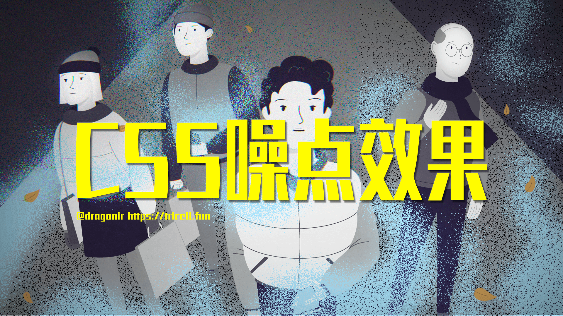
在插画中添加噪点肌理可以营造出一种自然的氛围。噪点肌理可以用于塑造阴影、高光、深度以及更多细节,并优化插画质感,应用噪点肌理的方式在扁平插画中广受欢迎。
在前端开发过程中,我们也有可能遇到噪点插画风格的设计稿,应用基础的前端开发知识,能不能实现噪点风格的样式呢,本文主要内容主要就是通过几个示例来实现几种噪点效果。本文包含的知识点包括:CSS 属性 mask 遮罩、SVG 滤镜 feTurbulence、CSS 属性 filter 滤镜、CSS 属性 mix-blend-mode 元素混合、CSS 属性 image-rendering 图像缩放等。
开始本文主要内容之前,我们先来欣赏几张设计师在插画作品中应用噪点肌理的优秀例子。
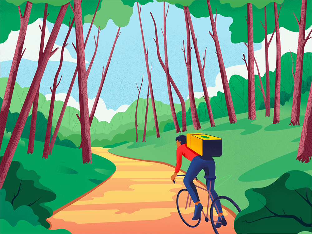
作品链接 dribbble.com
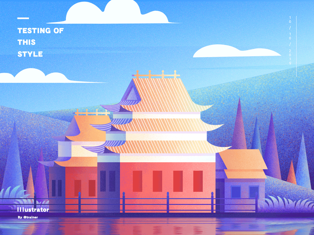
作品链接 dribbble.com
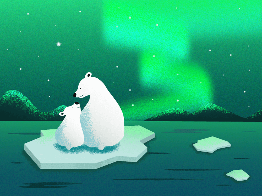
作品链接 dribbble.com

在 Photoshop 中增加噪点效果的基础操作方法:
本文中将用到以下几个 CSS 特性,正式开发之前先简单了解下。
? maskCSS 属性 mask 允许使用者通过遮罩或者裁切特定区域的图片的方式来隐藏一个元素的部分或者全部可见区域。
基本用法:
// 使用位图来做遮罩
mask: url(mask.png);
// 使用 SVG 图形中的形状来做遮罩
mask: url(masks.svg#star);
?详细用法可访问:MDN
? feTurbulence在 SVG 中,feTurbulence 滤镜利用 Perlin 噪声函数创建了一个图像。它实现了人造纹理比如说云纹、大理石纹的合成。本文中将利用该滤镜生成噪点背景图片。
?详细用法可访问:MDN
? filterCSS 属性 filter 将模糊或颜色偏移等图形效果应用于元素。可以为元素添加滤镜效果,本文中主要应用它来增强噪点视觉效果。
?详细用法可访问:MDN,也可访问我的另外一篇文章《CSS filter 有哪些神奇用途》,其中有filter应用的详细介绍。
? mix-blend-modeCSS 属性 mix-blend-mode 描述了元素的内容应该与元素的直系父元素的内容和元素的背景如何混合。
基本语法:
mix-blend-mode: normal;
mix-blend-mode: multiply;
mix-blend-mode: screen;
mix-blend-mode: overlay;
mix-blend-mode: darken;
mix-blend-mode: lighten;
mix-blend-mode: color-dodge
mix-blend-mode: color-burn;
mix-blend-mode: hard-light;
mix-blend-mode: soft-light;
mix-blend-mode: difference;
mix-blend-mode: exclusion;
mix-blend-mode: hue;
mix-blend-mode: saturation;
mix-blend-mode: color;
mix-blend-mode: luminosity;
mix-blend-mode: initial;
mix-blend-mode: inherit;
mix-blend-mode: unset;
不同 mix-blend-mode 效果:
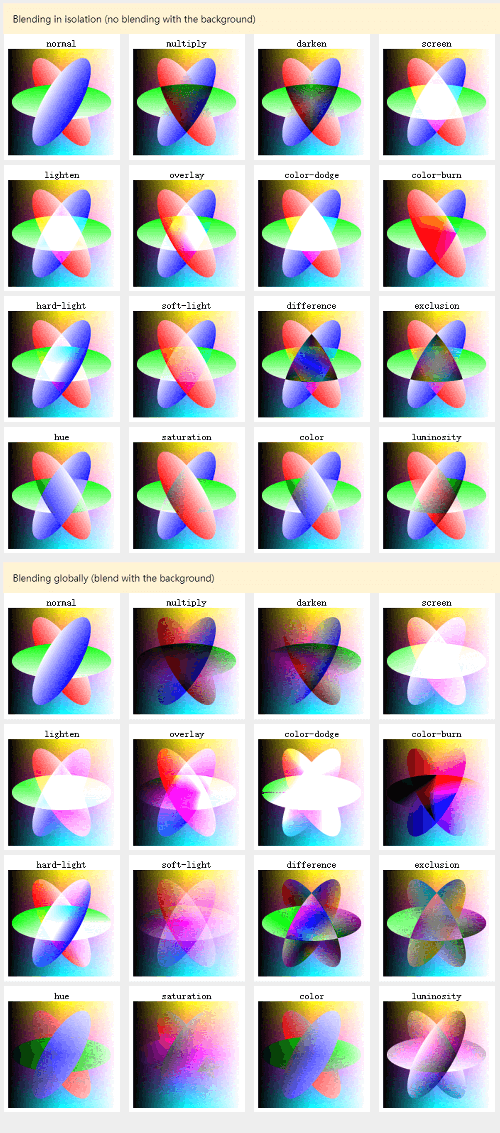
?详细用法可访问:MDN
? image-renderingCSS 属性 image-rendering 用于设置图像缩放算法。它适用于元素本身,适用于元素其他属性中的图像,也应用于子元素。
基本语法:
image-rendering: auto;
image-rendering: crisp-edges;
image-rendering: pixelated;
其中:
auto:自动,自 Gecko 1.9 起,使用双线性算法进行重新采样。crisp-edges:必须使用可有效保留对比度和图像中的边缘的算法来对图像进行缩放,并且,该算法既不会平滑颜色,又不会在处理过程中为图像引入模糊。pixelated:放大图像时,使用最近邻居算法,因此,图像看着像是由大块像素组成的。缩小图像时,算法与 auto 相同。
?详细用法可访问:MDN
以下页面是本文实现的多种噪点效果。
定义 CSS 全局变量。
:root {
  --black: #000000;
  --blue: #0072ff;
  --green: #03c03c;
  --yellow: #fffc00;
  --red: #ff4b2b;
  --orange: #f5af19;
  --pink: #ee9ca7;
  --purple: #a770ef;
}
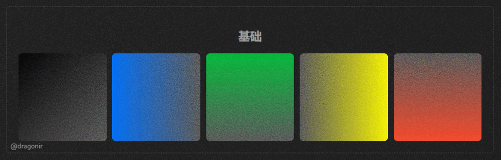
创建一个 SVG 噪点背景,后续将使用创建的 SVG 元素作为其他元素的噪点背景。
<svg viewBox="0 0 200 200" xmlns='http://www.w3.org/2000/svg'>
  <filter id='noise'>
    <feTurbulence type='fractalNoise' baseFrequency='0.65' numOctaves='3' stitchTiles='stitch' />
  </filter>
  <rect width='100%' height='100%' filter='url(#noiseFilter)' />
</svg>
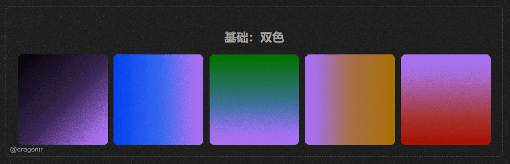
通过给 background 添加 linear-gradient 和噪点图片背景,就可实现渐变的噪点效果。
<div class="noise_0"></div>
.noise_0 {
  background: linear-gradient(to right bottom, var(--black), rgba(0, 0, 0, 0)), url(#noise);
}
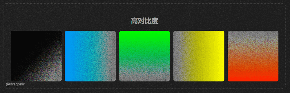
在上面的基础上,通过修改 filter 属性的对比度 contrast 和亮度 brightness,增强噪点效果得对比度。
<div class="noise_1"></div>
.noise_1 {
  filter: contrast(200%) brightness(150%);
}
使用 mix-blend-mode: multiply 实现混合双色渐变的噪点效果。
<div class="noise noise_2">
  <div class="isolate">
    <div class="gradient"></div>
    <div class="overlay"></div>
  </div>
</div>
.noise_2 {
  position: relative;
}
.noise_2 .isolate {
  isolation: isolate;
  position: relative;
  width: 100%;
  height: 100%;
}
.noise_2 .overlay {
  position: absolute;
  top: 0;
  width: 100%;
  height: 100%;
  background: var(--purple);
  mix-blend-mode: multiply;
}
.noise_2 .gradient {
  height: 100%;
  width: 100%;
  filter: contrast(200%) brightness(150%);
  background: linear-gradient(to right bottom, var(--black), rgba(0, 0, 0, 0)), url(#noise);
}
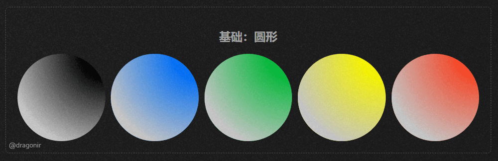
圆形的噪点元素。
<div class="noise_3">
  <div class="gradient"></div>
</div>
.noise_3 {
  border-radius: 50%;
}
.noise_3 {
  background: var(--black);
}
.noise_3 .gradient {
  width: 100%;
  height: 100%;
  background: radial-gradient(circle at 100% 0, transparent 20%, #cccccc 80%);
  mask: url(#noise), radial-gradient(circle at 100% 0, transparent 10%, #000 60%);
}
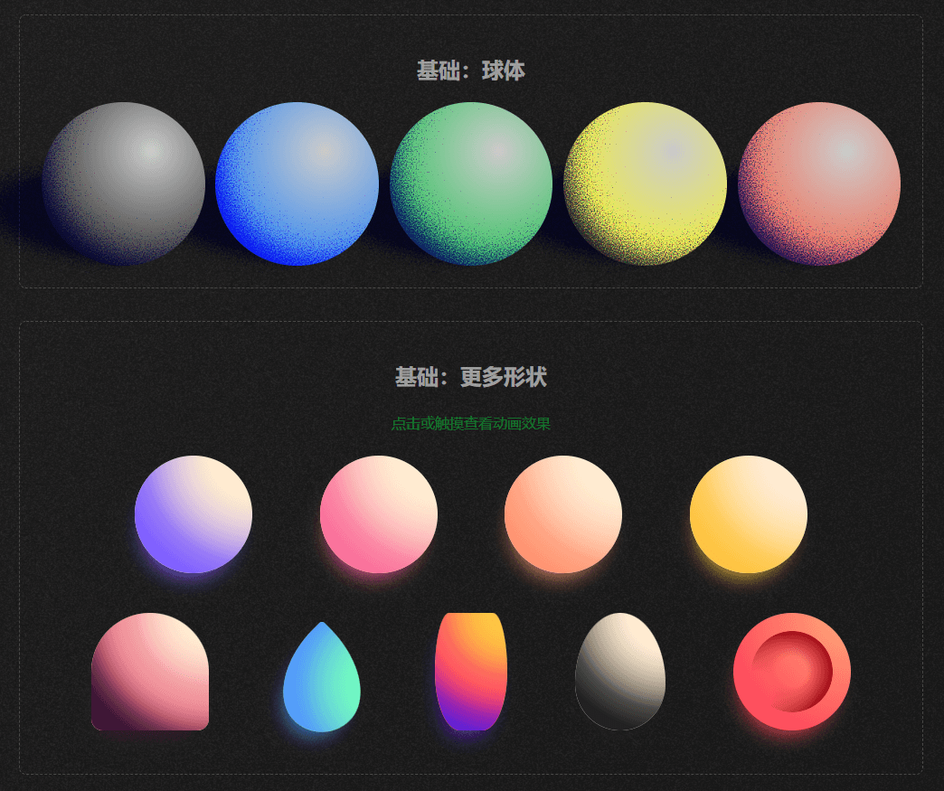
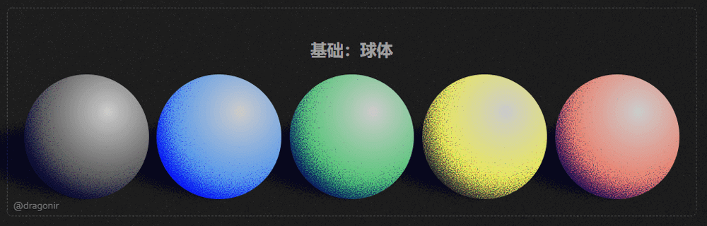
球形的噪点元素,给圆形噪点添加地面阴影和光照效果就能形成立体的球体效果。
<div class="noise noise_5">
  <div class="ground"><div class="ground-shadow"></div></div>
  <div class="ball">
    <div class="isolate">
      <div class="ball-shadow"></div>
      <div class="ball-light"></div>
    </div>
  </div>
</div>
<style>
.noise_5 {
  position: relative;
}
.noise_5 .ball {
  position: relative;
  display: flex;
  align-items: center;
  justify-content: center;
  height: 100%;
  width: 100%;
  border-radius: 50%;
  overflow: hidden;
  z-index: 20;
}
.noise_5 .isolate {
  isolation: isolate;
  position: absolute;
  top: 0;
  height: 100%;
  width: 100%;
}
.noise_5 .ball-shadow {
  height: 100%;
  background: radial-gradient(circle at 65% 35%, rgba(0, 0, 0, 0), mediumblue), url(#noise);
  filter: contrast(120%) brightness(900%);
}
.noise_5 .ground {
  position: absolute;
  width: 150%;
  height: 140px;
  bottom: -10px;
  left: -65%;
  transform: rotateZ(7deg);
  mix-blend-mode: multiply;
}
.noise_5 .ground-shadow {
  width: 95%;
  height: 140px;
  border-radius: 50%;
  background: radial-gradient(ellipse at 70%, navy, rgba(0, 0, 0, 0)), url(#noise);
  filter: contrast(150%) brightness(700%);
}
.noise_5 .ball-light {
  position: absolute;
  top: 0;
  width: 100%;
  height: 100%;
  mix-blend-mode: multiply;
  background: radial-gradient(circle at 67% 30%, #ccc, var(--black));
}
</style>
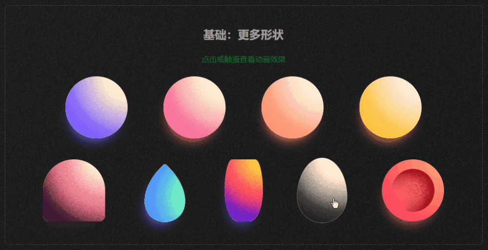
其他 3D 立体形状,包括球体、布丁 ?、水滴 ?、花瓶 ?、鸡蛋 ?、红细胞 ?等,? 鼠标悬浮到元素上面可以看到三维旋转效果。
<div class="item item--sphere item--color1"></div>
<div class="item item--pudding item--color5"></div>
<div class="item item--droplet item--color6"></div>
<div class="item item--vase item--color7"></div>
<div class="item item--egg item--color8"></div>
<div class="item item--cell"></div>
.item {
  background-color: #ffecd2;
  box-shadow: -5px 18px 25px -15px;
  overflow: hidden;
  transition: all 0.2s ease-out;
  image-rendering: pixelated;
}
.item::before {
  content: "";
  position: absolute;
  display: block;
  top: 0;
  left: 0;
  height: 100%;
  width: 400%;
  mask: url(#noise), radial-gradient(circle at 50% 0, transparent 5%, #000 80%) 0 0/50% 100%;
}
.item:hover {
  transform: scale(1.05);
}
.item:hover.item::before, .item:hover.item::after {
  animation: spin-round 3.5s linear infinite;
}
.item:active {
  animation: hue-rotate 7s infinite;
}
.item--sphere {
  border-radius: 50%;
}
.item--egg {
  width: 100.1px;
  border-radius: 50% 50% 50% 50%/60% 60% 40% 40%;
}
.item--pudding {
  width: 130px;
  height: 130px;
  border-radius: 50% 50% 10% 10%;
}
.item--pudding::after {
  content: "";
  position: absolute;
  top: 0;
  display: block;
  top: 0;
  left: 0;
  height: 100%;
  width: 400%;
  mask: url(#noise), radial-gradient(circle at 50% 0, transparent 55%, #000 85%) 0 0/50% 100%;
}
.item--droplet {
  width: 100.1px;
  height: 100.1px;
  border-radius: 5% 100% 50% 65%/5% 65% 50% 100%;
  transform: rotate(45deg);
  box-shadow: 5px 18px 25px -15px;
}
.item--droplet:hover {
  transform: rotate(45deg) scale(1.05);
}
.item--vase {
  position: relative;
  width: 80px;
  height: 130px;
  border-radius: 40% 40% 70% 70%/100%;
}
.item--vase::after {
  content: "";
  position: absolute;
  top: 0;
  display: block;
  top: 0;
  left: 0;
  height: 100%;
  width: 400%;
  mask: url(#noise), radial-gradient(circle at 50% 0, transparent 55%, #000 90%) 0 0/50% 100%;
}
.item--cell {
  width: 130px;
  height: 130px;
  border-radius: 50%;
  color: #ff4d5d;
  background: radial-gradient(circle at 100% 0, #ffa878 5%, transparent 75%), #ff4d5d;
}
.item--cell::before {
  top: 50%;
  left: 50%;
  transform: translate(-50%, -50%);
  width: 90px;
  height: 90px;
  border-radius: 50%;
  background: radial-gradient(circle at 0 75%, transparent 20%, #98000e 65%);
  mask: url(#noise), radial-gradient(circle at 50%, transparent 25%, #000 75%);
}
.item--cell:hover {
  animation: spin-flat-thick 3.5s linear infinite;
}
.item--cell:hover.item--cell::before {
  animation: spin-flat 3.5s linear infinite;
}
.item--cell:hover:active {
  animation: spin-flat-thick 3.5s linear infinite, hue-rotate 7s linear infinite;
}
.item--color1 {
  color: #7f5fff;
}
.item--color1::before {
  background: repeat-x 100% 0/50% 100% radial-gradient(circle at 50% 0, transparent 25%, #7f5fff 65%);
}
.item--color5 {
  color: #3d1635;
  background-color: #ffecd2;
}
.item--color5::before {
  background: repeat-x 100% 0/50% 100% radial-gradient(circle at 50% 0, transparent 15%, #e7627d 45%);
}
.item--color5::after {
  background: repeat-x 100% 0/50% 100% radial-gradient(circle at 50% 0, transparent 50%, #3d1635 75%);
}
.item--color6 {
  background-color: #72f9c1;
  color: #5193ff;
}
.item--color6::before {
  background: repeat-x 100% 0/50% 100% radial-gradient(circle at 50% 0, transparent 25%, #5193ff 65%);
}
.item--color7 {
  color: #5e21d6;
  background-color: #fec440;
}
.item--color7::before {
  background: repeat-x 100% 0/50% 100% radial-gradient(circle at 50% 0, transparent 15%, #fd2472 45%);
}
.item--color7::after {
  background: repeat-x 100% 0/50% 100% radial-gradient(circle at 50% 0, transparent 50%, #5e21d6 75%);
}
.item--color8 {
  color: #222;
}
.item--color8::before {
  background: repeat-x 100% 0/50% 100% radial-gradient(circle at 50% 0, transparent 25%, #222 65%);
}
多个噪点元素地叠加可以生成非常惊艳的效果,比如通过将三个噪点元素层叠在一起可以实现光学三原色 RGB 效果。
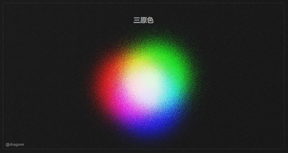
<div class="noise_6">
  <div class="circle noise-1"></div>
  <div class="circle noise-2"></div>
  <div class="circle noise-3"></div>
</div>
.noise_6 .circle {
  filter: contrast(145%) brightness(650%) invert(100%);
  mix-blend-mode: screen;
}
.noise_6 .noise-1 {
  position: absolute;
  top: 0;
  left: -10%;
  background: radial-gradient(circle at 50% 50%, rgba(0,255,255,1), rgba(0,0,0,0)), url(#noise);
}
.noise_6 .noise-2 {
  position: absolute;
  left: 10%;
  top: -30px;
  background: radial-gradient(circle at 50% 50%, rgba(255,0,255,1), rgba(0,0,0,0)), url(#noise);
}
.noise_6 .noise-3 {
  position: absolute;
  top: 50px;
  left: 4%;
  background: radial-gradient(circle at 50% 50%, rgba(255,255,0,1), rgba(0,0,0,0)), url(#noise);
}
利用噪点元素还可以实现什么呢?中心扩散效果,太阳,涟漪,荷包蛋……
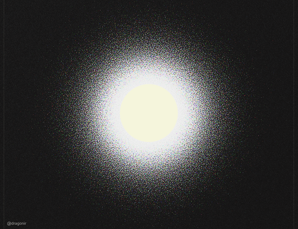
<div class="noise_7">
  <div class="noise"></div>
  <div class="center">
    <div class="circle">
    </div>
  </div>
</div>
<style>
.noise_7 {
  position: relative;
  width: 1000px;
  height: 1000px;
  margin: 0 auto;
}
.noise_7 .noise {
  width: 100%;
  height: 100%;
  background: radial-gradient(circle at 50% 50%, rgba(0, 0, 0, 1), rgba(0, 0, 0, 0)), url(#noise);
  filter: contrast(145%) brightness(650%) invert(100%);
  mix-blend-mode: screen;
}
.noise_7 .center {
  position: absolute;
  top: 0;
  width: 100%;
  height: 100%;
  display: flex;
  justify-content: center;
  align-items: center;
}
.noise_7 .circle {
  width: 200px;
  height: 200px;
  background-color: beige;
  border-radius: 50%;
}
</style>
如果仔细观察的话,页面黑色背景也应用了噪点效果,是不是有一种黑白电视机的雪花屏复古感 ?。
<div class="bg"></div>
.bg {
  position: fixed;
  top: -50%;
  left: -50%;
  right: -50%;
  bottom: -50%;
  width: 200%;
  height: 200vh;
  background: transparent url(#noise) repeat 0 0;
  background-repeat: repeat;
  animation: bg-animation .2s infinite;
  opacity: .9;
  visibility: visible;
}
@keyframes bg-animation {
  0% { transform: translate(0,0) }
  10% { transform: translate(-5%,-5%) }
  20% { transform: translate(-10%,5%) }
  30% { transform: translate(5%,-10%) }
  40% { transform: translate(-5%,15%) }
  50% { transform: translate(-10%,5%) }
  60% { transform: translate(15%,0) }
  70% { transform: translate(0,10%) }
  80% { transform: translate(-15%,0) }
  90% { transform: translate(10%,5%) }
  100% { transform: translate(5%,0) }
}
本文主要包含的知识点包括:
CSS 属性 mask 遮罩SVG 滤镜 feTurbulenceCSS 属性 filter 滤镜CSS 属性 mix-blend-mode 元素混合CSS 属性 image-rendering 图像缩放想了解其他前端知识或
WEB 3D开发技术相关知识,可阅读我往期文章。转载请注明原文地址和作者。如果觉得文章对你有帮助,不要忘了一键三连哦 ?。
......作者: dragonir 本文地址:https://www.cnblogs.com/dragonir/p/16571120.html
我正在学习如何使用Nokogiri,根据这段代码我遇到了一些问题:require'rubygems'require'mechanize'post_agent=WWW::Mechanize.newpost_page=post_agent.get('http://www.vbulletin.org/forum/showthread.php?t=230708')puts"\nabsolutepathwithtbodygivesnil"putspost_page.parser.xpath('/html/body/div/div/div/div/div/table/tbody/tr/td/div
我有一个Ruby程序,它使用rubyzip压缩XML文件的目录树。gem。我的问题是文件开始变得很重,我想提高压缩级别,因为压缩时间不是问题。我在rubyzipdocumentation中找不到一种为创建的ZIP文件指定压缩级别的方法。有人知道如何更改此设置吗?是否有另一个允许指定压缩级别的Ruby库? 最佳答案 这是我通过查看rubyzip内部创建的代码。level=Zlib::BEST_COMPRESSIONZip::ZipOutputStream.open(zip_file)do|zip|Dir.glob("**/*")d
类classAprivatedeffooputs:fooendpublicdefbarputs:barendprivatedefzimputs:zimendprotecteddefdibputs:dibendendA的实例a=A.new测试a.foorescueputs:faila.barrescueputs:faila.zimrescueputs:faila.dibrescueputs:faila.gazrescueputs:fail测试输出failbarfailfailfail.发送测试[:foo,:bar,:zim,:dib,:gaz].each{|m|a.send(m)resc
很好奇,就使用rubyonrails自动化单元测试而言,你们正在做什么?您是否创建了一个脚本来在cron中运行rake作业并将结果邮寄给您?git中的预提交Hook?只是手动调用?我完全理解测试,但想知道在错误发生之前捕获错误的最佳实践是什么。让我们理所当然地认为测试本身是完美无缺的,并且可以正常工作。下一步是什么以确保他们在正确的时间将可能有害的结果传达给您? 最佳答案 不确定您到底想听什么,但是有几个级别的自动代码库控制:在处理某项功能时,您可以使用类似autotest的内容获得关于哪些有效,哪些无效的即时反馈。要确保您的提
假设我做了一个模块如下:m=Module.newdoclassCendend三个问题:除了对m的引用之外,还有什么方法可以访问C和m中的其他内容?我可以在创建匿名模块后为其命名吗(就像我输入“module...”一样)?如何在使用完匿名模块后将其删除,使其定义的常量不再存在? 最佳答案 三个答案:是的,使用ObjectSpace.此代码使c引用你的类(class)C不引用m:c=nilObjectSpace.each_object{|obj|c=objif(Class===objandobj.name=~/::C$/)}当然这取决于
我正在尝试使用ruby和Savon来使用网络服务。测试服务为http://www.webservicex.net/WS/WSDetails.aspx?WSID=9&CATID=2require'rubygems'require'savon'client=Savon::Client.new"http://www.webservicex.net/stockquote.asmx?WSDL"client.get_quotedo|soap|soap.body={:symbol=>"AAPL"}end返回SOAP异常。检查soap信封,在我看来soap请求没有正确的命名空间。任何人都可以建议我
关闭。这个问题是opinion-based.它目前不接受答案。想要改进这个问题?更新问题,以便editingthispost可以用事实和引用来回答它.关闭4年前。Improvethisquestion我想在固定时间创建一系列低音和高音调的哔哔声。例如:在150毫秒时发出高音调的蜂鸣声在151毫秒时发出低音调的蜂鸣声200毫秒时发出低音调的蜂鸣声250毫秒的高音调蜂鸣声有没有办法在Ruby或Python中做到这一点?我真的不在乎输出编码是什么(.wav、.mp3、.ogg等等),但我确实想创建一个输出文件。
我在我的项目目录中完成了compasscreate.和compassinitrails。几个问题:我已将我的.sass文件放在public/stylesheets中。这是放置它们的正确位置吗?当我运行compasswatch时,它不会自动编译这些.sass文件。我必须手动指定文件:compasswatchpublic/stylesheets/myfile.sass等。如何让它自动运行?文件ie.css、print.css和screen.css已放在stylesheets/compiled。如何在编译后不让它们重新出现的情况下删除它们?我自己编译的.sass文件编译成compiled/t
我想将html转换为纯文本。不过,我不想只删除标签,我想智能地保留尽可能多的格式。为插入换行符标签,检测段落并格式化它们等。输入非常简单,通常是格式良好的html(不是整个文档,只是一堆内容,通常没有anchor或图像)。我可以将几个正则表达式放在一起,让我达到80%,但我认为可能有一些现有的解决方案更智能。 最佳答案 首先,不要尝试为此使用正则表达式。很有可能你会想出一个脆弱/脆弱的解决方案,它会随着HTML的变化而崩溃,或者很难管理和维护。您可以使用Nokogiri快速解析HTML并提取文本:require'nokogiri'h
我想为Heroku构建一个Rails3应用程序。他们使用Postgres作为他们的数据库,所以我通过MacPorts安装了postgres9.0。现在我需要一个postgresgem并且共识是出于性能原因你想要pggem。但是我对我得到的错误感到非常困惑当我尝试在rvm下通过geminstall安装pg时。我已经非常明确地指定了所有postgres目录的位置可以找到但仍然无法完成安装:$envARCHFLAGS='-archx86_64'geminstallpg--\--with-pg-config=/opt/local/var/db/postgresql90/defaultdb/po