文章目录
3D动画效果使页面看起来更加立体,图形更下加生动,实现原理是通过透视的视距,改变图像在人眼内成像的类型,从而达到图像立体的展示在人的眼前。
这几个动画案例均是由CSS 3D动画技术制成。大家知道javascript可以很轻松的实现动画效果
今天带大家不用js也实现一些简单的动画效果。
实现图片的翻转,可以自己制定旋转轴
实现了两个盒子的前后翻转

实现了导航栏立体化

比普通的轮播图更加立体^_^
3D动画效果展示只不过是对2D动画效果的延伸,2D动画进行定位、旋转、缩放的轴是
我们头部与电脑屏幕连线所在的直线,而3D动画效果可以自定义旋转轴。然后进行相应的操作。

在3D旋转的时候有三个轴X、Y、Z(X是横向的、Y是竖向的、Z垂直与X、Y)
 1.以X轴旋转
            transform: rotateX(45deg);
 2.以Y轴旋转
          /* transform: rotateY(45deg); */
 3.以Z轴旋转(与2D的旋转没有本质的区别)
            transform: rotateZ(45deg);
 4.综合旋转(遵守规则:各个轴的矢量和)
这个属性的作用是告诉浏览器,以3D的形式对图片进行旋转。
这个属性一般是加在需要进行变换的盒子上
以下通过翻转纽扣进行体会:
代码如下:
<!DOCTYPE html>
<html lang="en">

<head>
    <meta charset="UTF-8">
    <meta http-equiv="X-UA-Compatible" content="IE=edge">
    <meta name="viewport" content="width=device-width, initial-scale=1.0">
    <title>Document</title>
    <!--
        文字会有倒着的效果
        可以先利用旋转转动一定的角度将其隐藏在其他盒子的下面
        想要避免盒子的闪动就在盒子上继续套盒子,然后利用套的盒子对被套的盒子进行旋转
     -->
    <style>
        body {
        /*可以修改该属性,达到纽扣的不同效果的展示。*/
            perspective: 400px;
        }

        .root {
            position: relative;
            width: 300px;
            height: 300px;
            margin: 100px auto;
        }

        .root:hover .box {
            transform: rotateY(180deg);
        }

        .box {
            position: relative;
            width: 100%;
            height: 100%;
            transition: all 2s;
            transform-style: preserve-3d;
        }


        .nav,
        .qwe {
            position: absolute;
            top: 0;
            left: 0;
            width: 100%;
            height: 100%;
            border-radius: 50%;
            text-align: center;
            line-height: 300px;
            font-size: 45px;
            font-family: '幼圆';
            font-weight: 700;
            color: #fff;
            transition: all 2s;
        }

        .nav {
            background-color: cadetblue;
            z-index: 1;
        }

        .qwe {

            background-color: cornflowerblue;
            transform: rotateY(180deg);
        }
    </style>
</head>

<body>
    <div class="root">
        <div class="box">
            <div class="nav">Hello</div>
            <div class="qwe">World</div>
        </div>
    </div>


</body>

</html>
这里指物理距离不变,改变的是展示的效果(就像在平时观察真实的物
体走近了几步,观察的角度改变了)
这个属性一般加在需要变换盒子的父盒子上。
以下使用翻转飞人案例进行代码展示
修改透视距离为100px会看到飞人踢你。(嘿嘿)
代码如下:
<!DOCTYPE html>
<html lang="en">

<head>
    <meta charset="UTF-8">
    <meta http-equiv="X-UA-Compatible" content="IE=edge">
    <meta name="viewport" content="width=device-width, initial-scale=1.0">
    <title>Document</title>
    <style>
        body {
            perspective: 400px;
            /* 保持三D效果 */
            transform-style: preserve-3d;
        }

        div {
            margin: 200px auto;
            width: 300px;
            height: 300px;
            background: url(../3.gif);
            background-size: 100% 100%;
            transition: all 2s;
        }

        div:hover {
            transform: rotate3d(1, 1, 1, 360deg);

        }
    </style>
    <style></style>
</head>

<body>
    <div></div>
</body>

</html>
	这个的实现过程就是将盒子通过x轴进行旋转,直到与电脑屏幕垂直,然后添加一个新的
	盒子,与第一个盒子垂直,在鼠标聚焦在第二个盒子上的时候盒子进行90度旋转
<!DOCTYPE html>
<html lang="en">

<head>
    <meta charset="UTF-8">
    <meta http-equiv="X-UA-Compatible" content="IE=edge">
    <meta name="viewport" content="width=device-width, initial-scale=1.0">
    <title>Document</title>
    <!--
        立体导航栏刚开始都在z轴的0处,沿z轴所在的平面进行旋转,旋转轴是x轴
        视距会影响标签的显示效果,所以一般将视距与transform-style加在3D标签的父标签
    -->
    <style>
        .navrootr {
            float: left;
            position: relative;
            width: 100px;
            height: 40px;
            margin: 100px 10px;
            perspective: 400px;
        }

        .navrootr:hover .navroot {
            transform: rotateX(90deg);
        }

        .navroot {
            position: relative;
            width: 100%;
            height: 100%;
            /* perspective: 400px; */
            transform-style: preserve-3d;
            transition: all .4s;
        }

        .box1,
        .box2 {
            color: #fff;
            position: absolute;
            width: 100%;
            height: 100%;
            text-align: center;
            line-height: 40px;
        }

        .box1 {
            transform: translateZ(50%);
            background-color: teal;
            transform: translateZ(20px);
        }

        .box2 {
            background-color: cornflowerblue;
            transform: translateY(20px) rotateX(-90deg);
        }
    </style>
</head>

<body>
    <div class="navrootr">
        <div class="navroot">
            <div class="box1">哔哩哔哩</div>
            <div class="box2">百度知道</div>

        </div>
    </div>
    <div class="navrootr">
        <div class="navroot">
            <div class="box1">哔哩哔哩</div>
            <div class="box2">百度知道</div>

        </div>
    </div>
    <div class="navrootr">
        <div class="navroot">
            <div class="box1">哔哩哔哩</div>
            <div class="box2">百度知道</div>

        </div>
    </div>
    <div class="navrootr">
        <div class="navroot">
            <div class="box1">哔哩哔哩</div>
            <div class="box2">百度知道</div>

        </div>
    </div>
    <div class="navrootr">
        <div class="navroot">
            <div class="box1">哔哩哔哩</div>
            <div class="box2">百度知道</div>

        </div>
    </div>
    <div class="navrootr">
        <div class="navroot">
            <div class="box1">哔哩哔哩</div>
            <div class="box2">百度知道</div>

        </div>
    </div>


</body>

</html>
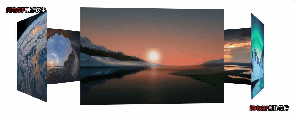
添加了6个盒子,中间一个,将每一个图片按照第一个图片先旋转,再平移
【例如translateZ(350px),沿z轴平移350px】,可以在纸上先画一个俯视图,
看看每一个图片具体旋转多少度,移动多少可以达到固定的位置。
<!DOCTYPE html>
<html lang="en">

<head>
    <meta charset="UTF-8">
    <meta http-equiv="X-UA-Compatible" content="IE=edge">
    <meta name="viewport" content="width=device-width, initial-scale=1.0">
    <title>Document</title>
    <!--
        在进行3D视角的页面布局时,应优先调整角度,再移动距离
     -->
    <style>
        @keyframes run {
            0% {
                transform: rotateY(0);
            }

            100% {
                transform: rotateY(360deg);
            }
        }

        .bodyroot {
            perspective: 1000px;
        }
        section {
            position: relative;
            width: 350px;
            height: 200px;
            background: url(../IMG_1770\(20210111-231055\).JPG) no-repeat;
            background-size: 100% 100%;
            margin: 200px auto;
            transform-style: preserve-3d;
            animation: run 6s linear infinite;
        }

        section:hover {
            animation-play-state: paused;
        }

        section div {
            position: absolute;
            top: 0px;
            left: 0px;
            width: 300px;
            height: 200px;
            background: url(../dog.jpg) no-repeat;
        }

        /* 前 */
        section div:nth-child(1) {
            transform: translateZ(350px);
            background: url(../q.jpg) no-repeat;
            background-size: 100% 100%;
        }

        /* 后 */
        section div:nth-child(2) {
            transform: rotateY(60deg) translateZ(350px);
            background: url(../w.jpg) no-repeat;
            background-size: 100% 100%;
        }

        /* 前左 */
        section div:nth-child(3) {
            transform: rotateY(120deg) translateZ(350px);
            background: url(../e.jpg) no-repeat;
            background-size: 100% 100%;
        }

        /* 前右 */
        section div:nth-child(4) {
            transform: rotateY(180deg) translateZ(350px);
            background: url(../r.jpg) no-repeat;
            background-size: 100% 100%;
        }

        /* 后左 */
        section div:nth-child(5) {
            transform: rotateY(240deg) translateZ(350px);
            background: url(../t.jpg) no-repeat;
            background-size: 100% 100%;
        }

        /* 后右 */
        section div:nth-child(6) {
            transform: rotateY(300deg) translateZ(350px);
            background: url(../y.jpg) no-repeat;
            background-size: 100% 100%;
        }
    </style>
</head>

<body>
    <div class="bodyroot">
         <section>
        <div></div>
        <div></div>
        <div></div>
        <div></div>
        <div></div>
        <div></div>
    </section>
    </div>
</body>

</html>
以上的案例将图片路径替换成你的图片所在的路径就可以直接运行,对于3D动画效果,整不清楚就画图,可以先局部后整体。
我在MiniTest::Spec和Capybara中使用以下规范:find_field('Email').must_have_css('[autofocus]')检查名为“电子邮件”的字段是否具有autofocus属性。doc说如下:has_css?(path,options={})ChecksifagivenCSSselectorisonthepageorcurrentnode.据我了解,字段“Email”是一个节点,因此调用must_have_css绝对有效!我做错了什么? 最佳答案 通过JonasNicklas得到了答案:No
我有一个div,它根据表单是否正确提交而改变。我想知道是否可以检查类的特定元素?开始元素看起来像这样。如果输入不正确,添加错误类。 最佳答案 试试这个:browser.div(:id=>"myerrortest").class_name更多信息:http://watir.github.com/watir-webdriver/doc/Watir/HTMLElement.html#class_name-instance_method另一种选择是只查看具有您期望的类的div是否存在browser.div((:id=>"myerrortes
无论您是想搭建桌面端、WEB端或者移动端APP应用,HOOPSPlatform组件都可以为您提供弹性的3D集成架构,同时,由工业领域3D技术专家组成的HOOPS技术团队也能为您提供技术支持服务。如果您的客户期望有一种在多个平台(桌面/WEB/APP,而且某些客户端是“瘦”客户端)快速、方便地将数据接入到3D应用系统的解决方案,并且当访问数据时,在各个平台上的性能和用户体验保持一致,HOOPSPlatform将帮助您完成。利用HOOPSPlatform,您可以开发在任何环境下的3D基础应用架构。HOOPSPlatform可以帮您打造3D创新型产品,HOOPSSDK包含的技术有:快速且准确的CAD
本教程将在Unity3D中混合Optitrack与数据手套的数据流,在人体运动的基础上,添加双手手指部分的运动。双手手背的角度仍由Optitrack提供,数据手套提供双手手指的角度。 01 客户端软件分别安装MotiveBody与MotionVenus并校准人体与数据手套。MotiveBodyMotionVenus数据手套使用、校准流程参照:https://gitee.com/foheart_1/foheart-h1-data-summary.git02 数据转发打开MotiveBody软件的Streaming,开始向Unity3D广播数据;MotionVenus中设置->选项选择Unit
Unity自动旋转动画1.开门需要门把手先动,门再动2.关门需要门先动,门把手再动3.中途播放过程中不可以再次进行操作觉得太复杂?查看我的文章开关门简易进阶版效果:如果这个门可以直接打开的话,就不需要放置"门把手"如果门把手还有钥匙需要旋转,那就可以把钥匙放在门把手的"门把手",理论上是可以无限套娃的可调整参数有:角度,反向,轴向,速度运行时点击Test进行测试自己写的代码比较垃圾,命名与结构比较拉,高手轻点喷,新手有类似的需求可以拿去做参考上代码usingSystem.Collections;usingSystem.Collections.Generic;usingUnityEngine;u
之前说过10之后的版本没有3dScan了,所以还是9.8的版本或者之前更早的版本。 3d物体扫描需要先下载扫描的APK进行扫面。首先要在手机上装一个扫描程序,扫描现实中的三维物体,然后上传高通官网,在下载成UnityPackage类型让Unity能够使用这个扫描程序可以从高通官网上进行下载,是一个安卓程序。点到Tools往下滑,找到VuforiaObjectScanner下载后解压数据线连接手机,将apk文件拷入手机安装然后刚才解压文件中的Media文件夹打开,两个PDF图打印第一张A4-ObjectScanningTarget.pdf,主要是用来辅助扫描的。好了,接下来就是扫描三维物体。将瓶
我开始了一个新的Rails3.2.5项目,Assets管道不再工作了。CSS和Javascript文件不再编译。这是尝试生成Assets时日志的输出:StartedGET"/assets/application.css?body=1"for127.0.0.1at2012-06-1623:59:11-0700Servedasset/application.css-200OK(0ms)[2012-06-1623:59:11]ERRORNoMethodError:undefinedmethod`each'fornil:NilClass/Users/greg/.rbenv/versions/1
rails新手。只是想了解\assests目录中的这两个文件。例如,application.js文件有如下行://=requirejquery//=requirejquery_ujs//=require_tree.我理解require_tree。只是将所有JS文件添加到当前目录中。根据上下文,我可以看出requirejquery添加了jQuery库。但是它从哪里得到这些jQuery库呢?我没有在我的Assets文件夹中看到任何jquery.js文件——或者直接在我的整个应用程序中没有看到任何jquery.js文件?同样,我正在按照一些说明安装TwitterBootstrap(http:
我正在尝试消除使用Bootstrap3的Rails4元素中的glyphicon错误。我没有使用任何Bootstrapgem将其添加到Assets管道中。我手动将bootstrap.css和bootstrap.js添加到各自的app/assets目录下,分别添加到application.css和application.js什么的我现在在网络浏览器的控制台中看到以下内容:GEThttp://localhost:3000/fonts/glyphicons-halflings-regular.woff404(NotFound)localhost/:1GEThttp://localhost:30
关闭。这个问题不符合StackOverflowguidelines.它目前不接受答案。要求我们推荐或查找工具、库或最喜欢的场外资源的问题对于StackOverflow来说是偏离主题的,因为它们往往会吸引自以为是的答案和垃圾邮件。相反,describetheproblem以及迄今为止为解决该问题所做的工作。关闭9年前。Improvethisquestion是否有适用于这些的3d游戏引擎?