flex 是css3 中一种新的布局模式,可以简单、完整、响应式地实现各种页面布局,非常适合移动端页面开发,使用flex布局来应对页面需要适应不同屏幕大小以及各种设备类型等问题,而且目前是市面上几乎所有浏览器都支持flex 布局,尤其是在移动端。

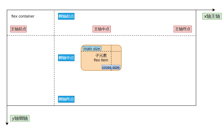
将元素的 display 属性设置为 flex,即可开启 flex 布局;
注意:开启弹性布局后,子项的 float 、clear 和vertical-align 属性将失效;
.container {
    display: flex;
}
.container {
/*01 主轴方向:从左到右(默认) | 从右到左 | 从上到下 | 从下到上*/
flex-direction: row | row-reverse | column | column-reverse;
/*02 换行:不换行(默认) | 换行 | 换行并且第一行在下方*/
flex-wrap: nowrap | wrap | wrap-reverse;
/*03 主轴方向和换行简写方式*/
flex-flow: {flex-direction} {flex-wrap};
/*04 主轴对齐方式: 靠左对齐(默认) | 靠右对齐 | 居中对齐 | 两端对齐 | 平均分布*/
justify-content: flex-start | flex-end | center | space-between | space-around;
/*05 交叉轴对齐方式: 顶部对齐(默认) | 底部对齐 | 居中对齐 | 上下对齐并铺满 | 文本基线对齐*/
align-items: flex-start | flex-end | center | baseline | stretch;
/*06 多主轴对齐方式: 顶部对齐(默认) | 底部对齐 | 居中对齐 | 上下对齐并铺满 | 上下平均分布*/
align-content: flex-start | flex-end | center | space-between | space-around | stretch;
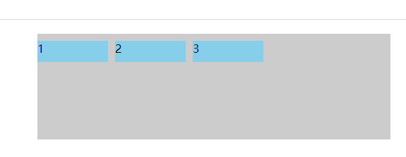
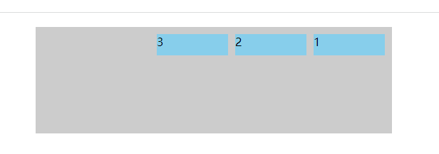
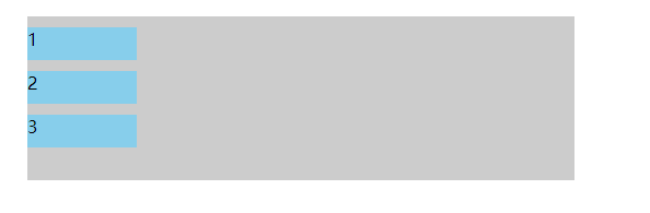
}flex-direction 属性决定主轴的方向,从而决定子元素在容器中的位置,共有四个值可选
flex-direction: row | row-reverse | column | column-reverse;<!DOCTYPE html>
<html lang="en">
<head>
<meta charset="UTF-8">
<meta name="viewport" content="width=device-width,initial-scale=1,maximum-scale=1">
<meta http-equiv="X-UA-Compatible" content="IE=EDGE">
<title>flex学习</title>
<style>
.container {
display: flex;
flex-direction: column;
width: 500px;
height: 150px;
margin: 20px auto;
background-color: #ccc;
}
.item {
width: 100px;
height: 30px;
margin-right: 10px;
margin-top: 10px;
background-color: skyblue;
}
</style>
</head>
<body>
<div class="container">
<div class="item">1</div>
<div class="item">2</div>
<div class="item">3</div>
</div>
</body>
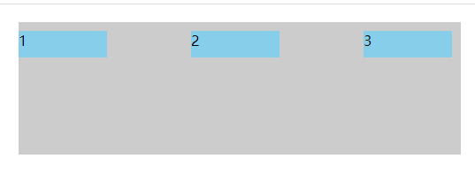
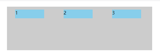
</html>(1)flex-direction:row;
(2)flex-direction:row-reverse;
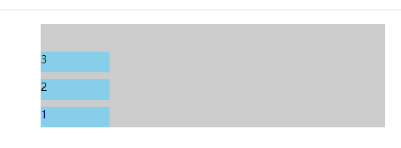
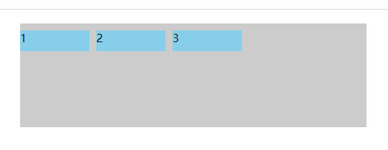
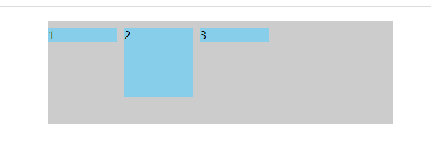
(3)flex-direction: column;
(4)flex-direction: column-reverse;
flex-wrap 属性用于指定弹性布局中子项是否换行,默认不换行,共有三个值可以选
flex-wrap: nowrap | wrap | wrap-reverse;注:使用该属性,需要为弹性容器添加固定宽度, 当弹性容器宽度超过子项宽度总和时, 值设为 wrap 或 wrap-reverse 均不起效果 ;
<!DOCTYPE html>
<html lang="en">
<head>
<meta charset="UTF-8">
<meta name="viewport" content="width=device-width,initial-scale=1,maximum-scale=1">
<meta http-equiv="X-UA-Compatible" content="IE=EDGE">
<title>flex学习</title>
<style>
.container {
display: flex;
flex-wrap: wrap;
width: 500px;
height: 150px;
margin: 20px auto;
background-color: #ccc;
}
.item {
width: 100px;
height: 30px;
margin-right: 10px;
margin-top: 10px;
background-color: skyblue;
}
</style>
</head>
<body>
<div class="container">
<div class="item">1</div>
<div class="item">2</div>
<div class="item">3</div>
<div class="item">4</div>
<div class="item">5</div>
<div class="item">6</div>
<div class="item">7</div>
</div>
</body>
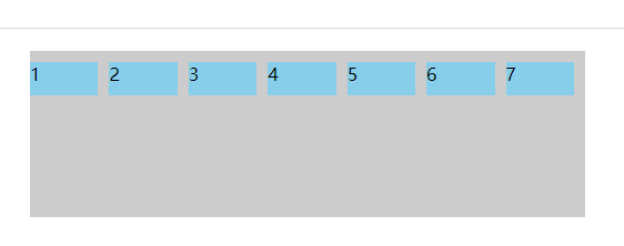
</html>(1)flex-wrap: nowrap;
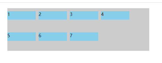
(2)flex-wrap: wrap;
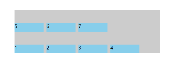
(3) flex-wrap: wrap-reverse;
flex-flow 属性是 flex-direction 属性和 flex-wrap 属性的简写形式,默认值为 row nowrap;
flex-flow: {flex-direction} {flex-wrap};
flex-flow: row nowrap;
flex-flow: row wrap;
flex-flow: row wrap-reverse;
flex-flow: column nowrap;
flex-flow: column wrap;
flex-flow: column wrap-reverse;justify-content 属性定义了子项在 主轴(水平方向x轴)上的对齐方式,可选值有:
justify-content: flex-start | flex-end | center | space-between | space-around;<!DOCTYPE html>
<html lang="en">
<head>
<meta charset="UTF-8">
<meta name="viewport" content="width=device-width,initial-scale=1,maximum-scale=1">
<meta http-equiv="X-UA-Compatible" content="IE=EDGE">
<title>flex学习</title>
<style>
.container {
display: flex;
justify-content: flex-start;
width: 500px;
height: 150px;
margin: 20px auto;
background-color: #ccc;
}
.item {
width: 100px;
height: 30px;
margin-right: 10px;
margin-top: 10px;
background-color: skyblue;
}
</style>
</head>
<body>
<div class="container">
<div class="item">1</div>
<div class="item">2</div>
<div class="item">3</div>
</div>
</body>
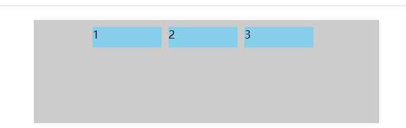
</html>(1) justify-content: flex-start;
(2) justify-content: flex-end;
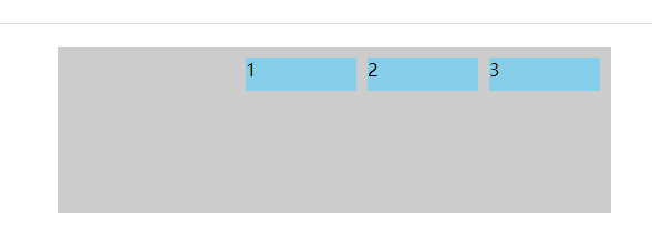
(3) justify-content: center;
(4) justify-content: space-between;
(5)justify-content: space-around;
align-items 属性定义弹性容器子项在交叉轴(垂直方向)上的对齐方式,可选值:
align-items: flex-start | flex-end | center | baseline | stretch;<!DOCTYPE html>
<html lang="en">
<head>
<meta charset="UTF-8">
<meta name="viewport" content="width=device-width,initial-scale=1,maximum-scale=1">
<meta http-equiv="X-UA-Compatible" content="IE=EDGE">
<title>flex学习</title>
<style>
.container {
display: flex;
align-items: stretch;
width: 500px;
height: 150px;
margin: 20px auto;
background-color: #ccc;
}
.item {
width: 100px;
/*height: 30px;*/
margin-right: 10px;
margin-top: 10px;
background-color: skyblue;
}
.item:nth-of-type(2) {
height: 100px;
}
</style>
</head>
<body>
<div class="container">
<div class="item">1</div>
<div class="item">2</div>
<div class="item">3</div>
</div>
</body>
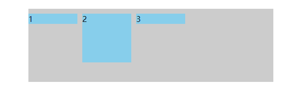
</html>(1)align-items: flex-start;
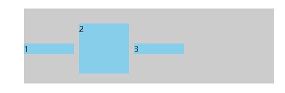
(2)align-items: flex-end;
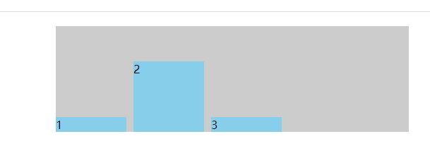
(3)align-items: center;
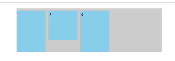
(4)align-items: baseline;
(5)align-items: stretch;
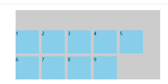
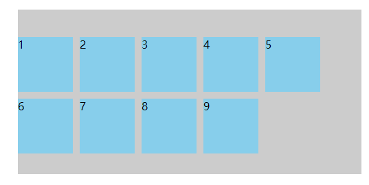
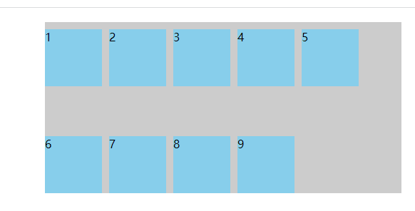
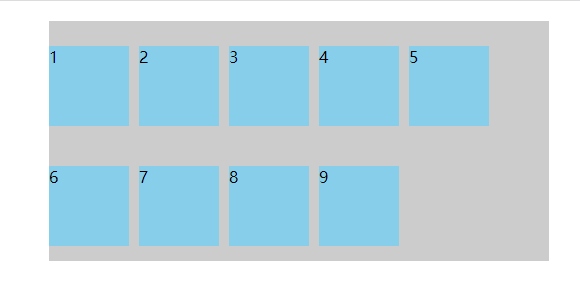
align-content 属性定义了多根轴线的对齐方式,简单说就是盒子内部的元素超过了盒子项的宽度(默认)出现了换行,也就是有多行才可以,可选值:
align-content: flex-start | flex-end | center | space-between | space-around | stretch;<!DOCTYPE html>
<html lang="en">
<head>
<meta charset="UTF-8">
<meta name="viewport" content="width=device-width,initial-scale=1,maximum-scale=1">
<meta http-equiv="X-UA-Compatible" content="IE=EDGE">
<title>flex学习</title>
<style>
.container {
display: flex;
flex-wrap: wrap;
align-content: stretch;
width: 500px;
height: 240px;
margin: 20px auto;
background-color: #ccc;
}
.item {
width: 80px;
height: 80px;
margin-right: 10px;
margin-top: 10px;
background-color: skyblue;
}
</style>
</head>
<body>
<div class="container">
<div class="item">1</div>
<div class="item">2</div>
<div class="item">3</div>
<div class="item">4</div>
<div class="item">5</div>
<div class="item">6</div>
<div class="item">7</div>
<div class="item">8</div>
<div class="item">9</div>
</div>
</body>
</html>(1)align-content: stretch;(默认)
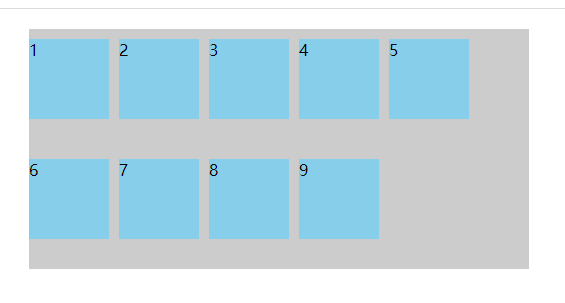
(2)align-content: flex-start;
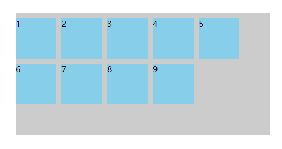
(3)align-content: flex-end;
(4)align-content: center;
(5)align-content: space-between;
(6)align-content: space-around;
我是Google云的新手,我正在尝试对其进行首次部署。我的第一个部署是RubyonRails项目。我基本上是在关注thisguideinthegoogleclouddocumentation.唯一的区别是我使用的是我自己的项目,而不是他们提供的“helloworld”项目。这是我的app.yaml文件runtime:customvm:trueentrypoint:bundleexecrackup-p8080-Eproductionconfig.ruresources:cpu:0.5memory_gb:1.3disk_size_gb:10当我转到我的项目目录并运行gcloudprevie
是否可以为特定(或所有)项目使用多个布局?例如,我有几个项目,我想对其应用两种不同的布局。一个是绿色的,一个是蓝色的(但是)。我想将它们编译到我的输出目录中的两个不同文件夹中(例如v1和v2)。我一直在玩弄规则和编译block,但我不知道这是怎么回事。因为,每个项目在编译过程中只编译一次,我不能告诉nanoc第一次用layout1编译,第二次用layout2编译。我试过这样的东西,但它导致输出文件损坏。compile'*'doifitem.binary?#don’tfilterbinaryitemselsefilter:erblayout'layout1'layout'layout2'
目录前言滤波电路科普主要分类实际情况单位的概念常用评价参数函数型滤波器简单分析滤波电路构成低通滤波器RC低通滤波器RL低通滤波器高通滤波器RC高通滤波器RL高通滤波器部分摘自《LC滤波器设计与制作》,侵权删。前言最近需要学习放大电路和滤波电路,但是由于只在之前做音乐频谱分析仪的时候简单了解过一点点运放,所以也是相当从零开始学习了。滤波电路科普主要分类滤波器:主要是从不同频率的成分中提取出特定频率的信号。有源滤波器:由RC元件与运算放大器组成的滤波器。可滤除某一次或多次谐波,最普通易于采用的无源滤波器结构是将电感与电容串联,可对主要次谐波(3、5、7)构成低阻抗旁路。无源滤波器:无源滤波器,又称
最近在学习CAN,记录一下,也供大家参考交流。推荐几个我觉得很好的CAN学习,本文也是在看了他们的好文之后做的笔记首先是瑞萨的CAN入门,真的通透;秀!靠这篇我竟然2天理解了CAN协议!实战STM32F4CAN!原文链接:https://blog.csdn.net/XiaoXiaoPengBo/article/details/116206252CAN详解(小白教程)原文链接:https://blog.csdn.net/xwwwj/article/details/105372234一篇易懂的CAN通讯协议指南1一篇易懂的CAN通讯协议指南1-知乎(zhihu.com)视频推荐CAN总线个人知识总
深度学习部署:Windows安装pycocotools报错解决方法1.pycocotools库的简介2.pycocotools安装的坑3.解决办法更多Ai资讯:公主号AiCharm本系列是作者在跑一些深度学习实例时,遇到的各种各样的问题及解决办法,希望能够帮助到大家。ERROR:Commanderroredoutwithexitstatus1:'D:\Anaconda3\python.exe'-u-c'importsys,setuptools,tokenize;sys.argv[0]='"'"'C:\\Users\\46653\\AppData\\Local\\Temp\\pip-instal
在我做的一些网络开发中,我有多个操作开始,比如对外部API的GET请求,我希望它们同时开始,因为一个不依赖另一个的结果。我希望事情能够在后台运行。我找到了concurrent-rubylibrary这似乎运作良好。通过将其混合到您创建的类中,该类的方法具有在后台线程上运行的异步版本。这导致我编写如下代码,其中FirstAsyncWorker和SecondAsyncWorker是我编写的类,我在其中混合了Concurrent::Async模块,并编写了一个名为“work”的方法来发送HTTP请求:defindexop1_result=FirstAsyncWorker.new.async.
我完全不是程序员,正在学习使用Ruby和Rails框架进行编程。我目前正在使用Ruby1.8.7和Rails3.0.3,但我想知道我是否应该升级到Ruby1.9,因为我真的没有任何升级的“遗留”成本。缺点是什么?我是否会遇到与普通gem的兼容性问题,或者甚至其他我不太了解甚至无法预料的问题? 最佳答案 你应该升级。不要坚持从1.8.7开始。如果您发现不支持1.9.2的gem,请避免使用它们(因为它们很可能不被维护)。如果您对gem是否兼容1.9.2有任何疑问,您可以在以下位置查看:http://www.railsplugins.or
如何学习ruby的正则表达式?(对于假人) 最佳答案 http://www.rubular.com/在Ruby中使用正则表达式时是一个很棒的工具,因为它可以立即将结果可视化。 关于ruby-我如何学习ruby的正则表达式?,我们在StackOverflow上找到一个类似的问题: https://stackoverflow.com/questions/1881231/
深度学习12.CNN经典网络VGG16一、简介1.VGG来源2.VGG分类3.不同模型的参数数量4.3x3卷积核的好处5.关于学习率调度6.批归一化二、VGG16层分析1.层划分2.参数展开过程图解3.参数传递示例4.VGG16各层参数数量三、代码分析1.VGG16模型定义2.训练3.测试一、简介1.VGG来源VGG(VisualGeometryGroup)是一个视觉几何组在2014年提出的深度卷积神经网络架构。VGG在2014年ImageNet图像分类竞赛亚军,定位竞赛冠军;VGG网络采用连续的小卷积核(3x3)和池化层构建深度神经网络,网络深度可以达到16层或19层,其中VGG16和VGG
文章目录1、自相关函数ACF2、偏自相关函数PACF3、ARIMA(p,d,q)的阶数判断4、代码实现1、引入所需依赖2、数据读取与处理3、一阶差分与绘图4、ACF5、PACF1、自相关函数ACF自相关函数反映了同一序列在不同时序的取值之间的相关性。公式:ACF(k)=ρk=Cov(yt,yt−k)Var(yt)ACF(k)=\rho_{k}=\frac{Cov(y_{t},y_{t-k})}{Var(y_{t})}ACF(k)=ρk=Var(yt)Cov(yt,yt−k)其中分子用于求协方差矩阵,分母用于计算样本方差。求出的ACF值为[-1,1]。但对于一个平稳的AR模型,求出其滞