先绘制一个电池,电池头部和电池的身体
这里其实就是两个div,使用z-index改变层级,电池的身体盖住头部,圆角使用border-radius完成
html部分,完整的css部分在最后
<div class="chargerBox">
     <div class="chargerHead"></div>
     <div class="chargerBody">
             <div class="water">
                  <div class="whiteBox"></div>
             </div>
     </div>

     <div class="shade"></div>
</div>
绘制电池的css部分
.chargerBox{
    width: 200px;
    height: 200px;
    background: #eee;
    margin: 30px;
    padding: 50px;
    .chargerHead{
        width: 20px;
        height: 20px;
        background: #e9e9e9;
        border-radius: 4px;
        margin: 0 auto;
        box-shadow: 0px 0px 6px -2px #6d6d6d;
        animation: light 1s forwards linear 25s;
    }
    .chargerBody{
        width: 120px;
        height: 180px;
        margin: 0 auto;
        margin-top: -12px;
        border-radius: 15px 15px 10px 10px;
        z-index: 10;
        background-color: #fff;
        box-shadow: 0px 0px 6px -2px #6d6d6d;
   }
}
绘制完身体后开始给电池充电,让电池身体内部动起来。
给电池内部添加一个div,div的初始高度为0,随着动画的播放,慢慢的充满电池
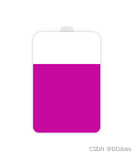
这里充电的颜色可以改成渐变,随着电量的饱和,渐变的颜色也会随之更改,linear-gradient渐变是不能直接更改颜色的,这里可以使用 filter: hue-rotate();来修改图像的色相值,从而达到渐变动画的效果。
下面是充电部分的代码:
.water{
      width: 120px;
      height: 10px;
      position: absolute;
      bottom: 0;
      background: linear-gradient(0deg,#7F7FD5,#86A8E7,#91eae4);
      filter: hue-rotate(0deg);  /**关于渐变,普通的颜色更改是无效的,只能通过filter:hue-rotate色相旋转来实现颜色变化,初始不变 */
      animation: riseWater 20s forwards  linear;
      left: 50%;
      transform: translateX(-50%);
}
@keyframes riseWater {
      from {
           height: 10px;
      }
      to {
           height: 100%;
           filter: hue-rotate(60deg);   /* 颜色变化 */
         }
}

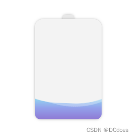
现在电池的电量已经充起来了,写到这里,充电的部分已经ok了,剩下的就是让电量动起来,像水一样流动
先绘制一个圆角矩形
border-radius: 45%
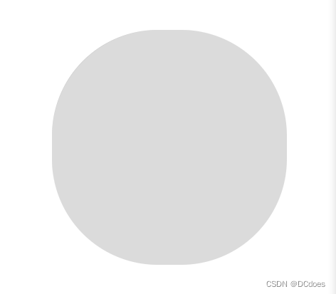
这个圆角矩形就是充电动画的关键,静止的时候其实看不出来它与水流有什么关联,咱们让它动起来观察一下

这一块就是水流动画的显示部分,白色的是水流,灰色的不展示,上一步中已经写好了充电的动画,这里只需要将该位置叠加到充电动画上面,即可完成充电的水流效果。

水流一般是多层的,所以这里可以再添加一个旋转的矩形,两个矩形旋转的角度和时长不同,并且更改其中一个矩形的rgba即可实现真实的水流效果。
.whiteBox{
         width: 300px;
         height: 300px;
         position: absolute;
         left: 50%;
         bottom: -10px;
         transform: translateX(-50%);
         animation: whiteBoxTop 25s forwards linear;

         &::before
         {
           content: '';
           width: 100%;
           height: 100%;
           position: absolute;
           background: #fff;
           border-radius: 45% ;
           animation: whiteSpin 5s infinite linear;
         }
         &::after{
           content: '';
            width: 101%;
            height: 101%;
            position: absolute;
            border-radius: 45% ;
            background: rgba(255,255,255,0.3);
            animation: whiteSpin2 7s infinite linear;
         }
}
@keyframes whiteBoxTop {
            from {
                bottom: 0;
            }
            to {
                bottom: 190px;
            }
}

@keyframes whiteSpin {
            from {
                transform:rotate(0deg);
            }
            to {
                transform:rotate(360deg);
            }
}

@keyframes whiteSpin2 {
            from {
                transform:rotate(0deg);
            }
            to {
                transform:rotate(360deg);
            }
}
注意:矩形的旋转必须是
360度的,否则会出现卡顿的情况,因为无限循环的动画第一次循环结束后会回到最初的起点,如果不是360度可能会发生旋转到某度(例如:200度)的时候度数重置到0,重新循环就会出现不流畅的画面。
做完水流动画后,给电池的头部加一个动画,延迟时间为充电设置的时间,当电池充满时,头部亮起表示电池已经充满。
我这里设置的充满时长为20s,这里需要延迟25s,因为水流的中间有凹陷的地方,所以延迟时间需要大于充满时长才行。
    .chargerHead{
        width: 20px;
        height: 20px;
        background: #e9e9e9;
        border-radius: 4px;
        margin: 0 auto;
        z-index: 10;
        box-shadow: 0px 0px 6px -2px #6d6d6d;
        animation: light 1s forwards linear 25s;  /*延迟25s*/
    }
    @keyframes light {
        from {
            background: #ffe793;
        }
        to {
            background: #ffe793;
            filter: contrast(200%);  /*让头部亮起来 增加200%的饱和度*/
        }
    }
完成这些后,需要给电池增加渐变阴影,让电池有厚度感和真实感,这里创建一个div,大小和电池一致,通过给电池添加z-index使电池覆盖div,使用filter: blur(20px)来让底部的div高斯模糊从而实现阴影的效果,阴影和电池的颜色保持一致(动态渐变),并且div的动画时长和高度也和电池保持一致。
/* 渐变阴影 */
.shade{
        width: 120px;
        height: 0px;
        margin: 0 auto;
        margin-top: 0px;
        border-radius: 15px 15px 15px 15px;
        background: linear-gradient(0deg,#7F7FD5,#86A8E7,#91eae4);
        filter: blur(10px);
        animation: shadeBase 25s forwards linear;
}
@keyframes shadeBase {
        from {
            height: 0px;
            margin-top: 0px;
            filter: blur(20px) hue-rotate(0deg);   /* 颜色变化 */
        }
        to {
            height: 180px;
            margin-top: -180px;  /*高度和电池一致*/
            filter: blur(20px) hue-rotate(60deg);   /* 颜色变化 */
        }
    }
}

除了这种方案外,还可以使用box-shadow实现阴影,box-shadow使用rgba,在动画渲染的同时修改rgba来实现阴影颜色的变化。
   @keyframes shadeBase {
        from {
            height: 0px;
            margin-top: 0px;
            box-shadow: 0px 0px 15px 10px rgba(143, 148, 227,0.2);

        }
        to {
            height: 180px;
            margin-top: -180px;
            box-shadow: 0px 5px 20px 5px rgba(203, 163, 238,0.8);
        }
    }
下面是css部分的代码
.chargerBox{
    width: 200px;
    height: 200px;
    margin: 30px;
    padding: 50px;
    .chargerHead{
        width: 20px;
        height: 20px;
        background: #e9e9e9;
        border-radius: 4px;
        margin: 0 auto;
        z-index: 10;
        box-shadow: 0px 0px 6px -2px #6d6d6d;
        animation: light 1s forwards linear 25s;
    }
    @keyframes light {
        from {
            background: #ffe793;
        }
        to {
            background: #ffe793;
            filter: contrast(200%);
        }
    }

    .chargerBody{
        width: 120px;
        height: 180px;
        margin: 0 auto;
        margin-top: -12px;
        border-radius: 15px 15px 10px 10px;
        z-index: 10;
        box-shadow: 0px 0px 6px -2px #6d6d6d;
        position: relative;
        overflow: hidden;
        .water{
            width: 120px;
            height: 10px;
            position: absolute;
            bottom: 0;
            background: linear-gradient(0deg,#7F7FD5,#86A8E7,#91eae4);
            filter: hue-rotate(0deg);  /**关于渐变,普通的颜色更改是无效的,只能通过filter:hue-rotate色相旋转来实现颜色变化,初始不变 */
            animation: riseWater 20s forwards  linear;
            left: 50%;
            transform: translateX(-50%);
        }
        @keyframes riseWater {
            from {
                height: 10px;
            }
            to {
                height: 100%;
                filter: hue-rotate(60deg);   /* 颜色变化 */
            }
        }


        .whiteBox{
            width: 300px;
            height: 300px;
            position: absolute;
            left: 50%;
            bottom: -10px;
            transform: translateX(-50%);
            animation: whiteBoxTop 25s forwards linear;

            &::before
            {
                content: '';
                width: 100%;
                height: 100%;
                position: absolute;
                background: #fff;
                border-radius: 45% ;
                animation: whiteSpin 5s infinite linear;
            }
            &::after{
                content: '';
                width: 101%;
                height: 101%;
                position: absolute;
                border-radius: 45% ;
                background: rgba(255,255,255,0.3);
                animation: whiteSpin2 7s infinite linear;
            }
        }
        @keyframes whiteBoxTop {
            from {
                bottom: 0;
            }
            to {
                bottom: 190px;
            }
        }
        @keyframes whiteSpin {
            from {
                transform:rotate(0deg);
            }
            to {
                transform:rotate(360deg);
            }
        }
        @keyframes whiteSpin2 {
            from {
                transform:rotate(0deg);
            }
            to {
                transform:rotate(360deg);
            }
        }
    }


    /* 渐变阴影 */
    .shade{
        width: 120px;
        height: 0px;
        margin: 0 auto;
        margin-top: 0px;
        border-radius: 15px 15px 15px 15px;
        background: linear-gradient(0deg,#7F7FD5,#86A8E7,#91eae4);
        filter: blur(10px);
        animation: shadeBase 25s forwards linear;
    }
    @keyframes shadeBase {
        from {
            height: 0px;
            margin-top: 0px;
            filter: blur(20px) hue-rotate(0deg);   /* 颜色变化 */
        }
        to {
            height: 180px;
            margin-top: -180px;
            filter: blur(20px) hue-rotate(60deg);   /* 颜色变化 */
        }
    }
}
该动画的灵感来自:https://github.com/chokcoco/iCSS/issues/75
案例源码:https://gitee.com/wang_fan_w/css-diary
如果觉得这篇文章对你有帮助,欢迎点赞、收藏、转发哦~
我在MiniTest::Spec和Capybara中使用以下规范:find_field('Email').must_have_css('[autofocus]')检查名为“电子邮件”的字段是否具有autofocus属性。doc说如下:has_css?(path,options={})ChecksifagivenCSSselectorisonthepageorcurrentnode.据我了解,字段“Email”是一个节点,因此调用must_have_css绝对有效!我做错了什么? 最佳答案 通过JonasNicklas得到了答案:No
我有一个用户工厂。我希望默认情况下确认用户。但是鉴于unconfirmed特征,我不希望它们被确认。虽然我有一个基于实现细节而不是抽象的工作实现,但我想知道如何正确地做到这一点。factory:userdoafter(:create)do|user,evaluator|#unwantedimplementationdetailshereunlessFactoryGirl.factories[:user].defined_traits.map(&:name).include?(:unconfirmed)user.confirm!endendtrait:unconfirmeddoenden
我有一个div,它根据表单是否正确提交而改变。我想知道是否可以检查类的特定元素?开始元素看起来像这样。如果输入不正确,添加错误类。 最佳答案 试试这个:browser.div(:id=>"myerrortest").class_name更多信息:http://watir.github.com/watir-webdriver/doc/Watir/HTMLElement.html#class_name-instance_method另一种选择是只查看具有您期望的类的div是否存在browser.div((:id=>"myerrortes
华为OD机试题本篇题目:明明的随机数题目输入描述输出描述:示例1输入输出说明代码编写思路最近更新的博客华为od2023|什么是华为od,od薪资待遇,od机试题清单华为OD机试真题大全,用Python解华为机试题|机试宝典【华为OD机试】全流程解析+经验分享,题型分享,防作弊指南华为o
Unity自动旋转动画1.开门需要门把手先动,门再动2.关门需要门先动,门把手再动3.中途播放过程中不可以再次进行操作觉得太复杂?查看我的文章开关门简易进阶版效果:如果这个门可以直接打开的话,就不需要放置"门把手"如果门把手还有钥匙需要旋转,那就可以把钥匙放在门把手的"门把手",理论上是可以无限套娃的可调整参数有:角度,反向,轴向,速度运行时点击Test进行测试自己写的代码比较垃圾,命名与结构比较拉,高手轻点喷,新手有类似的需求可以拿去做参考上代码usingSystem.Collections;usingSystem.Collections.Generic;usingUnityEngine;u
C#实现简易绘图工具一.引言实验目的:通过制作窗体应用程序(C#画图软件),熟悉基本的窗体设计过程以及控件设计,事件处理等,熟悉使用C#的winform窗体进行绘图的基本步骤,对于面向对象编程有更加深刻的体会.Tutorial任务设计一个具有基本功能的画图软件**·包括简单的新建文件,保存,重新绘图等功能**·实现一些基本图形的绘制,包括铅笔和基本形状等,学习橡皮工具的创建**·设计一个合理舒适的UI界面**注明:你可能需要先了解一些关于winform窗体应用程序绘图的基本知识,以及关于GDI+类和结构的知识二.实验环境Windows系统下的visualstudio2017C#窗体应用程序三.
MIMO技术的优缺点优点通过下面三个增益来总体概括:阵列增益。阵列增益是指由于接收机通过对接收信号的相干合并而活得的平均SNR的提高。在发射机不知道信道信息的情况下,MIMO系统可以获得的阵列增益与接收天线数成正比复用增益。在采用空间复用方案的MIMO系统中,可以获得复用增益,即信道容量成倍增加。信道容量的增加与min(Nt,Nr)成正比分集增益。在采用空间分集方案的MIMO系统中,可以获得分集增益,即可靠性性能的改善。分集增益用独立衰落支路数来描述,即分集指数。在使用了空时编码的MIMO系统中,由于接收天线或发射天线之间的间距较远,可认为它们各自的大尺度衰落是相互独立的,因此分布式MIMO
遍历文件夹我们通常是使用递归进行操作,这种方式比较简单,也比较容易理解。本文为大家介绍另一种不使用递归的方式,由于没有使用递归,只用到了循环和集合,所以效率更高一些!一、使用递归遍历文件夹整体思路1、使用File封装初始目录,2、打印这个目录3、获取这个目录下所有的子文件和子目录的数组。4、遍历这个数组,取出每个File对象4-1、如果File是否是一个文件,打印4-2、否则就是一个目录,递归调用代码实现publicclassSearchFile{publicstaticvoidmain(String[]args){//初始目录Filedir=newFile("d:/Dev");Datebeg
通常,数组被实现为内存块,集合被实现为HashMap,有序集合被实现为跳跃列表。在Ruby中也是如此吗?我正在尝试从性能和内存占用方面评估Ruby中不同容器的使用情况 最佳答案 数组是Ruby核心库的一部分。每个Ruby实现都有自己的数组实现。Ruby语言规范只规定了Ruby数组的行为,并没有规定任何特定的实现策略。它甚至没有指定任何会强制或至少建议特定实现策略的性能约束。然而,大多数Rubyist对数组的性能特征有一些期望,这会迫使不符合它们的实现变得默默无闻,因为实际上没有人会使用它:插入、前置或追加以及删除元素的最坏情况步骤复
在ruby中,你可以这样做:classThingpublicdeff1puts"f1"endprivatedeff2puts"f2"endpublicdeff3puts"f3"endprivatedeff4puts"f4"endend现在f1和f3是公共(public)的,f2和f4是私有(private)的。内部发生了什么,允许您调用一个类方法,然后更改方法定义?我怎样才能实现相同的功能(表面上是创建我自己的java之类的注释)例如...classThingfundeff1puts"hey"endnotfundeff2puts"hey"endendfun和notfun将更改以下函数定