接着上周写的截图控件继续更新 绘制方框与椭圆。
1.WPF实现截屏「仿微信」
2.WPF 实现截屏控件之移动(二)「仿微信」
3.WPF 截图控件之伸缩(三) 「仿微信」
有开发者在B站反馈第三篇有Issues已修复。
实现在截图区域内绘制 方框与椭圆 有两种方式
1)可以在截图的区域内部添加一个Canvas宽高填充至区域内,在进行绘制方框或椭圆。
2)直接在外层的Canvas中添加,这样需要判断鼠标按下的位置和移动的位置必须在已截图区域内,如超出范围也不绘制到区域外。
本章使用了第二种方式
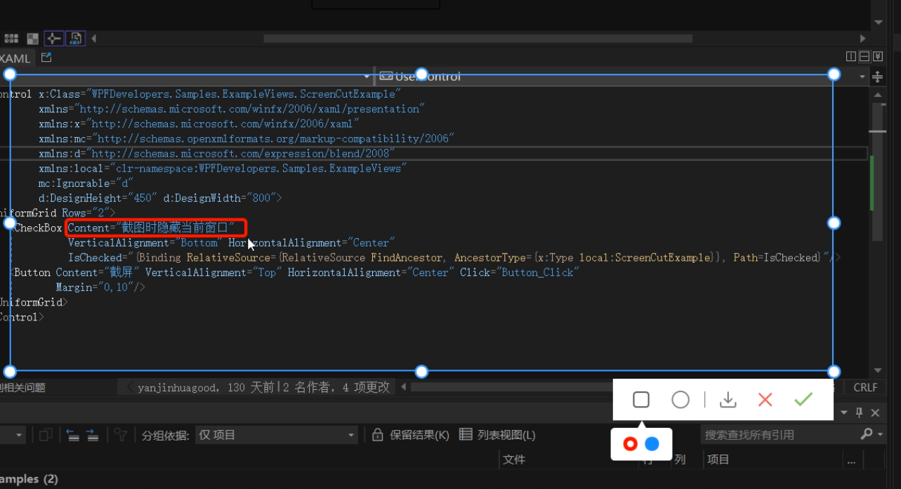
此篇更新截图时隐藏当前窗口
一、首先接着ScreenCut继续发电。
新增定义 画方框、椭圆、颜色选择框Popup、Popup内部Border、Border内部RadioButton的父容器
     [TemplatePart(Name = RadioButtonRectangleTemplateName, Type = typeof(RadioButton))]
  [TemplatePart(Name = RadioButtonEllipseTemplateName, Type = typeof(RadioButton))]
  [TemplatePart(Name = PopupTemplateName, Type = typeof(Popup))]
  [TemplatePart(Name = PopupBorderTemplateName, Type = typeof(Border))]
  [TemplatePart(Name = WrapPanelColorTemplateName, Type = typeof(WrapPanel))]

     private const string RadioButtonRectangleTemplateName = "PART_RadioButtonRectangle";
      private const string RadioButtonEllipseTemplateName = "PART_RadioButtonEllipse";
      private const string PopupTemplateName = "PART_Popup";
      private const string PopupBorderTemplateName = "PART_PopupBorder";
      private const string WrapPanelColorTemplateName = "PART_WrapPanelColor";
      private Popup _popup;
      private WrapPanel _wrapPanel;

      /// <summary>
      /// 当前绘制矩形
      /// </summary>
      private Border borderRectangle;
      /// <summary>
      /// 绘制当前椭圆
      /// </summary>
      private Ellipse drawEllipse;
      /// <summary>
      /// 当前选择颜色
      /// </summary>
      private Brush _currentBrush;
新增RadioButtonStyles为了选择方框、椭圆、颜色
<ResourceDictionary xmlns="http://schemas.microsoft.com/winfx/2006/xaml/presentation"
                   xmlns:x="http://schemas.microsoft.com/winfx/2006/xaml">

   <ResourceDictionary.MergedDictionaries>
       <ResourceDictionary Source="Basic/ControlBasic.xaml"/>
   </ResourceDictionary.MergedDictionaries>

   <Style x:Key="PathRadioButton" TargetType="{x:Type RadioButton}" BasedOn="{StaticResource ControlBasicStyle}">
       <Setter Property="FocusVisualStyle" Value="{x:Null}"/>
       <Setter Property="FrameworkElement.OverridesDefaultStyle" Value="True" />
       <Setter Property="HorizontalContentAlignment" Value="Center" />
       <Setter Property="VerticalContentAlignment" Value="Center" />
       <Setter Property="BorderThickness" Value="1" />
       <Setter Property="Padding" Value="8" />
       <Setter Property="Cursor" Value="Hand"/>
       <Setter Property="Template">
           <Setter.Value>
               <ControlTemplate TargetType="{x:Type RadioButton}">
                   <Border Background="Transparent">
                       <ContentPresenter HorizontalAlignment="{TemplateBinding HorizontalContentAlignment}"
                                         Margin="{TemplateBinding Padding}"
                                         VerticalAlignment="{TemplateBinding VerticalContentAlignment}"
                                         x:Name="PART_ContentPresenter" Opacity=".8"/>
                   </Border>
                   <ControlTemplate.Triggers>
                       <Trigger Property="IsChecked" Value="True">
                           <Setter Property="Opacity" TargetName="PART_ContentPresenter" Value="1"/>
                       </Trigger>
                       <Trigger Property="IsMouseOver" Value="True">
                           <Setter Property="Opacity" TargetName="PART_ContentPresenter" Value="1"/>
                       </Trigger>
                   </ControlTemplate.Triggers>
               </ControlTemplate>
           </Setter.Value>
       </Setter>
   </Style>

   <Style x:Key="ColorRadioButton" TargetType="{x:Type RadioButton}" BasedOn="{StaticResource ControlBasicStyle}">
       <Setter Property="FocusVisualStyle" Value="{x:Null}"/>
       <Setter Property="FrameworkElement.OverridesDefaultStyle" Value="True" />
       <Setter Property="HorizontalContentAlignment" Value="Center" />
       <Setter Property="VerticalContentAlignment" Value="Center" />
       <Setter Property="Padding" Value="8" />
       <Setter Property="Width" Value="15"/>
       <Setter Property="Height" Value="15"/>
       <Setter Property="Cursor" Value="Hand"/>
       <Setter Property="Template">
           <Setter.Value>
               <ControlTemplate TargetType="{x:Type RadioButton}">
                   <Border Background="{TemplateBinding Background}"
                           BorderThickness="0"
                           x:Name="PART_Border"
                           CornerRadius="7"
                           Width="{TemplateBinding Width}"
                           Height="{TemplateBinding Height}">
                       <VisualStateManager.VisualStateGroups>
                           <VisualStateGroup x:Name="CheckStates">
                               <VisualState x:Name="Checked">
                                   <Storyboard>
                                       <ObjectAnimationUsingKeyFrames Storyboard.TargetProperty="(UIElement.Visibility)"
                                                Storyboard.TargetName="PART_Ellipse">
                                           <DiscreteObjectKeyFrame KeyTime="0"
                                           Value="{x:Static Visibility.Visible}" />
                                       </ObjectAnimationUsingKeyFrames>
                                   </Storyboard>
                               </VisualState>
                               <VisualState x:Name="Unchecked" />
                               <VisualState x:Name="Indeterminate" />
                           </VisualStateGroup>
                       </VisualStateManager.VisualStateGroups>
                       <Ellipse x:Name="PART_Ellipse"
                                Width="7"
                                Height="7"
                                Fill="{DynamicResource WhiteSolidColorBrush}"
                                Visibility="Collapsed"/>
                   </Border>
                   <ControlTemplate.Triggers>
                       <Trigger Property="IsMouseOver" Value="True">
                           <Setter Property="Opacity" Value=".8"/>
                       </Trigger>
                   </ControlTemplate.Triggers>
               </ControlTemplate>
           </Setter.Value>
       </Setter>
   </Style>

</ResourceDictionary>
ScreenCut.xaml增加代码如下
<RadioButton x:Name="PART_RadioButtonRectangle"
                                                Style="{DynamicResource PathRadioButton}"
                                                ToolTip="方框"
                                               Margin="4,0">
                                      <RadioButton.Content>
                                          <Path Fill="{DynamicResource RegularTextSolidColorBrush}"
                                        Width="18" Height="18" Stretch="Fill"
                                        Data="{StaticResource PathRectangle}"/>
                                      </RadioButton.Content>
                                  </RadioButton>
                                  <RadioButton x:Name="PART_RadioButtonEllipse"
                                                Style="{DynamicResource PathRadioButton}"
                                                ToolTip="椭圆"
                                               Margin="4,0">
                                      <ToggleButton.Content>
                                          <Ellipse Width="19" Height="19"
                                                   StrokeThickness="1.5"
                                                   SnapsToDevicePixels="True"
                                                   UseLayoutRounding="True"
                                                   Stroke="{DynamicResource RegularTextSolidColorBrush}"/>
                                      </ToggleButton.Content>
                                  </RadioButton>

<Popup x:Name="PART_Popup"
                                 AllowsTransparency="True"
                                 Placement="Bottom"
                                 VerticalOffset="13">
                              <Border Effect="{DynamicResource PopupShadowDepth}"
                                      Background="{DynamicResource WhiteSolidColorBrush}"
                                      Margin="10,30,10,10"
                                      CornerRadius="{Binding Path=(helpers:ControlsHelper.CornerRadius),RelativeSource={RelativeSource TemplatedParent}}"
                                      x:Name="PART_PopupBorder">
                                  <Grid>
                                      <Path Data="{StaticResource PathUpperTriangle}"
                                        Fill="{DynamicResource WhiteSolidColorBrush}"
                                        Stretch="Uniform"
                                        Width="10" VerticalAlignment="Top"
                                        Margin="0,-8,0,0"
                                        SnapsToDevicePixels="True"
                                        UseLayoutRounding="True"/>
                                      <WrapPanel Margin="10"
                                                 VerticalAlignment="Center"
                                                 x:Name="PART_WrapPanelColor">
                                          <RadioButton Style="{DynamicResource ColorRadioButton}"
                                                       Margin="4,0" Background="Red"
                                                       IsChecked="True">
                                          </RadioButton>
                                          <RadioButton Style="{DynamicResource ColorRadioButton}"
                                                       Margin="4,0"
                                                       Background="DodgerBlue">
                                          </RadioButton>
                                      </WrapPanel>
                                  </Grid>
                              </Border>
                          </Popup>
二、ScreenCut.cs 增加的后台逻辑如下
2.1 RadioButton选中方框和椭圆的切换Popup并设置ScreenCutMouseType枚举和鼠标:
    _radioButtonRectangle = GetTemplateChild(RadioButtonRectangleTemplateName) as RadioButton;
         if (_radioButtonRectangle != null)
             _radioButtonRectangle.Click += _radioButtonRectangle_Click;
         _radioButtonEllipse = GetTemplateChild(RadioButtonEllipseTemplateName) as RadioButton;
         if (_radioButtonEllipse != null)
             _radioButtonEllipse.Click += _radioButtonEllipse_Click;
             private void _radioButtonRectangle_Click(object sender, RoutedEventArgs e)
     {
         RadioButtonChecked(_radioButtonRectangle, ScreenCutMouseType.DrawRectangle);
     }
     private void _radioButtonEllipse_Click(object sender, RoutedEventArgs e)
     {
         RadioButtonChecked(_radioButtonEllipse, ScreenCutMouseType.DrawEllipse);
     }
     void RadioButtonChecked(RadioButton radioButton, ScreenCutMouseType screenCutMouseTypeRadio)
     {
         if (radioButton.IsChecked == true)
         {
             screenCutMouseType = screenCutMouseTypeRadio;
             _border.Cursor = Cursors.Arrow;
             if (_popup.PlacementTarget != null && _popup.IsOpen)
                 _popup.IsOpen = false;
             _popup.PlacementTarget = radioButton;
             _popup.IsOpen = true;
         }
         else
         {
             if (screenCutMouseType == screenCutMouseTypeRadio)
                 Restore();

         }
     }
     void Restore()
     {
         _border.Cursor = Cursors.SizeAll;
         if (screenCutMouseType == ScreenCutMouseType.Default) return;
         screenCutMouseType = ScreenCutMouseType.Default;
     }
2.2 ScreenCut绘制方框和椭圆代码如下:
void DrawMultipleControl(Point current)
        {
            if (current == pointStart) return;

            if (current.X > rect.BottomRight.X
                ||
                current.Y > rect.BottomRight.Y)
                return;
            var drawRect = new Rect(pointStart, current);
            switch (screenCutMouseType)
            {
                case ScreenCutMouseType.DrawRectangle:
                    if (borderRectangle == null)
                    {
                        borderRectangle = new Border()
                        {
                            BorderBrush = _currentBrush == null ? Brushes.Red : _currentBrush,
                            BorderThickness = new Thickness(3),
                            CornerRadius = new CornerRadius(3),
                        };
                        _canvas.Children.Add(borderRectangle);
                    }
                    break;
                case ScreenCutMouseType.DrawEllipse:
                    if (drawEllipse == null)
                    {
                        drawEllipse = new Ellipse()
                        {
                            Stroke = _currentBrush == null ? Brushes.Red : _currentBrush,
                            StrokeThickness = 3,
                        };
                        _canvas.Children.Add(drawEllipse);
                    }
                    break;

            }

            var _borderLeft = drawRect.Left - Canvas.GetLeft(_border);

            if (_borderLeft < 0)
                _borderLeft = Math.Abs(_borderLeft);
            if (drawRect.Width + _borderLeft < _border.ActualWidth)
            {
                var wLeft = Canvas.GetLeft(_border) + _border.ActualWidth;
                var left = drawRect.Left < Canvas.GetLeft(_border) ? Canvas.GetLeft(_border) : drawRect.Left > wLeft ? wLeft : drawRect.Left;
                if (borderRectangle != null)
                {
                    borderRectangle.Width = drawRect.Width;
                    Canvas.SetLeft(borderRectangle, left);
                }
                if (drawEllipse != null)
                {
                    drawEllipse.Width = drawRect.Width;
                    Canvas.SetLeft(drawEllipse, left);
                }


            }

            var _borderTop = drawRect.Top - Canvas.GetTop(_border);
            if(_borderTop < 0)
                _borderTop = Math.Abs(_borderTop);
            if (drawRect.Height + _borderTop < _border.ActualHeight)
            {
                var hTop = Canvas.GetTop(_border) + _border.Height;
                var top = drawRect.Top < Canvas.GetTop(_border) ? Canvas.GetTop(_border) : drawRect.Top > hTop ? hTop : drawRect.Top;
                if (borderRectangle != null)
                {
                    borderRectangle.Height = drawRect.Height;
                    Canvas.SetTop(borderRectangle, top);
                }

                if (drawEllipse != null)
                {
                    drawEllipse.Height = drawRect.Height;
                    Canvas.SetTop(drawEllipse, top);
                }

            }
        }
2.3 Popup跟随问题这里解决办法是先关闭再打开代码如下:
 if (_popup != null && _popup.IsOpen)
           {
               _popup.IsOpen = false;
               _popup.IsOpen = true;
           }
2.4 ScreenCut使用方式如下:
 public partial class ScreenCutExample : UserControl
   {
       public bool IsChecked
       {
           get { return (bool)GetValue(IsCheckedProperty); }
           set { SetValue(IsCheckedProperty, value); }
       }

       public static readonly DependencyProperty IsCheckedProperty =
           DependencyProperty.Register("IsChecked", typeof(bool), typeof(ScreenCutExample), new PropertyMetadata(false));


       public ScreenCutExample()
       {
           InitializeComponent();
       }

       private void Button_Click(object sender, RoutedEventArgs e)
       {
           var screenCut = new ScreenCut();
           if (IsChecked)
           {
               App.CurrentMainWindow.WindowState = WindowState.Minimized;
               screenCut.Show();
               screenCut.Activate();
           }
           else
               screenCut.ShowDialog();
       }
   }
前言一般来说,前端根据后台返回code码展示对应内容只需要在前台判断code值展示对应的内容即可,但要是匹配的code码比较多或者多个页面用到时,为了便于后期维护,后台就会使用字典表让前端匹配,下面我将在微信小程序中通过wxs的方法实现这个操作。为什么要使用wxs?{{method(a,b)}}可以看到,上述代码是一个调用方法传值的操作,在vue中很常见,多用于数据之间的转换,但由于微信小程序诸多限制的原因,你并不能优雅的这样操作,可能有人会说,为什么不用if判断实现呢?但是if判断的局限性在于如果存在数据量过大时,大量重复性操作和if判断会让你的代码显得异常冗余。wxswxs相当于是一个独立
项目介绍随着我国经济迅速发展,人们对手机的需求越来越大,各种手机软件也都在被广泛应用,但是对于手机进行数据信息管理,对于手机的各种软件也是备受用户的喜爱小学生兴趣延时班预约小程序的设计与开发被用户普遍使用,为方便用户能够可以随时进行小学生兴趣延时班预约小程序的设计与开发的数据信息管理,特开发了小程序的设计与开发的管理系统。小学生兴趣延时班预约小程序的设计与开发的开发利用现有的成熟技术参考,以源代码为模板,分析功能调整与小学生兴趣延时班预约小程序的设计与开发的实际需求相结合,讨论了小学生兴趣延时班预约小程序的设计与开发的使用。开发环境开发说明:前端使用微信微信小程序开发工具:后端使用ssm:VU
@作者:SYFStrive @博客首页:HomePage📜:微信小程序📌:个人社区(欢迎大佬们加入)👉:社区链接🔗📌:觉得文章不错可以点点关注👉:专栏连接🔗💃:感谢支持,学累了可以先看小段由小胖给大家带来的街舞👉微信小程序(🔥)目录自定义组件-behaviors 1、什么是behaviors 2、behaviors的工作方式 3、创建behavior 4、导入并使用behavior 5、behavior中所有可用的节点 6、同名字段的覆盖和组合规则总结最后自定义组件-behaviors 1、什么是behaviorsbehaviors是小程序中,用于实现
电脑上可以截取图片吗?如果可以,该如何操作呢?相信很多小伙伴都只知道一两种截图的方式,知道的并不全面。其实,电脑上有多种方式截图的,而且非常方便。电脑怎么截图?今天我们就来教大家如何使用电脑截取图片的8种常用方式!操作环境:演示机型:Delloptiplex7050系统版本:Windows10方法一:系统自带截图具体操作:同时按下电脑的自带截图键【Windows+shift+S】,可以选择其中一种方式来截取图片:截屏有矩形截屏、任意形状截屏、窗口截屏和全屏截图。 方法二:QQ截图具体操作:在电脑登录QQ,然后同时按下【Ctrl+Alt+A】,可以任意截图你需要的界面,可以把截图的页面直接下载,
提供3种Ubuntu系统安装微信的方法,在Ubuntu20.04上验证都ok。1.WineHQ7.0安装微信:ubuntu20.04安装最新版微信--可以支持微信最新版,但是适配的不是特别好;比如WeChartOCR.exe报错。2.原生微信安装:linux系统下的微信安装(ubuntu20.04)--微信适配的最好,反应最快,但是微信版本只到2.1.1,版本太老,很多功能都没有。3.深度deepin-wine6安装微信:ubuntu20.04+系统deepin-wine6安装新版微信--综合比较好,当前个人使用此种方法1个月,微信版本3.4;没什么大问题,尚可。一、WineHQ7.0安装微信
对传统的餐饮商家来说,小程序很好地解决了餐厅线下线上连接的问题,在引流获客、节约人力、营销宣传、塑造会员体系、改善消费体验等方面都有很大帮助。小程序点餐可以帮助餐饮企业节省一大把人力开支。一个包含扫码点单、菜品管理、优惠券推送、外卖配送的小程序,商家花几万元就能完成开发测试并投入。商家为什么要开通“扫码点餐”1.解决服务员不够用的问题。2.不怕顾客跑单漏单。3.在微信就能管理菜品、查看营业额。4.订单小票显示顾客桌号和已点菜品。5.可在“附近的小程序”找到您的门店。如今餐饮业常用的三种经营模式:1堂食点单模式客人通过小程序堂食点单。商家可以在微信扫码点餐小程序管理后台根据自己店内情况来设置不同
在开发微信小程序的时候,我们可能需要开发环境和测试环境,或者其他环境,下面是切换环境的方法。首先需要明确的是:前端的页面代码是不区分环境的,环境的区分指的是云函数、云数据库、云存储这些。1、更改云函数的使用云环境这里我们从cloud1更改为test-cloud,这个改完是没有用的,因为在前端代码指定了使用的云环境。cloudfunctions文件和miniprogram文件虽然都在一个目录下,但是这两个没有直接联系。2、在evList.js中添加自己云环境evList.js存储了云环境列表,这里把test-cloud加到这个列表里,需要填写envId和alias,参照cloud1写就行。3、更
前言微信支付是企业级项目中经常使用到的功能,作为后端开发人员,完整地掌握该技术是十分有必要的。一、申请流程和步骤图1-1注册微信支付账号获取微信小程序APPID获取微信商家的商户ID获取微信商家的API私钥配置微信支付回调地址绑定微信小程序和微信支付的关系搭建SpringBoot工程编写后台支付接口发布部署接口服务项目使用微信小程序或者UniAPP调用微信支付功能支付接口的封装配置jwt或者openid的token派发原生微信小程序完成支付对接二、注册商家2.1商户平台商家或者企业想要通过微信支付来进行商品的销售,必须先通过微信平台(pay.weixin.qq.com)去将商家进行注册。注册成
介绍 最近在做微信小程序时,顶部标题栏总是与胶囊对不齐。往往是在这款手机上对齐了,在另外一款手机差很多。我在查阅资料后,提出了一种方法解决这个问题,即:在页面onLoad或组件created时,利用微信小程序提供的API,获取系统状态栏高度和胶囊信息,进而动态调整顶部标题栏样式。在苹果、小米、荣耀手机做验证,能做到精准对齐。理论 胶囊样式应该是垂直居中,有1px的border,border-radius为18px。 若要使顶部标题栏与胶囊对齐,则其高度必须是导航栏高度,标题栏内容也要垂直居中,顶部标题栏的外边距或内边距必须是状态栏高度。 如果顶部
我问了这个关于takingapictureofawebpageprogrammatically的问题,我已经下载并获得了webkit2png工作(为博客等HTML页面拍照)。太酷了,谢谢你给我看!现在我想开始做更多的事情,比如能够在加载Flash网站和我的桌面后拍照。是否可以使用webkit2png为Flash网站拍照(考虑到您可能需要等待几秒钟才能加载)?但主要问题是,如何以编程方式为桌面拍照?这将使我能够更好地控制正在发生的事情。 最佳答案 您可以使用xwd(1)获取根窗口的屏幕截图:xwd-display:0-root|xwd